J. John Corbett has worked on a impressive number of main titles for TV series such as LIFE IS WILD or 30 ROCK and also for movies like INTOLERABLE CRUELTY, THE DEVIL WEARS PRADA or NO COUNTRY FOR OLD MEN. He received a VES Award for BOARDWALK EMPIRE and was nominated for a Prime Time Emmy for the title sequence of ANGELS IN AMERICA.
What is your background?
I began my career in film through the fine arts. Classically trained in drawing and painting at The Cleveland Institute of Art, I eventually found an outlet in photography and video. This traditional training helped when crossing over into the digital world in graduate school at the Minneapolis College of Art and Design where I began to combine the fine and graphic arts with what was then the new medium of non-linear editing.
Having different disciplines to draw on when working with clients has helped when designing title sequences and visual effects. When creating the title sequence for Joel and Ethan Coen’s INTOLERABLE CRUELTY, I combined design, editing, illustration and animation to create the Victorian valentine card spoof. For THE STEPFORD WIVES, I created the concept, editing and design for the title sequence in just a few weeks. In the Martin Scorsese series, THE BLUES, I created hand-drawn lettering for the branding as well as the distinctive design and texture of the title sequence.
When creating visual effects for films such as THE DEVIL WEARS PRADA and SEX AND THE CITY, a more technical side is often needed to help filmmakers realize their shots. In DOUBT, I covered the world in snow for the final emotional scene which help create a stark beauty established by Roger Deakins’ photography.
I have also worked on the titles for CHICAGO and NO COUNTRY FOR OLD MEN, both of which won an Oscar for Best Picture. I won a VES Award in 2011 for my work on HBO’s BOARDWALK EMPIRE, as well as an Art Directors Guild Silver Medal for the title sequence for the Coen’s INTOLERABLE CRUELTY. I was also nominated for a prime time Emmy for the title sequence for Mike Nichols’ ANGELS IN AMERICA and designed the title sequence for 30 ROCK, one of the funniest things to watch on television.
How was the collaboration with Production VFX supervisor Mark Russell?
Great. Mark is really good at helping directors get the visual effects shots the way the they want it and working with us every step of the way. Sometimes it can be difficult to interpret what a director might want out of context in just your shot. Mark has a good grasp of the overall tone and look of the film which allows the director to focus on storytelling.
 |
|
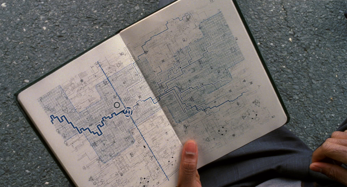
| David’s past, present and future paths lay within his « plan trough. » | |
What Brainstorm Digital has done on this project?
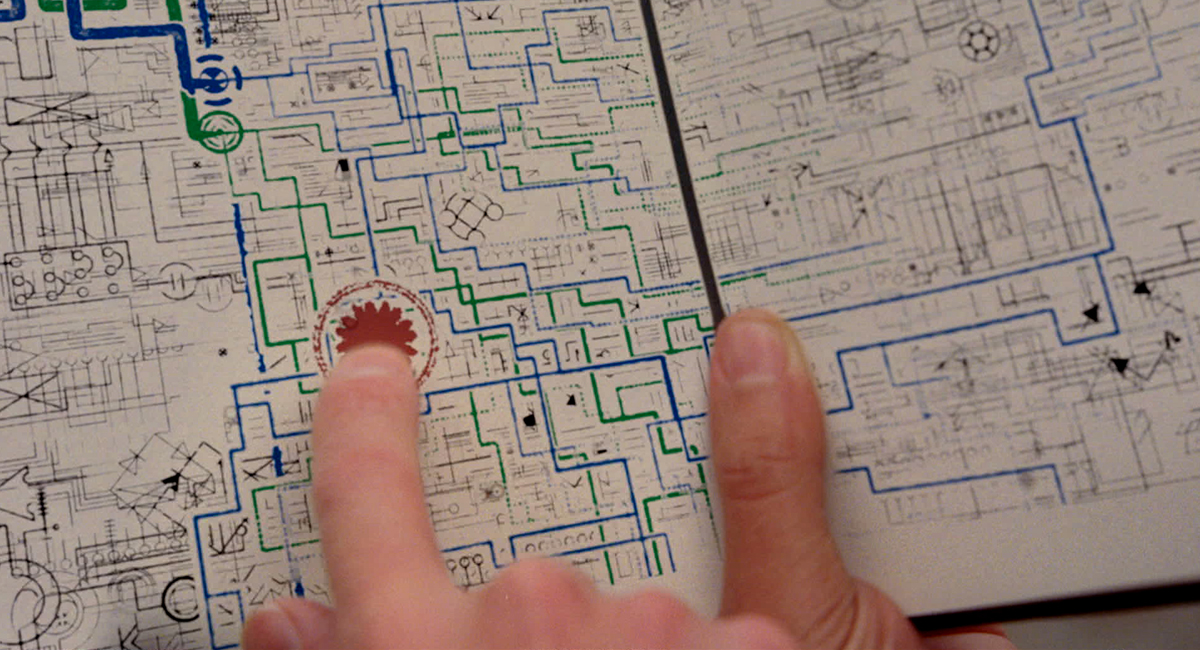
Brainstorm Digital did a lot of invisible effects such as greenscreen comps, shot fixes and enhancements. Things such as adding an waving man inside a taxi as it is crashed into. Our main focus however was the design, animation and integration of the planbooks to work within the story as part mystery and part plot illustration.
What references have you received for the book’s content?
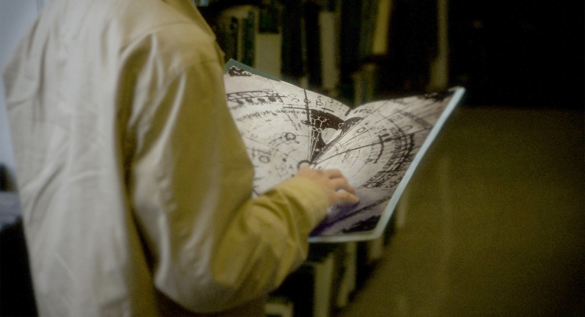
None. We read the script, listened closely to George and gave revision after revision until it honed in on what he wanted. The first pitches were a really wide net referencing circular astronomical and nautical designs to circuit boards and Kindles versus books. We were steered to a circuit board diagram in an old ledger book feel immediately and from there the design changes really had to do with the animation and the way the main character’s icons felt.
 |
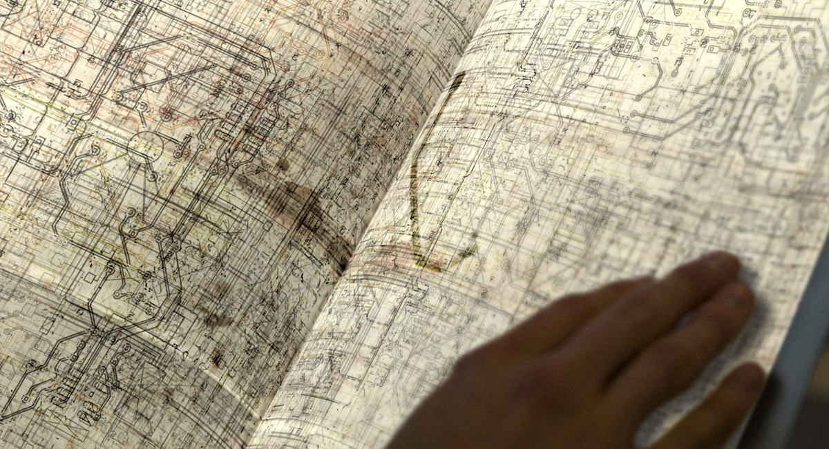 |
| Pitch/in process design on the planbooks | |
How was the shooting for shots containing the book?
We didn’t have anything to do with the initial shooting of the books. That was all Mark Russell. Later, during reshoots, we had done all the initial comps and directed him to place fewer tracking markers on the page. All the markers were actually very hard to match to. For tracking we really only need the sides. The edges were the only things that mattered for making it feel like it was on the page. He listened and it worked out great.
Mark had the art department make actual pages with different symbols on the pages. Our tracking had to be rock solid. Nothing could slide anywhere on the page with every real bend and fold. Mokey planar tracking and spline warping in Nuke was laborious but got the job done.
Can you explain in detail how you created the animation for the book content?
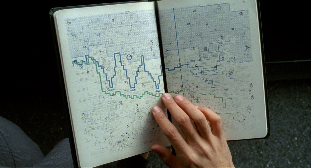
The base design was created in Illustrator and then brought into After Effects as masks. From there we were able to stroke the masks using both the internal plug-in and the Trapcode 3d stroke tool which offered more options. All the plot point animation was made with masks in After Effects and everything was rendered out as passes which were composited in Nuke where the tracking and warping was occurring.
 |
|
| Wide with both David’s and Elise’s paths moving out of their « plan trough » into unplanned territory. | |
What kind of cleanups did you do?
We cleaned up the crew in the shots, set extensions, equipment accidentally left in frame. When the guy is hit by a taxi we had to remove all the padding on the ground. We also extended the stairwell in the Chairman’s building.
What was the biggest challenge on this project?
Technically it was figuring out an efficient way to composite the planbooks that could handle a lot of revisions. Also the newspaper shot. In that one we had to put new photos in the newspaper. Warping in 2D was the only way to do it and it was tedious. Creatively it was the sun flare shot. Something so easy took us about 40 revisions to get it looking just right.
 |
|
| Close up shot of « future paths » and « inflection points » where their plan changes. | |
Was there a shot or a sequence that prevented you from sleeping?
I think around last July I was rushing to change the design of all of the planbooks to a new look for a screening. That kept me up for a late night. But nothing horrible on this film. Mark is not a slave driver. He’s a family man as well and knows that quality work comes from being awake.
How long have you worked on this film?
First meeting with George was in mid 2009.
What do you keep from this experience?
Hopefully a good relationship with people like Mark Russell and George Nolfi and their great editor Jay Rabinowitz.
What is your next project?
Currently working on season 2 of HBO’s BOARDWALK EMPIRE as well as a film called, VIOLET AND DAISY, written and directed by Geoffrey Fletcher who won an Oscar for writing PRECIOUS. It stars Saoirse Ronan, Alexis Bledel, and James Gandolfini.
What are the 4 movies that gave you the passion for the cinema?
As a kid: CLOSE ENCOUNTERS OF THE THIRD KNID, STAR WARS.
Then teen: BLADE RUNNER
Then college: BARTON FINK
A big thanks for your time.
// WANT TO KNOW MORE ?
– Brainstorm Digital: Official website of Brainstorm Digital.
© Vincent Frei – The Art of VFX – 2011


