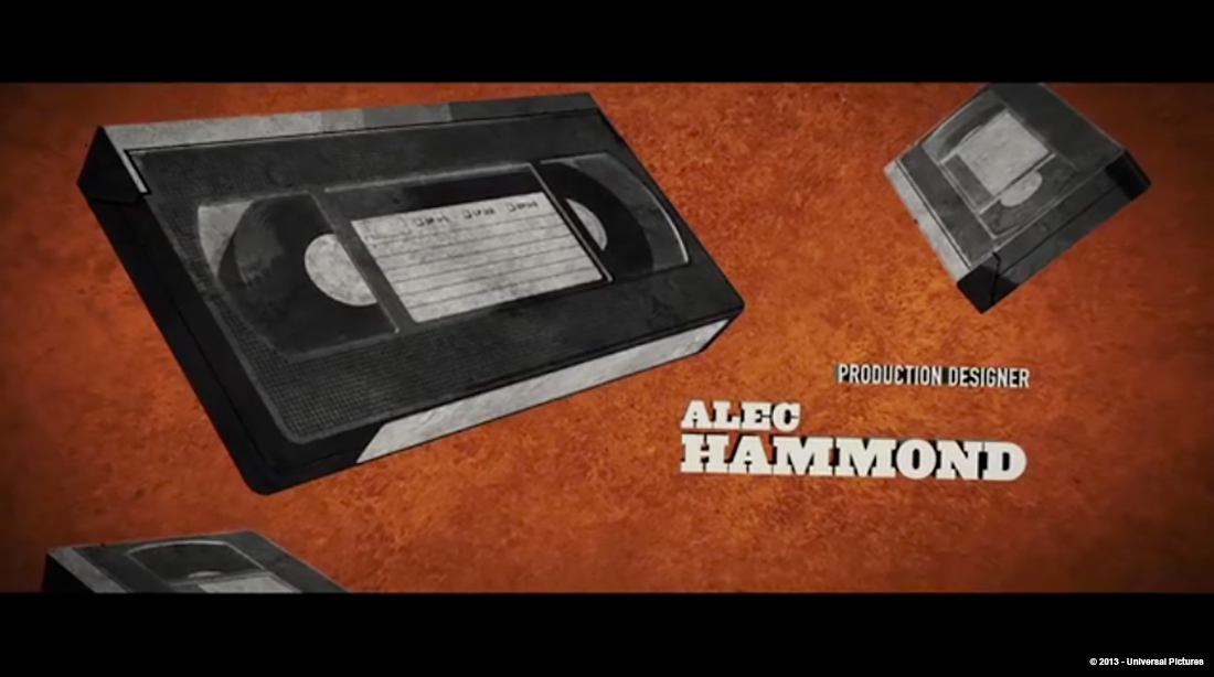
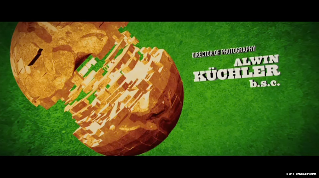
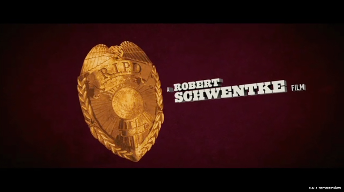
William Lebeda had designed titles for over 14 years. He created the titles for THE VILLAGE, SHOOT EM UP, THE HAPPENING or DRAG ME TO HELL. Now he tells us in detail the titles work of Picture Mill on R.I.P.D.
What is your background?
I am a classically trained graphic designer. Though I always loved movies and animation, I didn’t really get involved in film until graduate school at CalArts, where I studies ‘Experimental Animation.’ It was a program teaching animation techniques and filmmaking, but not traditional animated cartoons. This was in the early 90’s. We learned almost everything by hand on optical printers and Oxberry cameras. After Effects wouldn’t be invented for 5 years…
How did Picture Mill got involved on this show?
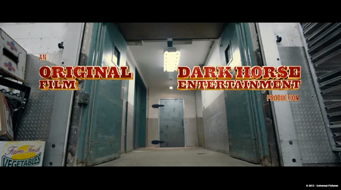
This is our 4th collaboration with Robert. We met him on his first American film, FLIGHTPLAN. It has been a great collaboration. Robert really trusts our instincts and understands the value of good titles on a movie. He knows that titles can really set the mood for the audience at the beginning of the film and on their way home. We were invited early to the project because of our past relationship.
How was the collaboration with director Robert Schwentke?
Robert is great. He always brings us in early, and gives us lots of access to the film and the editing room. R.I.P.D. was particularly fun, because Robert asked us to design some teaser poster and logo concepts during preproduction. We were working on the movie before he started shooting. And even as the film took its inevitable twists and turns during editing and post-production, he was always looking to us to help work out how the titles would interact with the film as a whole, not just when it was all finished. We were along for the entire ride, thanks to Robert.
What were his expectations about the titles?
The original concept had been to make a little bit of a throw-back sequence… like a Sergio Leone movie or a classic 70’s cop movie. We were going to edit a sequence out of select highlight moments and character bits from the film with an aggressive visual treatment and big bold dynamic typography. Very flat, very graphic and very 2D. Of course some of that changed when they decided to release the film in 3D.
Did he give you specific indications and references?
Mostly it was a tone discussion. “Not too Western, not too 70’s.” He wanted a flavor, a hint of the classic, but not a homage or something purely retro. We had a lot of room to make bold choices.
How did you approach these titles?
Like all of our title design projects, we start with the movie… what does the film want? Short open to get into the storytelling? Big ending title sequence to really celebrate and have fun with the characters and world we have just seen? Or a more ‘overture’ style open to settle the audience into the world of the film? These are the initial questions we ask when we watch the movies we work on. Then we listened to Robert, and heard his input and guidance. And then take it from there. In this case, it was short title at the beginning and big sequence at the end.
Can you tell more about the concept and design process?
Well for us, the idea is everything. Technique we can work out, but if we have a strong story and narrative approach, we can build on that. In the original brief from Robert, it was kind of the opposite… he had suggested a broad visual and style approach, so we needed to figure out the story. But the movie is filled with great visual material so it was really more about connecting the dots visually. ‘How are we going to get from the taxi driving in the city to flying bullets?’ kind of thinking.
As in all Film post processes, its an organic thing, and changes all the time. We had to keep up with editorial and filmmaker changes and develop a sequence with them as they developed their movie. Some things changed a LOT. In addition to the conversion to stereo 3D, there were lots of discussions about where the titles and where they should go in the film. Front or back, long or short, complicated or simple. We ended up doing LOTS of versions of the titles from elaborate editorial storytelling sequences explaining the R.I.P.D. to really short bits where a title appeared over the Boston skyline. As the edit changed, we had to adapt and be flexible to that process.
How did you get to the final concepts?
When all was said and done, the titles really ended up as two completely separate sequences, one for the front and one for the back, both solving different needs for the movie.
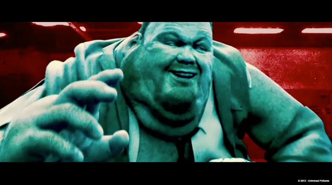
There had been lots of thoughts about how to introduce the characters and the world of the ‘Rest in Peace Department’ without having to have lots of exposition at the front of the film. In the end, we created a short sequence with just a few cards introducing Ryan Reynolds’ character and Jeff Bridges’ character. And a huge and monstrous dead Elvis. That idea came from a lot of discussion including the writers, Robert, and the creative team from Picture Mill. There were many experiments, rough tests, script writing, etc. before we got there though. But it’s a funny and exciting open to the movie, and sets the stage well for all that comes next.
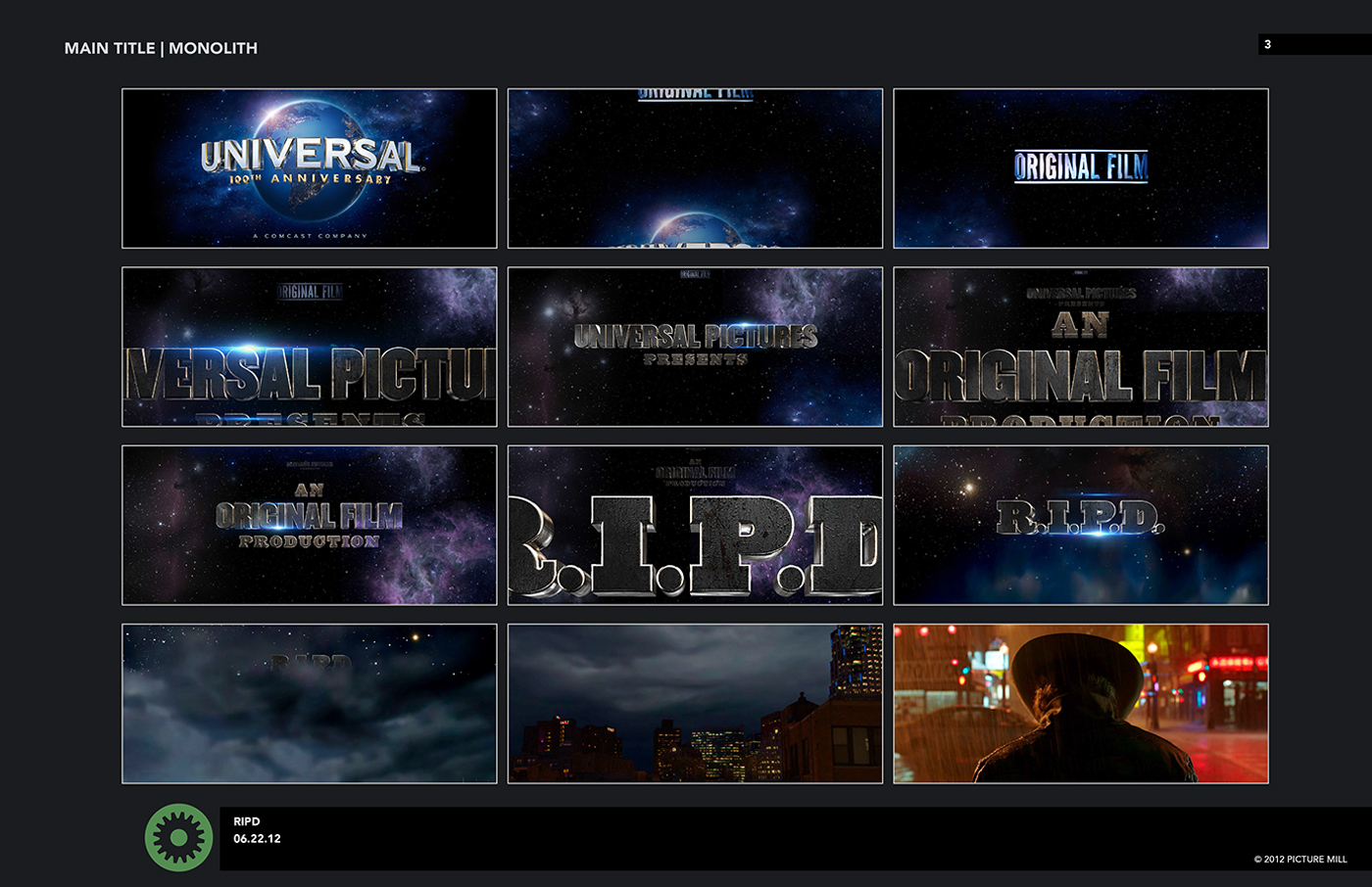
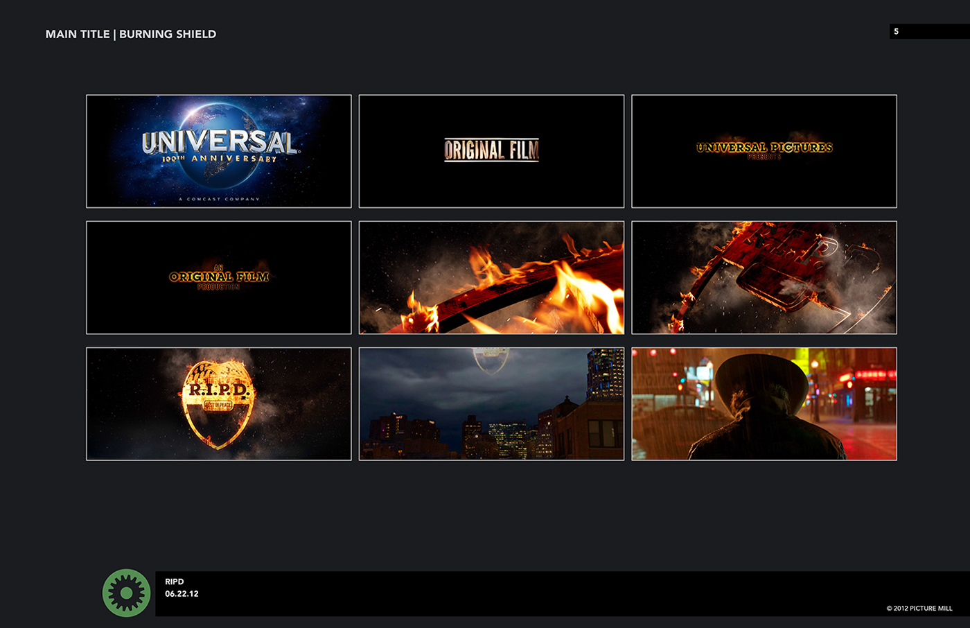
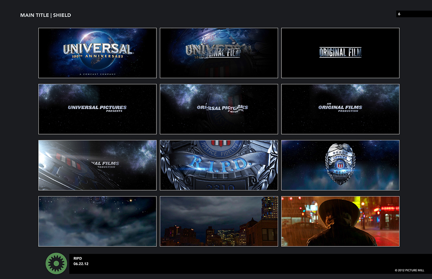
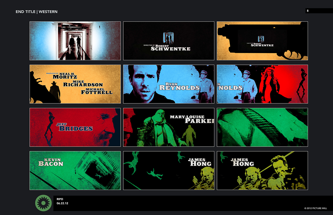
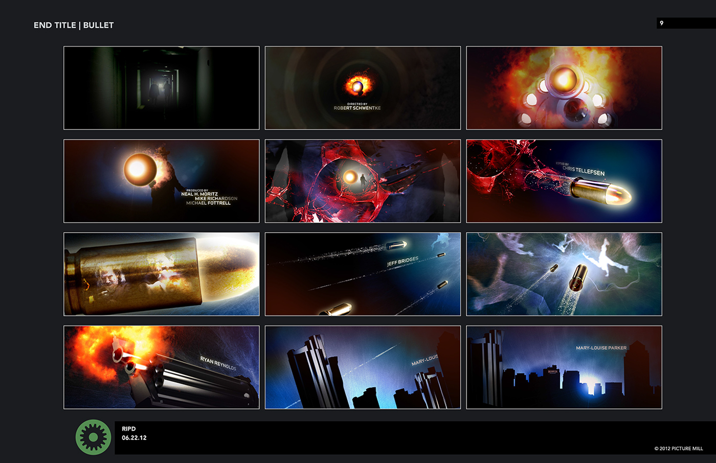
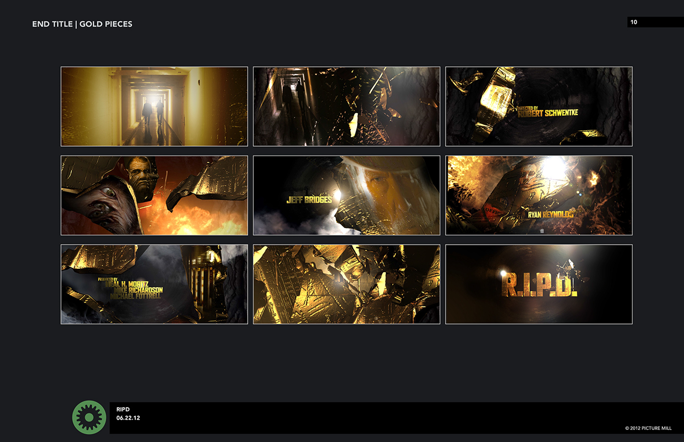
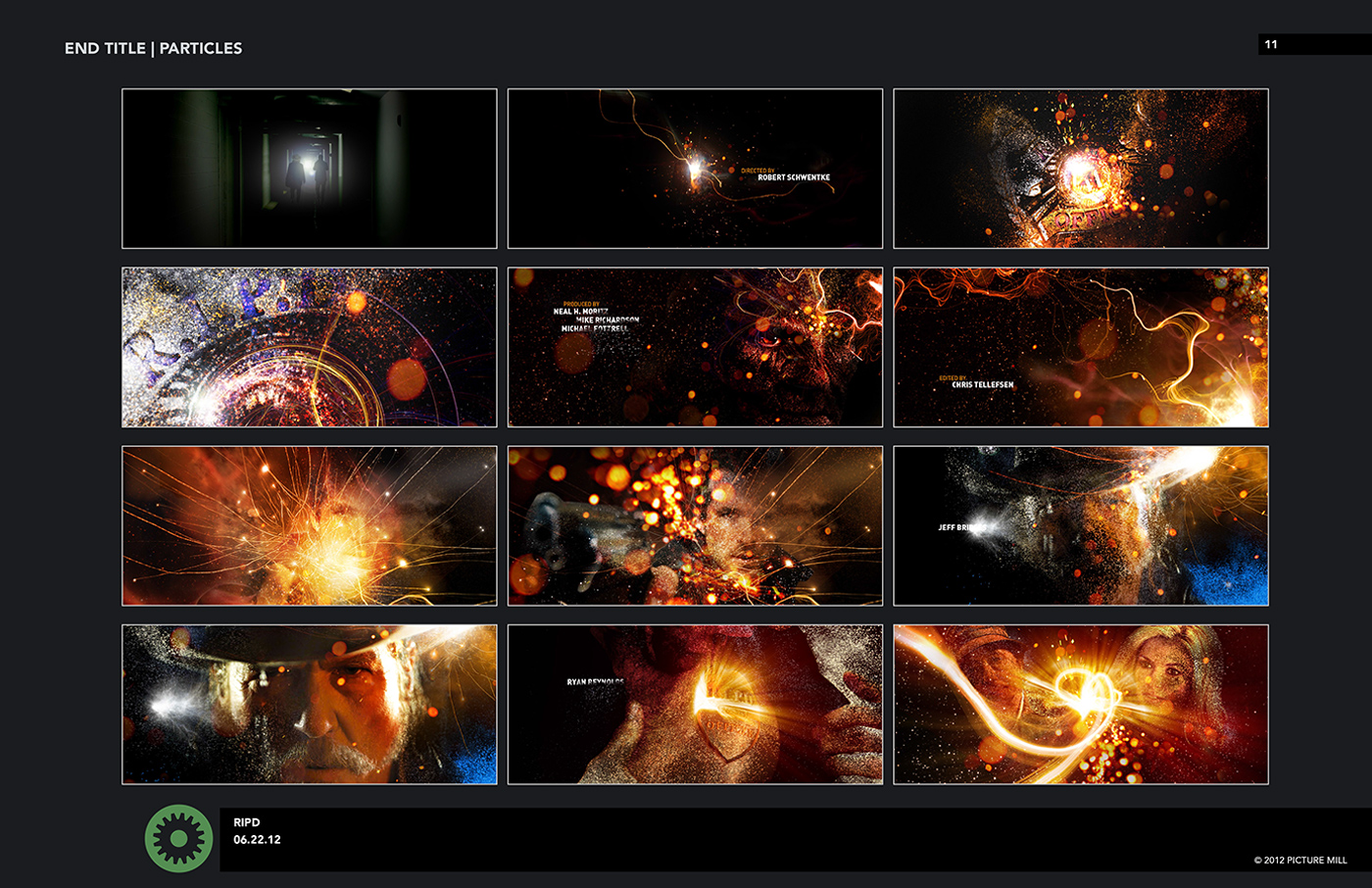
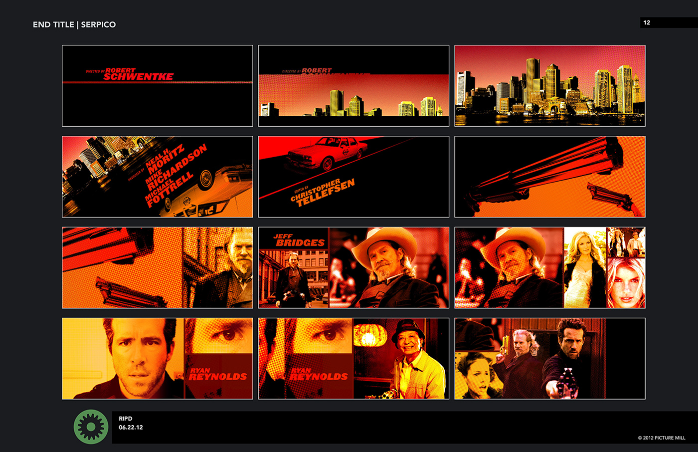
The ending was a whole different project. While the front was being worked on, the end titles went on hold, until we could get it all figured out. There were still ongoing discussions about all the titles going at the front of the film, until the introduction concept was settled. But once that was settled, and some other details about the ending of the film were worked out, we presented some very bold and graphic designs that maximized the dimension available in stereoscopic 3D. The movie ended with a funny sight gag, so the movie really needed a bold and animated title sequence, without any additional film footage. So we created a sequence with iconic objects, like handcuffs and the RIPD badges, combined with bold type moving though a colorful abstract environment. We had a lot of assets that had already been made for earlier versions of the end sequence, so we were able to design and animate fairly quickly to make the final version. Which turned out great in stereo… the colors and images really pop. And nothing is funnier than a giant stereoscopic banana.
Can you explain in details about the creation of the titles?
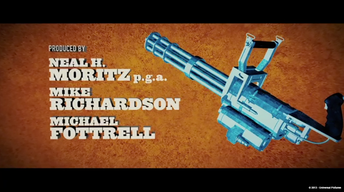
The front sequence was a bit trickier than the ending, because it required VFX shots and assets from the film to be turned over to us to be custom affected. We did additional rotoscoping on the shots, added a custom color correction, and integrated our CG typography. And after working on the film for almost 9 months, we did have a fairly tight deadline to get the open locked and approved in 2D. Once the concept was locked and the rough edit was approved, it was still quite a task to complete the open. We still needed everything from animation to compositing to rotoscoping a new face on the Jeff Bridges freeze frame and extracting other additional bits from the shots. Once it was approved as 2D it was turned over to the stereoscopic conversion team, which was another vendor entirely.
The end was actually much more straightforward since we were doing everything in-house, from editing to modeling to animation with only a single transition from the final shot of the movie into our sequence. We made a list of the icons we wanted, and how we wanted them to align with the credits… we tried to have meaningful objects with the actors especially, like Kevin Bacon’s name goes with the St. Christopher medal that he wore. And the composer gets the crazy concertina that Jeff Bridges plays in the film. We had a 5-person team building the end sequence, modeling the objects and animating in 3D and then turned over to compositing for color and final stereoscopic tweaks. The trickiest bit for the end titles was making sure the graphic textures on the 3D objects didn’t freak out in stereo. Stereoscopic work is always an adventure. There is always something new to fix…
What is one of your typical day?
As Creative Director, I lead our staff of about 16 designers, animators, and producers. Within a studio like ours, my responsibilities vary greatly from day to day… some days I am dealing with clients extensively, with conference calls and feedback. Others I am dealing strictly with internal design reviews and guiding the progress on on-going projects. My favorite days are when we start new projects and meet with the directors and producers and start to explore the possibilities.
When working on a big project like R.I.P.D. there was a dedicated team working on the project day to day, usually an Art Director partnered with Project Producer, along with the assigned animators. Usually we would start with a review of the overnight renders, and then discuss the goals for the day, and any upcoming client presentations. There will be individual check-ins during the day, as issues arise, but mostly you want people to be able to work and focus and not be distracted by meetings.

Can you tell us more about the fonts choice?
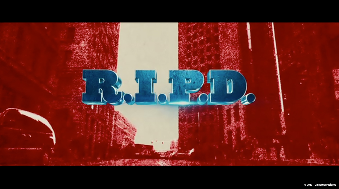
The font is called Ziggurat by Hoefler & Frere-Jones type foundry. It’s inspired by slab serif type from the 19th Century… so it’s got a touch of that old-west feeling. Though you’d never know it, when it’s floating in 3D. Next to a machine gun.
How did you manage this stereoscopic aspect for the titles?
We do a lot of stereoscopic work, and have several staff members that are exceptionally well versed, from lead compositors to CG animators to project producers. It was also helpful that for the end we were delivering stereo pairs to the DI. After that one transition from the exterior of the city it was all Picture Mill. Mostly it’s a matter of planning ahead, and thinking through the stereo BEFORE you start, rather than trying to back into it. Mostly it is experience combined with a bit of trial and error.
What is your software pipeline on this show?
This was an After Effects-based project for us. It’s our primary compositing and animation software… so much of our work is way beyond straight compositing that the flexibility of the animation tools in AE are really a good choice for us in general. The CG on this job was Cinema 4D, which is usually not what we use; we are typically a Maya studio. But in this case, it just worked out that we could get a great look out of C4D and it works very smoothly with After Effects.
Can you explain more about the team organization?
We had a Creative Director, Associate Creative Director, Project Producer, Lead Compositor, and a handful of designers and animators on the project on and off for over 9 months. David Clayton, ACD, served as Art Director and lead designer on the project. He partnered with David Midgen, the project producer. I was involved in the creative and overseeing the project in a larger scope. David and David ran the project on a daily basis, including frequent meetings and calls with Robert. They did a great job with project and it shows on screen.
Did you receive the score before doing the animation and the edit?
The score changed several times, but it always had a similar tempo. By the time we did the last bit of animation we had almost the final edit of the song for the end, but I think there was even some adjustments in the final mix after we delivered the sequence.
What was the biggest challenge on this project and how did you achieve it?
I think the biggest challenge was keeping up with the editorial changes to the film itself. They were moving very quickly, trying lots of ideas about starting and ending the film. I think we were able to do that by being flexible and willing and open to collaboration. We really took the attitude that we were there to help them with whatever they needed, from writing to design to previs to whatever. Even if it wasn’t directly “title” related.
Was there a shot or a sequence that prevented you from sleep?
Not in this project. But there have been in others…
What do you keep from this experience?
Never throw anything away! We went back to concepts pitched early on, and then used models that had been discarded in other ways. When the film was changing, we never knew what might come back, so everything was online and available.
How long have you worked on this film?
Well, we did teaser posters before they filmed, then nearly 10 months in post… all in at least a year, on and off.
What was the size of your team?
Anywhere from 2 to 12 or so. At our peak, I think we had 12 people working at once on the film… designers, animators, plus our own editor. We had a lot going on for a while.
Here are the credits:
William Lebeda – Creative Director
David Clayton – Art Director & Lead Designer
David Midgen – Project Producer
Sam Kim, Peter Sperrazza, Eric Zunkley – CG and Stereoscopic animation
Jon Wolfe – 2D and Stereoscopic compositing
What is your next project?
Top secret. Sorry. It’s going to be great though. But recently we did finish titles for THE WOLVERINE, THE HEAT, AFTER EARTH, A GOOD DAY TO DIE HARD, and earlier this year, HANSEL AND GRETEL: WITCH HUNTERS. We’ve had a good time, lately.
What are the four movies that gave you the passion for cinema?
STAR WARS, of course though I think of myself more as a Trekker. TRON changed my brain and it was never the same after. Scorsese’s AFTER HOURS was the first time I understood how much fun it could be to tell a story without space ships or special effects. And lastly, JAWS, even though I didn’t really understand it until much, much later. Now if I flip past it on TV, I will drop whatever I am doing and watch it until the end.
A big thanks for your time.
// WANT TO KNOW MORE?
– Picture Mill: Official website of Picture Mill.
// R.I.P.D. – MAIN TITLE – PICTURE MILL
// R.I.P.D. – END TITLE – PICTURE MILL
// R.I.P.D. – VARIOUS CONCEPTS FOR END TITLE – PICTURE MILL
© Vincent Frei – The Art of VFX – 2013

 & Aaron Eaton (VFX Supervisor – Cantina Creative)")
