Danny Yount is back on The Art of VFX. He explains the different process and the challenges for the creation of the opening title and end title for OBLIVION made by Prologue Films. This is his second collaboration with director Joseph Kosinski.
It’s your second collaboration with director Joseph Kosinski. How did you work with him on this show?
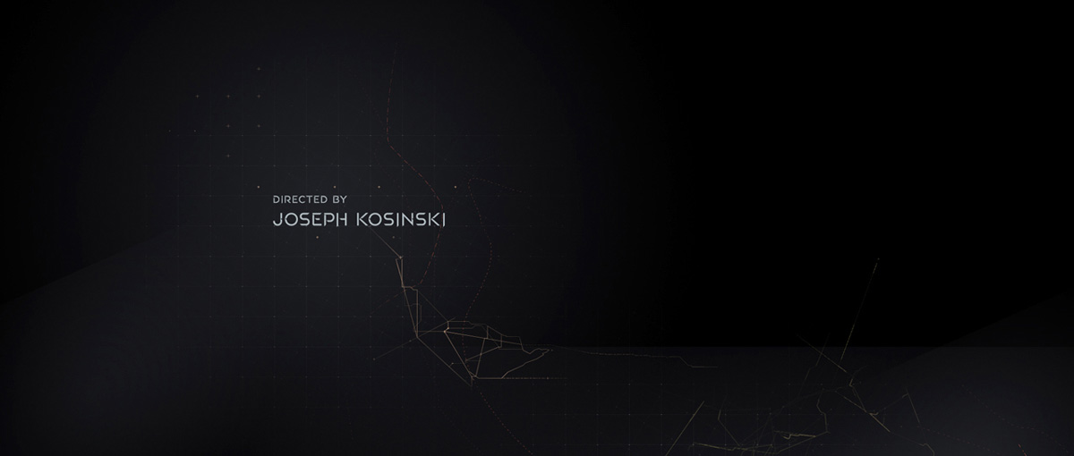
When I first talked to director Joseph Kosinski and Producer Steve Gaub they wanted us to help them develop a look for a part in the film that was a series of memory flashbacks that Jack Harper (Tom Cruise) kept having. In the story his memory was erased so we were asked to explore digital treatments that would make them feel like corrupt data. We tried breaking apart the image in a way that made them look very digital and highly detailed, but as the movie evolved the filmmakers decided they worked better as organic memories, so I made them look more cerebral with flutters and selective focus techniques – more dream-like. Once that was solved we were then asked to make titles for the film and to create type animations for the trailers.
What were his expectations for this main title?
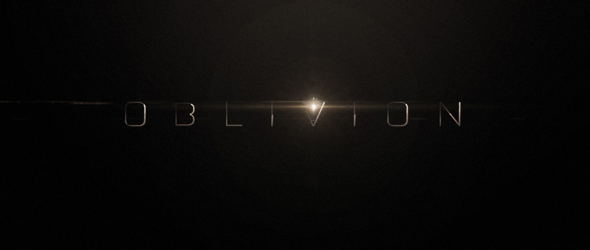
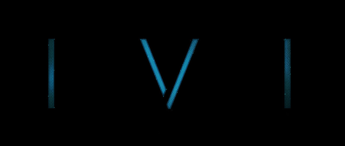
He wanted it to be interesting and feature the TET somehow (a prominent symbol in the film). The music starts with a pause of suspense and then a large crescendo so I thought it would be good to make the symbol very large and powerful. And it seemed appropriate for the the symbol and the title to « boot up » – as the camera slowly pulls back to reveal the title. I thought it would be good to have sort of a futuristic LED surface – like a large interactive display. I made an example image with an intricate hex pattern and designer Takayuki Sato did a terrific job coming up with variations of this in motion.
What indications and references did you received from the director for the main title?
Just a title card that they were using for marketing, along with a font they had made.
How did you approach the beautiful font animation for the logo?
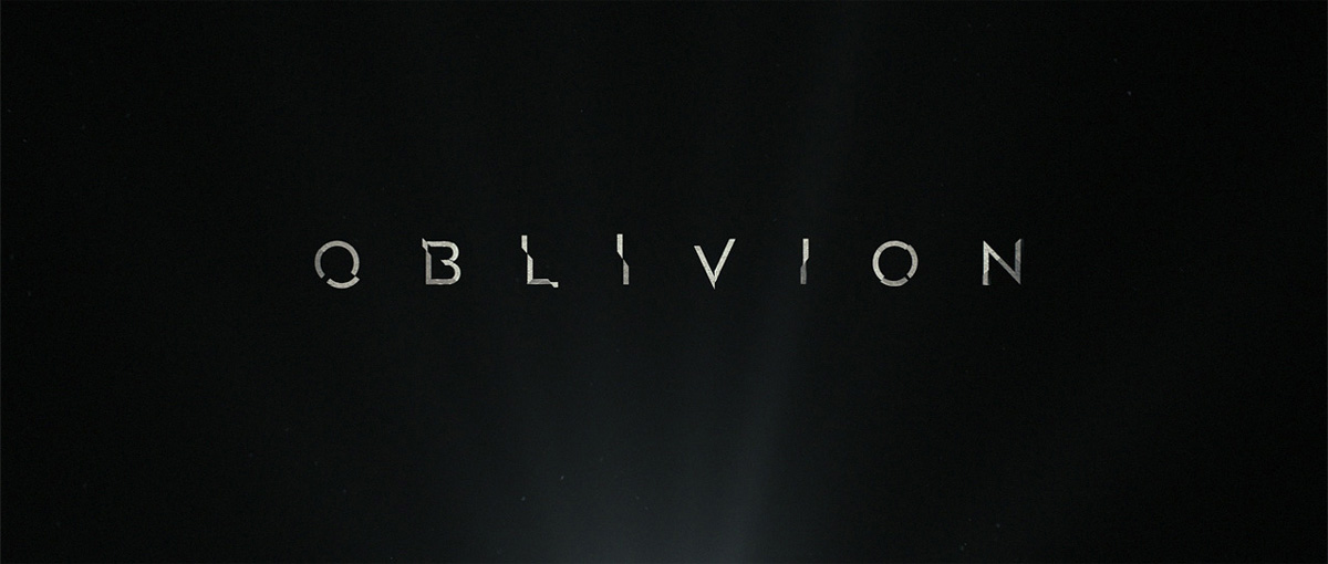
I wanted the typography to be different than what was used in the film so I altered the typeface they had given us to give it a unique look with a little more detail and complexity so it’s more interesting in motion. The animation of the type communicates the same theme as the title – that it is part of an interface of some sort that boots up.
Can you tell us more about its creation and animation?
If you see everything on screen you’ll notice a lot of micro-detail work – every pixel is carefully animated with utmost precision. That’s what I like so much about working with Taka and Yongsub – they don’t overlook those things. And with everything so completely digital now you can really take advantage of what the screen and projector is capable of detail-wise.
How did you get the idea for the end title?
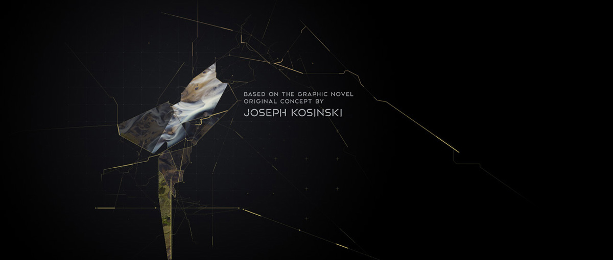
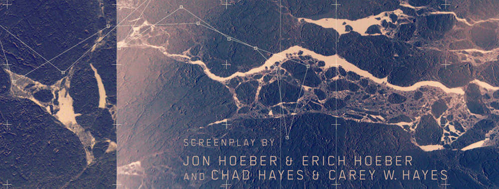
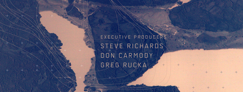
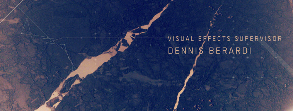
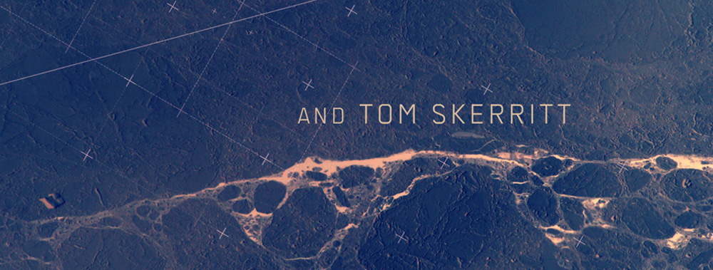
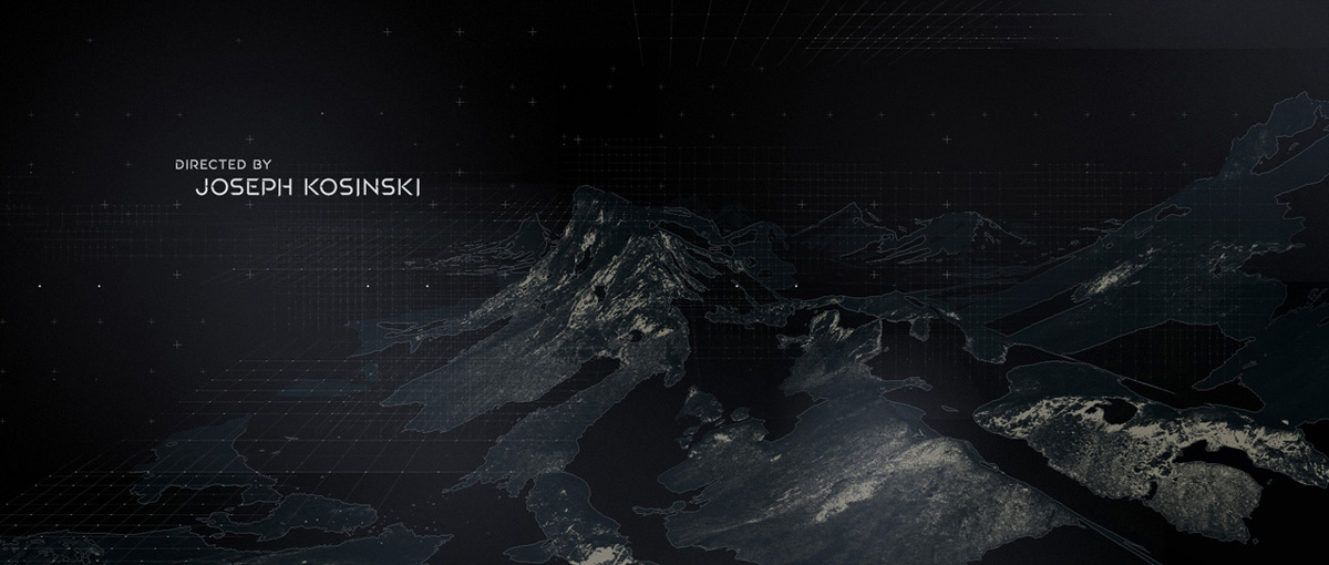
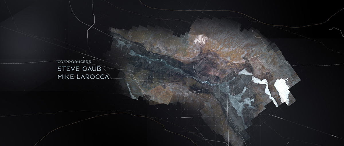
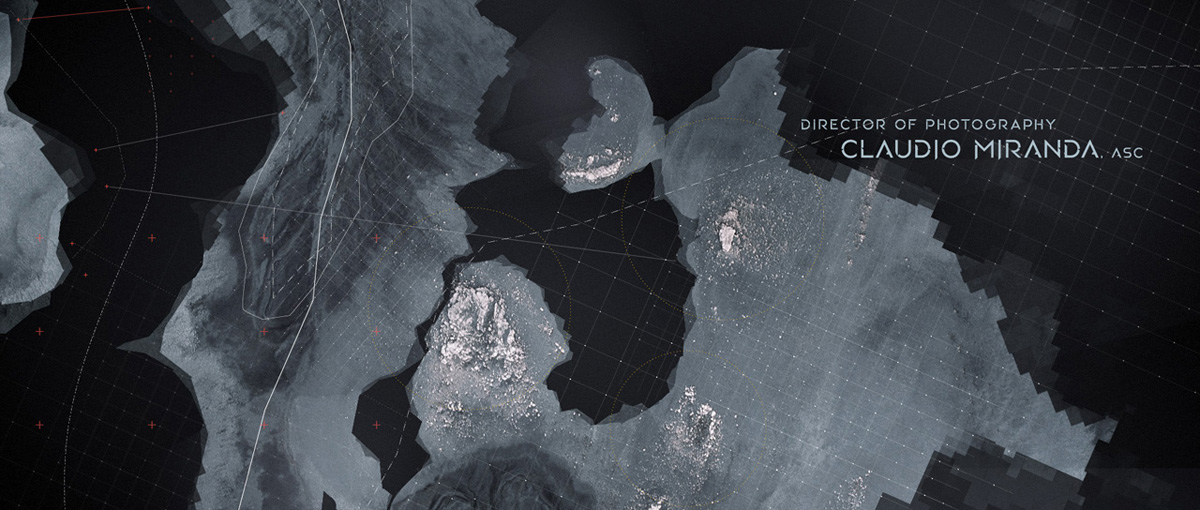
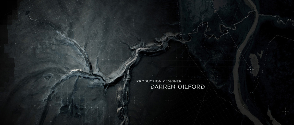
In the film, part of Jack Harper’s job is fix and put back online fallen drones – so I thought it would be good to do something that felt like an aerial study of some kind, scanning different regions of the planet in search of the machines.
Can you tell us more about its design?
The design of it was resurrected form a pitch I had made several years ago for another film. I also liked the look of it so I was excited to have a reason to bring it back.
Can you explain in details about the grid and various elements creation?
I pitched to Joe that I have this idea using aerials and asked them if they have anything like this from the film. They said yes – about 23 hours of it! I was thrilled to sit with editorial for a half day, going through some of the most amazing helicopter shots of Iceland I have ever seen. The filmmakers were quite happy with the result.
Which softwares did you used to create the animations?
Just standard Adobe tools – AI, PS and AE.
Taka used Particular extensively for the detail work.
What was the biggest challenge on this project and how did you achieve it?
Tom Cruise wanted his name on a specific background so we had to make some last minute adjustments to the edit. I think the memories were a little difficult to have the right look. But all in all it was a relatively painless project to work on – I had a great animation team, a great producer (Unjoo Bayars) and director Joseph Kosinski is always a joy to work for – he knows exactly what he is looking for and the collaboration is always a lot of fun.
OBLIVION end credit sequence from Danny Yount on Vimeo.
What do you keep from this experience?
That old discarded ideas are not always a waste of effort.
How long have you worked on this film?
On and off since september I believe.
What was the size of your team?
Small – no more than 3-5 at any given time.
What is your next project?
Nothing I can disclose yet, but I can say it’s fun.
A big thanks for your time.
// WANT TO KNOW MORE?
– Prologue: Dedicated page about OBLIVION on Prologue website.
© Vincent Frei – The Art of VFX – 2013


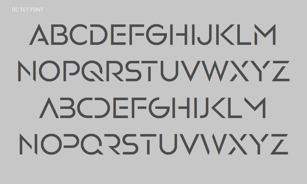


I’d like to know, where I can to download this font please.
Is it possible to buy this font?