
After explaining to us about his work on the titles for OBLIVION, Danny Yount is back and tell us now about his work on IRON MAN 3 which marks his second collaboration with the director Shane Black.
You have created many titles for Marvel universe. What was your feeling to be back on it?
Terrific – I always look forward to working with Kevin Feige and Victoria Alonso. But this one was extra special for me in that I was able to work with director Shane Black, who I did titles for back in 2004 for a movie he wrote and directed called KISS KISS BANG BANG. It was also one of Robert Downey’s films that he did right before he became an action hero.
How was the collaboration with director Shane Black?
Wonderful. Shane Black is a very down to earth guy and open to fun things. The first presentation I did was very rigid and technically ambitious, but he wanted none of that and was instead more open to ideas that were a little wacked out and fun, like one edit that Kyle Cooper made of Iron Man doing a striptease in his removable suit (haha). So it began a conversation with he and Kevin of what they wanted otherwise.
Did he give you specific indications or references for the titles?
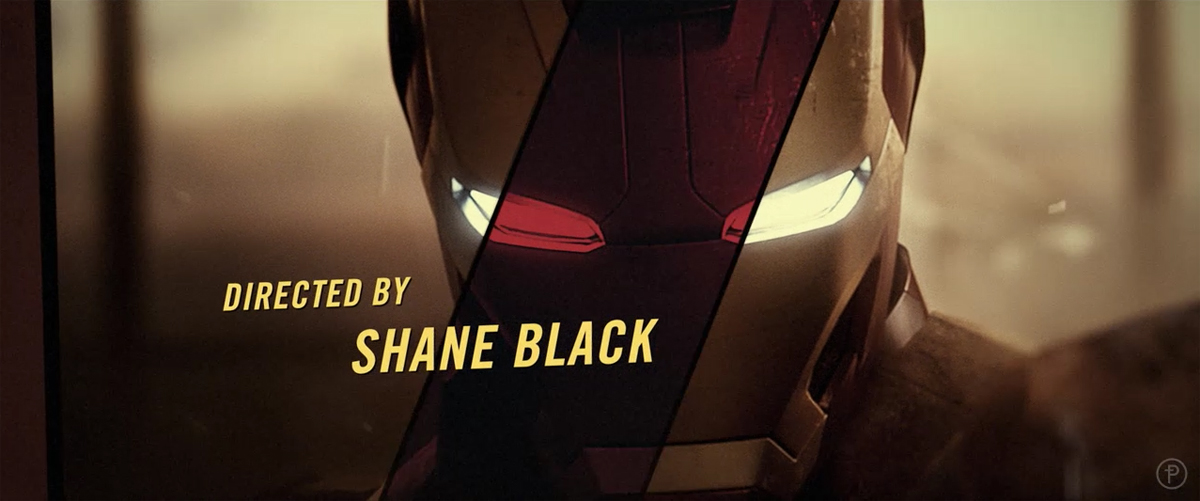
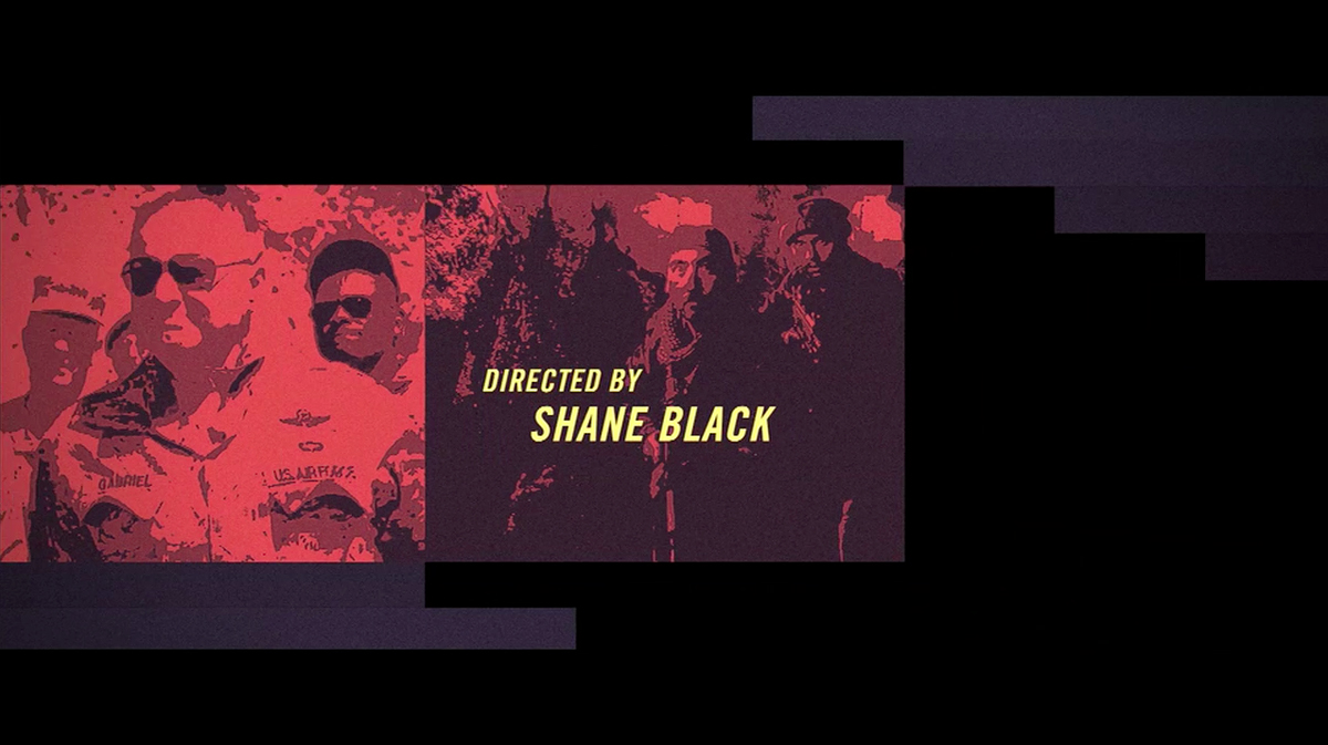
Shane likes retro things (as evident in KISS KISS BANG BANG), so he wanted something kind of like an old film title (like Pablo Ferro’s Bullet titles).
What was his approach and expectations about the title sequences?
That is needed to be anthemic to the franchise and show it’s evolution but without feeling like a curtain call. I’m sure this one will continue for a good long time!
Can you describes your work process for the title creation?
I’m a product of the 70’s and 80’s so I love old tv crime drama titles (like DUKES OF HAZARD and GET SMART, etc). Also a huge fan of the classic comedies like AIRPLANE and NAKED GUN, which to me are all about taking a very serious subject and finding the right moment to make it extremely unserious. So I made a test edit / animation of the titles using the IRON MAN 1 & 2 show footage and stuff I found in the current trailers running for 3. In the test I used the music from an old show called the Mod Squad, which was the cool show to watch back then but now the music is so campy that its hilarious. Everyone seemed delighted by the tone and comedic moments found in freezing frames you would not expect.
How did you organize the work with your teams?
Editorial, animation, 3D processing and output. I’m very big on each designer having a special part in their field of expertise, and thanks to producer Ian Dawson’s foresight in what was needed to get the job done I had the perfect team of guys who were technically and artistically balanced. It was a lot of material that we had to go through in a very short time (2-3 weeks total), with a lot of changes from the client so we had to be spot on with each round. We had a few issues that had to be worked out (as is always the case with so many layers of content), but in the end we made it.
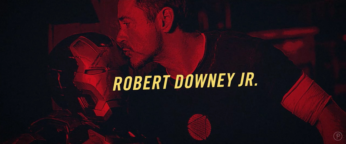
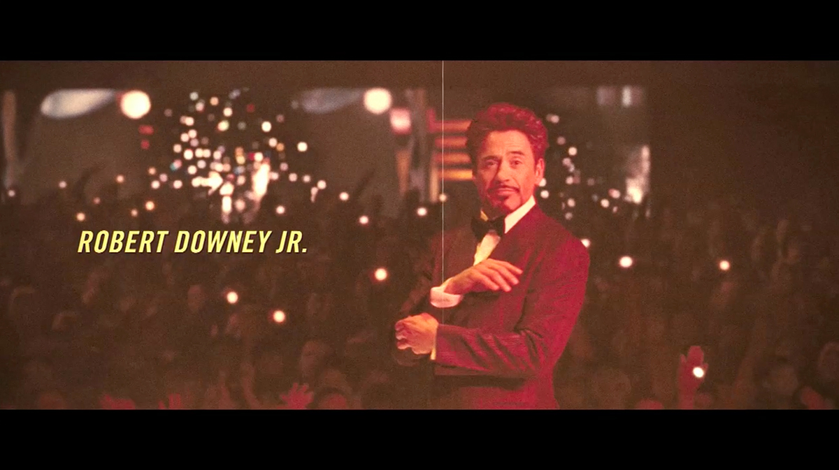
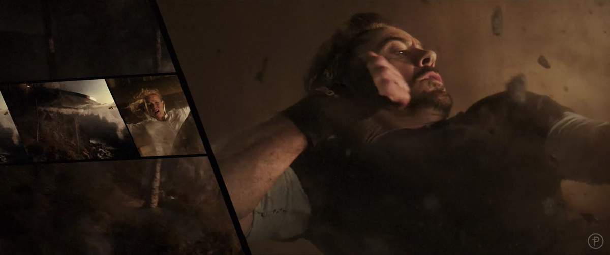
The end title sequence is a beautiful tribute to the Iron Man trilogy. How did you choose the best sequences for the movies?
I pretty much just went through each film and found what I thought were the best scenes. We then categorized them into action scenes & lifestyle scenes. Then sub-categorized them editorially into match cut moments – like every time Tony Stark or Iron Man uses a certain trick or every explosion or every time you see beautiful women or cars. After all, it’s entertainment so it has to be pure fun!
Can you tell us more about its design?
The 70’s vibe was a little heavy handed for the client so we ended up somewhere in the 90’s – with drop shadowed type and a tv-like wipes and split-screens. I wanted color to feel cheap but they wanted it to be film-accurate so we had to pull back on that. The color freezes are about the only 70’s aspect of the style but it seems to work well overall.
The Iron Man sequences have a particular visual aspect. What were your influences for it?
In the first IRON MAN I wanted the look to feel more like old atari video games and TRON (the first movie). The second film was editorial so we just did type over picture though. But much of the title work I do are newer interpretations of older things. So much can be drawn form the past – especially the golden years of film and tv.
Have you received the audio before the creation of the titles?
No. And the audio that was made did not at first have the same cool vibe as the Mod Squad music. The tone is all-important or it does not work. What’s great about the Mod Squad piece is the horn section – it’s almost monotonous. But the final piece that was scored by Brian Tyler seemed to work perfectly.
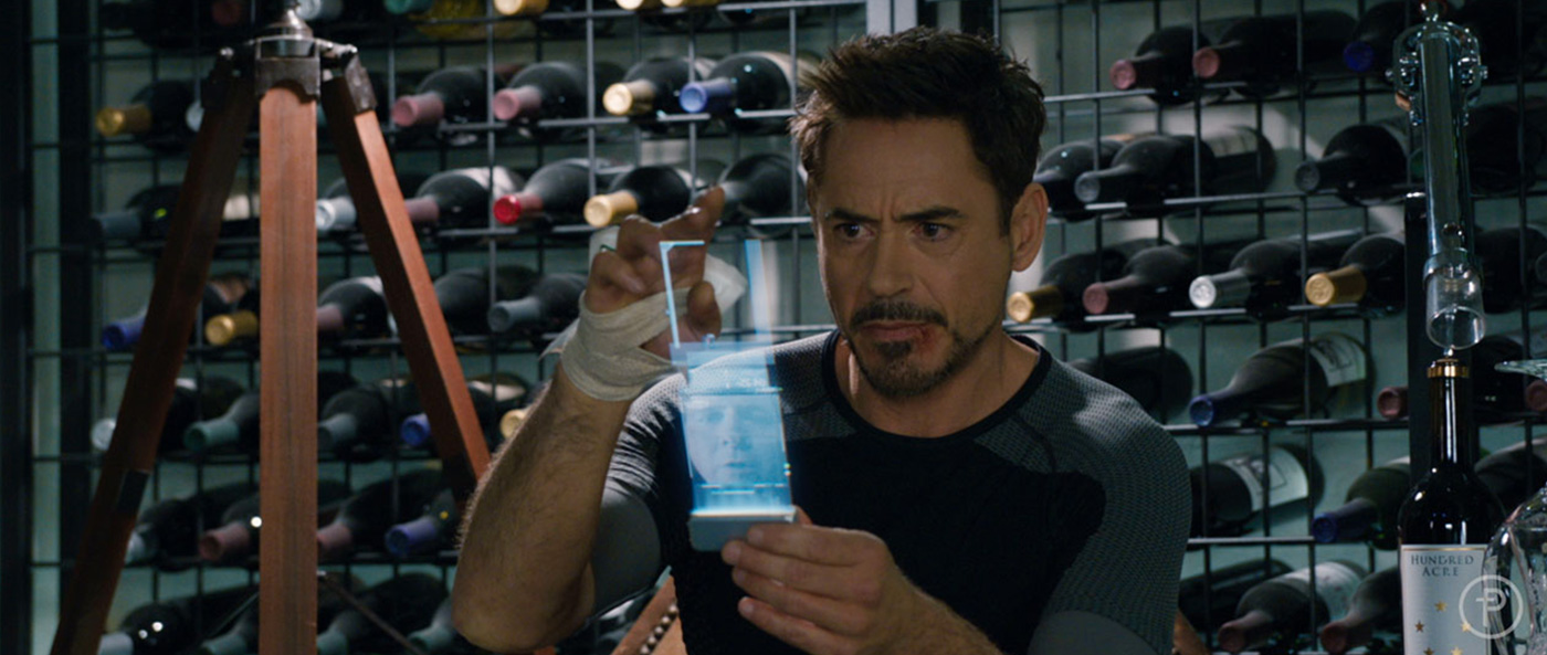
How did you approach the hologram phone?
They wanted a hologram to stream upward from a base element that Robert Downey is holding in the shoot. I wanted the look of it to not be too far out in terms of product development from the established design of all the holograms we had created in 2, so I began with that look as a base and worked from there. I noticed in the shoot that his eyeline is a little higher than expected so I played off that a little to make a telescoping design that expanded vertically and then unfolded to reveal the Aldrich Killian’s dossier. Ilya Abulhanov and team then animated the sequences.


What was the biggest challenge on this project and how did you achieve it?
Getting the color to be film-accurate. And each film had a specific style so we had to back and forth a little until it was perfect.
What do you keep from this experience?
That sometimes titles are just lighthearted and fun and that’s ok. I usually like things to be more refined but when you watch this one at the end of an amazing movie it seems to work perfectly with the film. And if everyone is happy with the result you can’t ask for much more.
How long have you worked on this film?
Just about a 2 months total (we did about 4 rounds of presentations before a final look and feel was chosen).
What was the size of your team?
6-8 people.
Executive Producer KYLE COOPER
Producer IAN DAWSON
Creative Director DANNY YOUNT
VFX Creative Supervisor ILYA ABULKHANOV
VFX UI Designer (tracking screens) NADIA TZUO
Coordinator ALICIA JOHNSON
Titles Editor DAVID NITZSCHE
Animators/Compositors
BEN HURAND
NADER HUSSEINI
BYRON SLAYBAUGH
YONGSUB SONG
AKEMI ABE
JOE KUTILEK
MATTHEW GREEN
Compositing Supervisor
SAM EDWARDS
What is your next project?
Time with my family! I also have to do another title for Semi-Permanent Sydney.
A big thanks for your time.
// WANT TO KNOW MORE?
– Prologue Films: Dedicated page about IRON MAN 3 on Prologue Films website.
– Danny Yount: Official website of Danny Yount.
// IRON MAN 3 – END TITLES – PROLOGUE
// IRON MAN 3 – TITLE SEQUENCES – PROLOGUE
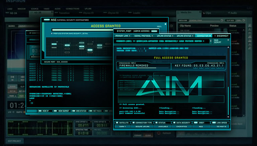
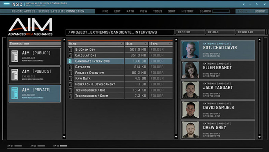
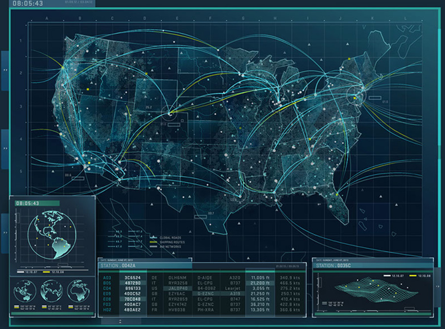
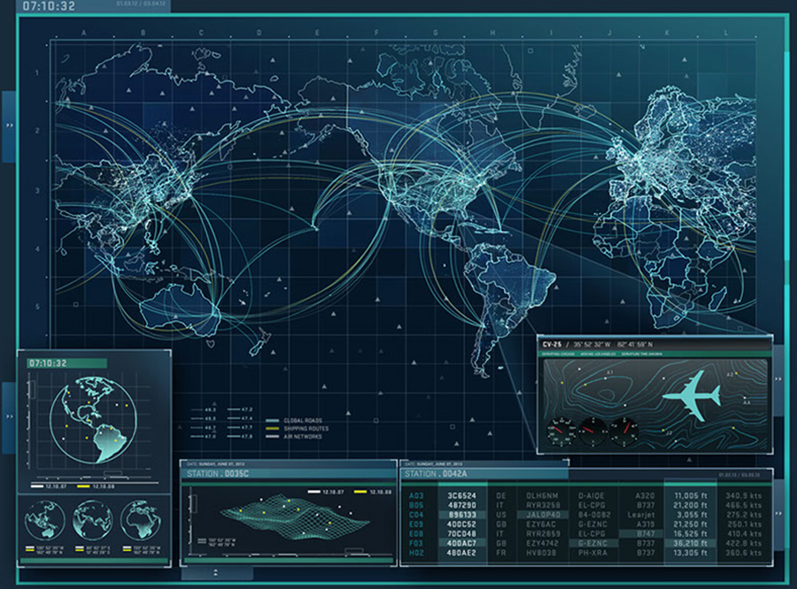
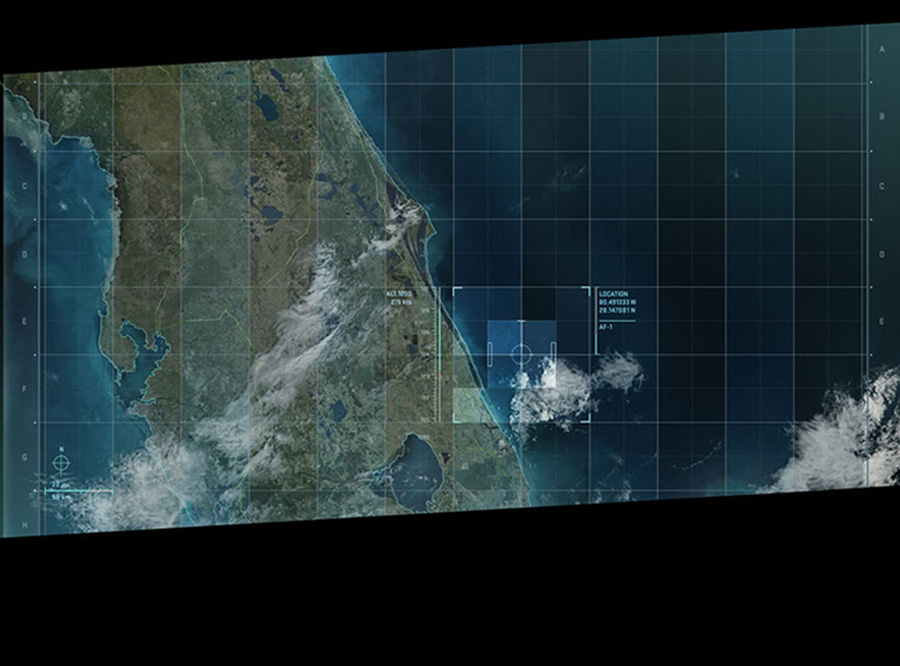
Another team at Prologue animated 2 other graphic UI sequences designed by Nadio Tzuo:
– the screens in the news van while Tony was stuck in Tennessee
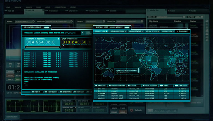
– the tracking screens that zero in on Air Force One


© Vincent Frei – The Art of VFX – 2013


 & Dave Cook (Head of 3D) – Jellyfish Pictures")

 & John Likens (Creative Director) – Method Studios")