
In 2012, David Sheldon-Hicks explained in details about the work of Territory Studio on PROMETHEUS. He then worked on many projects such as ZERO DARK THIRTY, FAST & FURIOUS 6 or JACK RYAN: SHADOW RECRUIT.
How did you get involved on this show?
We met members of the art department, Charles Wood and Alan Payne on a previous project, and really enjoyed working with them and had a good rapport. When they moved on to Marvel Studio’s Guardian’s project, they wanted us on board.
Alan Payne, Art Director // I have worked with the same set dec. team on numerous projects. It’s always good to work within a team you know and understand, so Territory was ideal for us.
How was the collaboration with director James Gunn and his art department?
It was really supportive and we were given a lot of freedom. James Gunn was very script focused with a clear vision of what he wanted. We felt a strong sense of connection with his dry and pithy sense of humour, which drives many of the humorous and quirky details that give this film such personality and humanness.
Charles and Alan were our main contacts. They’d keep us up-to-date with art department developments, how our work tied into the overall aesthetic of the film and generally doing a fantastic job of inspiring and briefing us. The art director, Alan, and I had a constant dialogue, bouncing ideas around, pulling in references and generally sharing our work with the rest of the art department team. It’s always an honour to see our work up on the art department walls against some world-class concept designers and creatives.
Alan Payne, Art Director // Using a dedicated team for this was a great help. It meant that Charlie (our Production Designer) could have real input into the look and feel of the on-screen Graphics. My job is looking after all the Graphics for the show so to have a team to bounce ideas off and to come up with some really strong looks was an immense help.
What was their approach and expectations about the graphic work?
We were tasked to create on screen graphics and vfx for all environments – spaceships, planets, prison, street markets, gambling dens, etc. Since PROMETHEUS, it’s the biggest project we’ve been involved with.
We began with the script and meetings with James and his team to get a feel for characters, environments, style, etc which result in mood boards that are further refined until everyone is happy. As a film about characters and personalities rather than an epic space drama we were able to take a more human, more personal creative approach to graphics, which was fun.
Alan Payne, Art Director // I think on set graphics are very important as it does really help the actors in imagining the complete setting, whether that be on a spaceship or on an Alien Planet. And, the great thing now is that the VFX department is really keen to have something on the screens even if it is not a final Graphic. They can always ‘swap-out’ a particular Graphic in post if they need a story point, but to have something on all the screens helps them as well, as they may only then need to replace a few screens rather than the entire show. Once again it gives not only the actors, but also the Director and Director of Photography something to work with. Happily, a lot of our screens made it into the final cut.
How did you work with Production VFX Supervisor Stéphane Ceretti?
Stephane was excellent. He has great respect for the value of on set screen graphics to support the visual narrative and actors, and really understood our way of working and what we were able to do and this helped to keep the team tight and effective. He had a wonderful way of getting to the essence of a shot and making sure, above all else, it told the story point with immediacy.
Can you describe a typical day during the pre-production, on-set and then on post?
Lots of coffee…. Phone call with Alan/Stephane….
Brief the team on the work ahead. For preproduction that would be developing styles, discussing ideas, critiquing work and all discussing how to move it forward. This initial hour of the day is crucial. It saves wasted time, gives everyone focus and hopefully excitement to just get cracking.
Then its headphones on, or crank up the speakers and everyone hits it, at pace. In fact the team were unrelenting. This was the first Marvel project in the studio, a fantastic opportunity for everyone and we all had something to prove. I have to say it was a great energy and vibe, all the discussions around the room were always focused on how to make the work better.
On-set is where Mark Jordan and his team at Compuhire come into their own. We’ll get calls, or requests to come on set, to see our graphics in situ and help adjust to suit the directors vision or to work with ideas from Charlie and Alan. A lot of the time Mark will come up with clever bits of code, or Richard will quickly prototype an idea that be fed onto the live set.
VFX is somewhat calmer than those 2 stages. As we can see the shot we’re working to, we have time to discuss with Stephane the main exposition of a shot or series of shots. We can balance our level of complexity and detail to how close the shot is too.
How did you approach the graphic and style creation for each alien culture?
The Dark Aster, and each other alien spaceship and world needed different fonts and graphic styles that felt fresh and unique. We spent time in the art and costume departments to make sure our work was in tune with the set designer, the costume designer, prosthetics and others.
In terms of research and references we would look at concept art and work in progress on how the aliens looked, sounded and moved, asking questions like ‘how do they control a ship’, ‘how do they write’, ….
We would then sketch graphic styles that felt authentic to their specific context. But it was tough because there were so many – we nearly ran out of colours!
Did you receive specific indications and references from James Gunn?
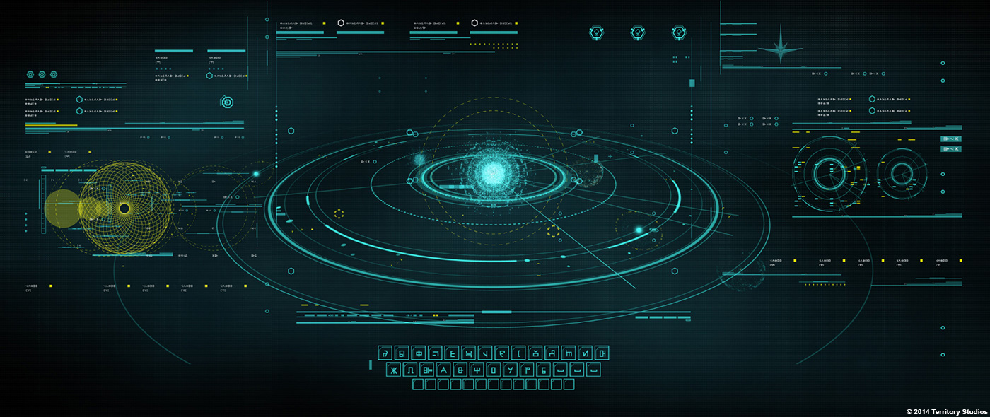
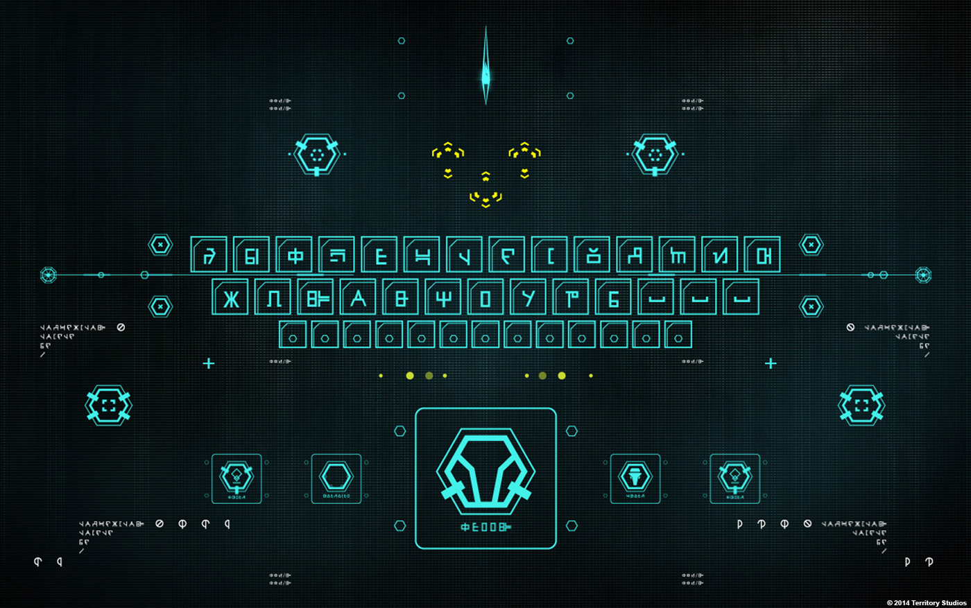
Yes, James could be very specific. For example, with the evil Ronan’s ship the Dark Aster, we knew he wanted a heavy brutalist look, with minimal concrete-like architecture to convey tone and function.
He had certain colour palates in mind across the various locations, but he was also open to our suggestions and gave us a good amount of freedom with Alan to innovate and explore.
Can you explain the various concepts you created before finding the final result?
It was an iterative process based on style guides per planet or per ship and our trips to the VFX and costume departments. Also, Alan did a lot of digging into old Marvel comics to find references to alien language that could influence our font designs. Fortunately a lot of the guys at Territory are really into comic culture, so between us we had a wealth of in-built references to draw on.
Once we had a sense of the alien personality and culture, we began to build font and graphic styles from all these references.
Can you tell us more about the various fonts creation?
Again, we referenced the research done by Alan from old Marvel comics and the style guides and concept art from the art and costume departments.
Lee Fasciani, my co-founder here at Territory’s and a specialist in crafting fonts and icons, created each typographic and icon style to reflect the character and personality of a particular culture or location, drawing on colours and shapes to provide a visual language to convey that.
Can you explain in detail about the on-set screen graphics process?
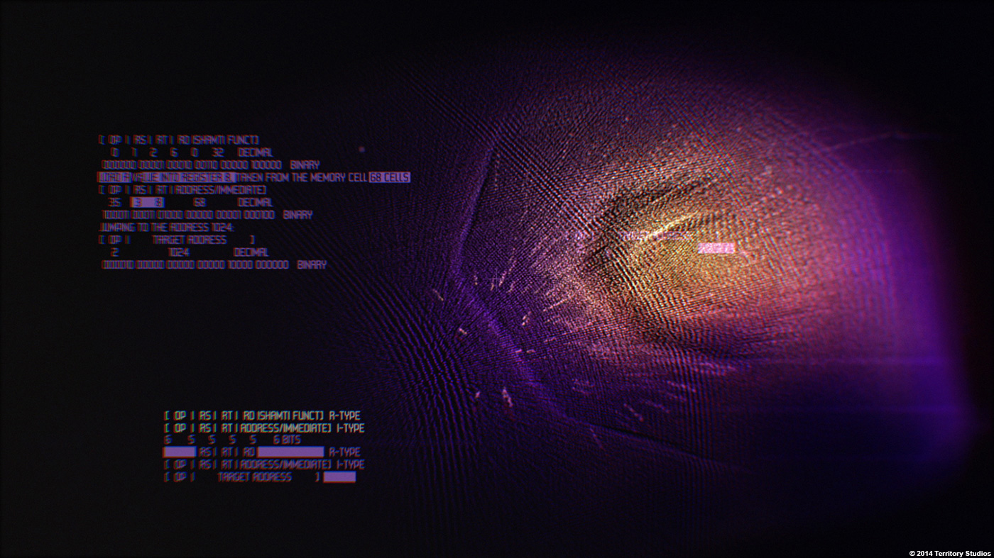
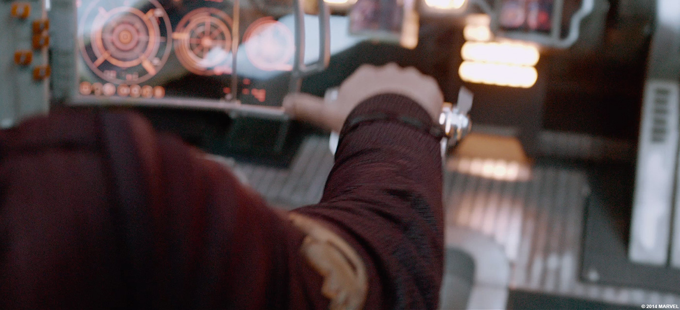
Screen graphics are used on set to lend the environment authenticity and give actors something to work with. To simulate interactions, we set up looping screens which can be challenging but the visuals makes life easier for the actors and directors. And it’s fun to see them try to push buttons on the screens when they came on set – that always feels like an affirmation that our graphics are credible enough.
In some cases we reverse engineer a number of interactions with the on set computer consoles, mapping to gestures in post. One of our key partners in the on set playback process is Compuhire. We’ve worked with them since PROMETHEUS, and they are the wizards behind programming on set playbacks and getting our graphics in front of actors and directors.
What were the challenges with the on-set screen graphics?
There are a number of challenges on any set. The biggest one is the immediate changes that can and are made by the director at times, and which means that my team has to be very responsive, flexible and quick on the uptake, with ‘live’ iterations.
There is definitely a beauty in this dynamic and it’s great to be part of that creative process and collaborate with the director, production designer, art department and DoP. It also means that we can sometimes make suggestions about alternative interactions that the director likes and uses on set.
The movie takes place in many environments. How does this affect your work?
It was a key challenge for us to stay fresh and inventive across the many environments and cultures with all that means for graphics, for example typography, iconography and interactions.
We had bi-weekly meetings with the art team in which they would show us their concepts and visuals for scenes and environments that were further down the line than where we were – this really helped us understand the look and feel of the many locations be they planets, prisons, spaceships, street scenes, gambling dens, etc, which we would reference and support.
For example, Ravager is a pirate race, a team of mercenaries that Peter Quill was a part of. Our UI for this needed to be a similar style to Milano but with a leaning towards more alien than the warm reds and oranges of 80’s retro. We went colder in colour palette and the UI was less layered than in the Milano.
Another very different example of an environment is the Comms Hub, a sci-fi phone booth that Drax uses to call up The Dark Aster to the Guardians location. We created a series of screens to suggest a seedy communications area, used by the mining community on Knowhere.
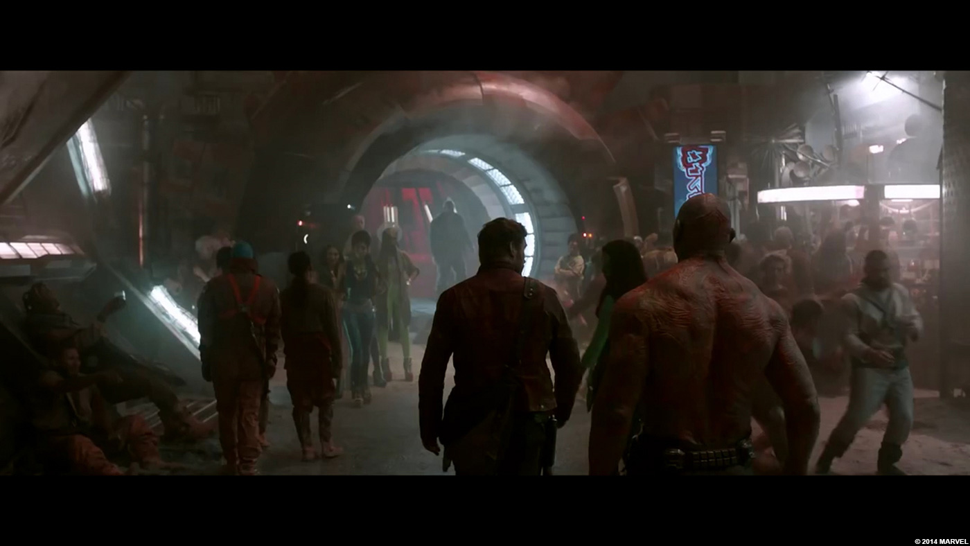
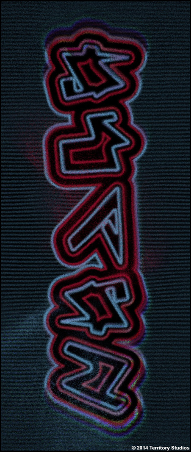
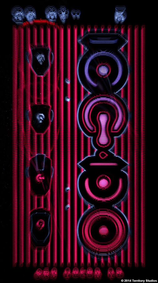
And the street scenes on Exitar, the main city on Knowhere, required a huge amount of neon-style signage that evoked the rough and ready multicultural space port that it was.
Alan Payne, Art Director // Yes, and everything we created for Knowhere is my favourite set piece. We wanted Knowhere to feel as though it really was in Deep Deep Space, so we had a Glitchy Interference style to those Graphics. This meant we could really think outside the box. We started looking into 1960’s and 70’s experimental computer graphics which gave it all a retro feel, and created a look very particular to Knowhere. Again we had a lot of projections on this set which made it into the Final Cut.
While we wanted to stay at the forefront of creativity and design, we did have to keep within some parameters set by the Marvel Universe, and looking at previous films in the franchise helped us to stay within the bounds of the Marvel language. Fortunately, the outer space aspect, combined with a 1980’s retro aesthetic, in the film enabled a great deal of creative freedom that delivered, we hope, a uniquely Guardian’s look and feel.
Can you explain in detail about the graphics creation and animation?
My priority is to make the graphic performance and interactions with it believable, authentic, interesting, and with richness and depth. Sometimes it can be quite expressive; the audience or actor sees graphic buttons on a screen that look good and feel right for the context. In film, that’s more important – it’s all about supporting the narrative and the actor’s performance.
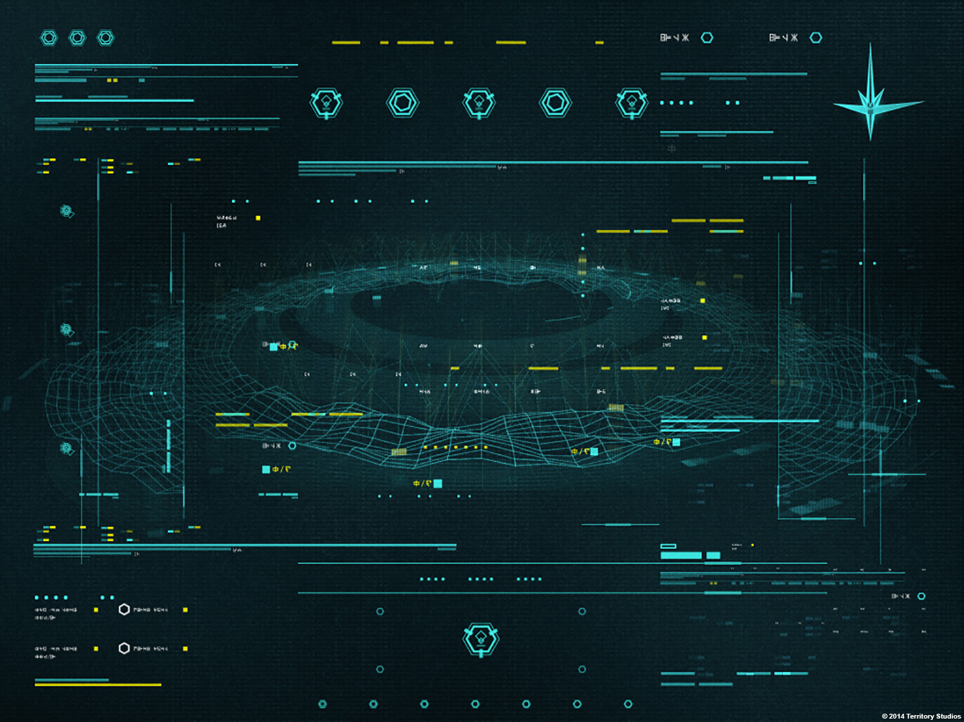
Our work on GUARDIANS was incredibly varied and we had to create distinct visual languages that were true to the context of each environment. We created graphics for very human environments, such as navigation, weapons and utility monitors, entertainment interfaces for the hero Peter Quill’s spaceship the Milano and street scenes, even a gambling hall, and for prison scenes that required a degraded military look.
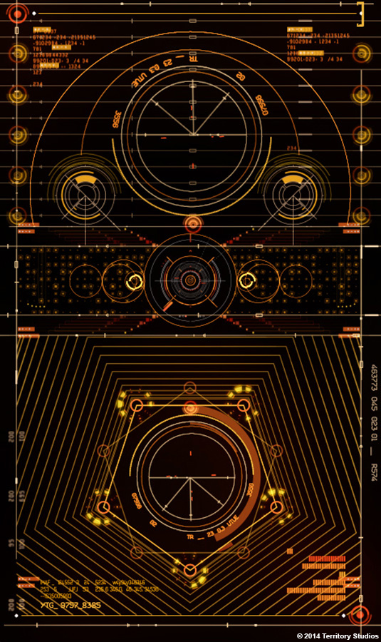
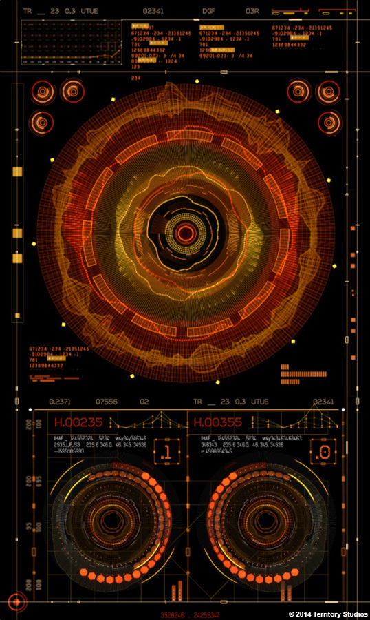
In addition to referencing the art and costume departments’ work, we also did our own research. Our art director Marti Romances looked at nature patterns to design some of his screens, specifically how the golden ratio affects some cellular systems and sea creatures. At the same time, she looked at cars `and cockpits from the 1980’s, when they were trying to look futuristic using vivid colours and intricate line-work.

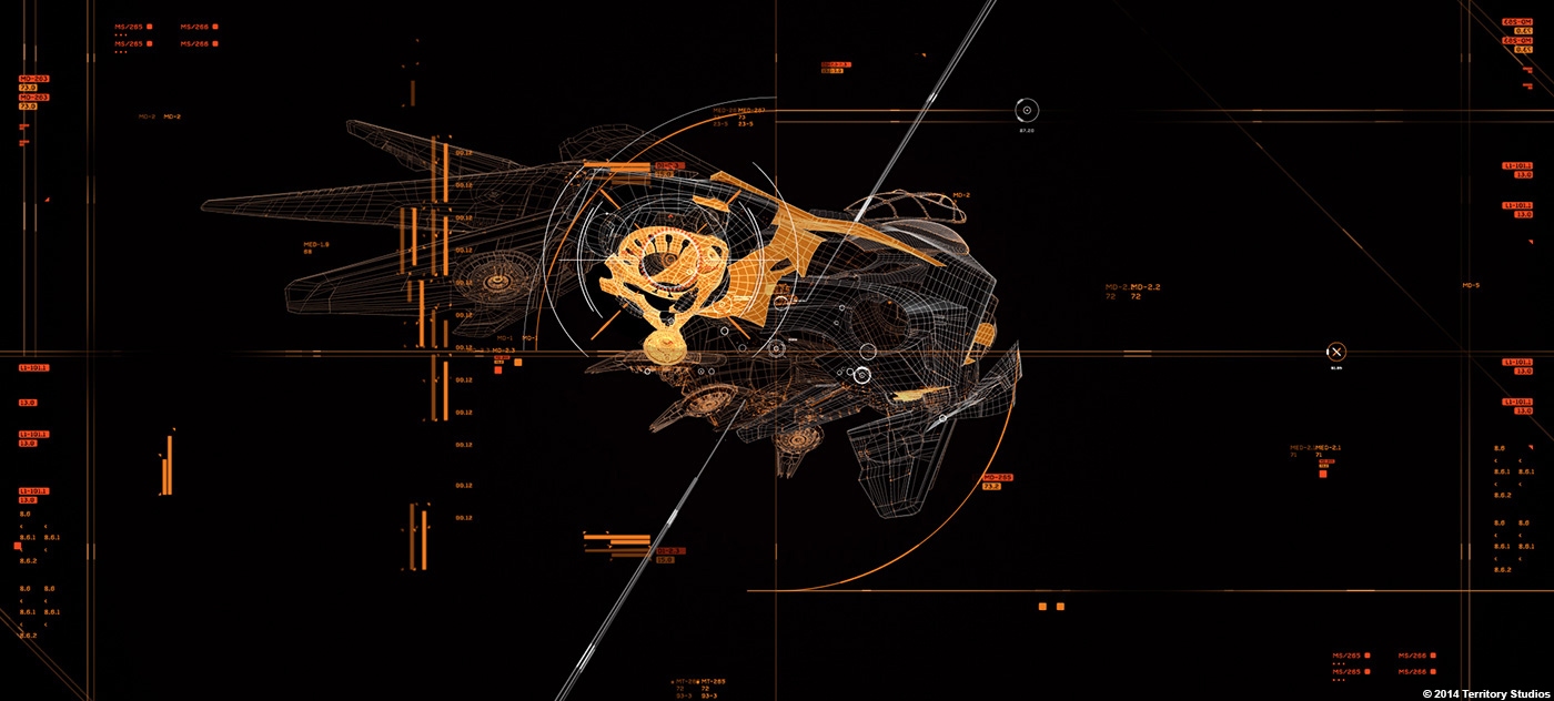
In the design concepts for Peter Quill’s ship the Milano, we also explored layering textures to evoke something that has aged. The ship is old and tatty, but still beautiful with many clever modifications. Our UI needed to reflect both this engineering sophistication and Quill’s can-do attitude to hacking the system to get the extra performance he wants – he’s more interested in effective modifications than in perfect code, so our screen graphics for the ship’s navigation, weapons and entertainment are a bit rough and ready to reflect this.
Our reference points were old airplanes, engineered metal and the lovely warmth of worn leather seats. We gave the graphics a hard overlay, like the projections on glass in jets, but keeping true to the idea of a varied history – the glass was worn and scratched, with a bit of misty fuzziness to it.
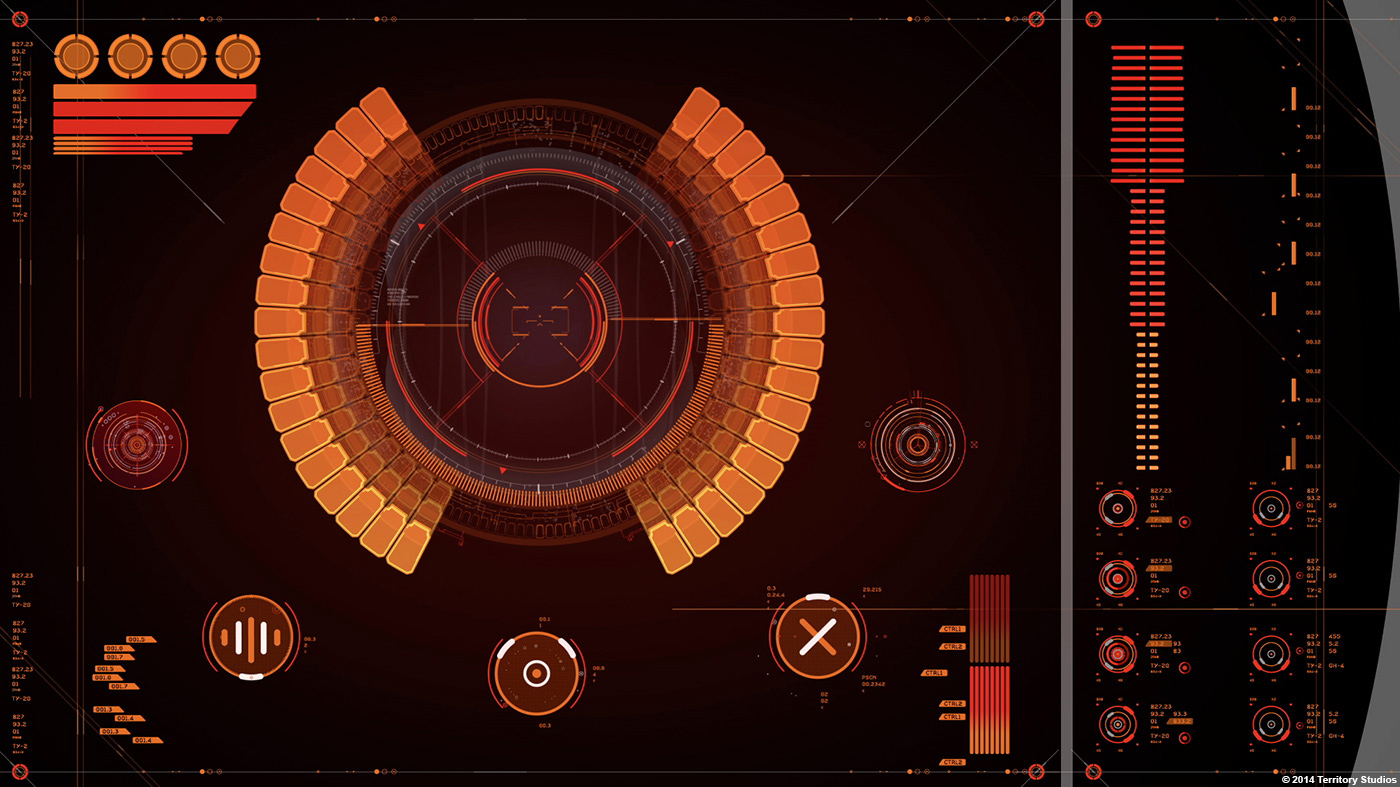
We were also able to have a lot of fun with details, such as the music interface that Quill hacked to simulate a 1980’s tape deck.
How did you collaborate with the VFX studios to share elements?
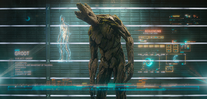
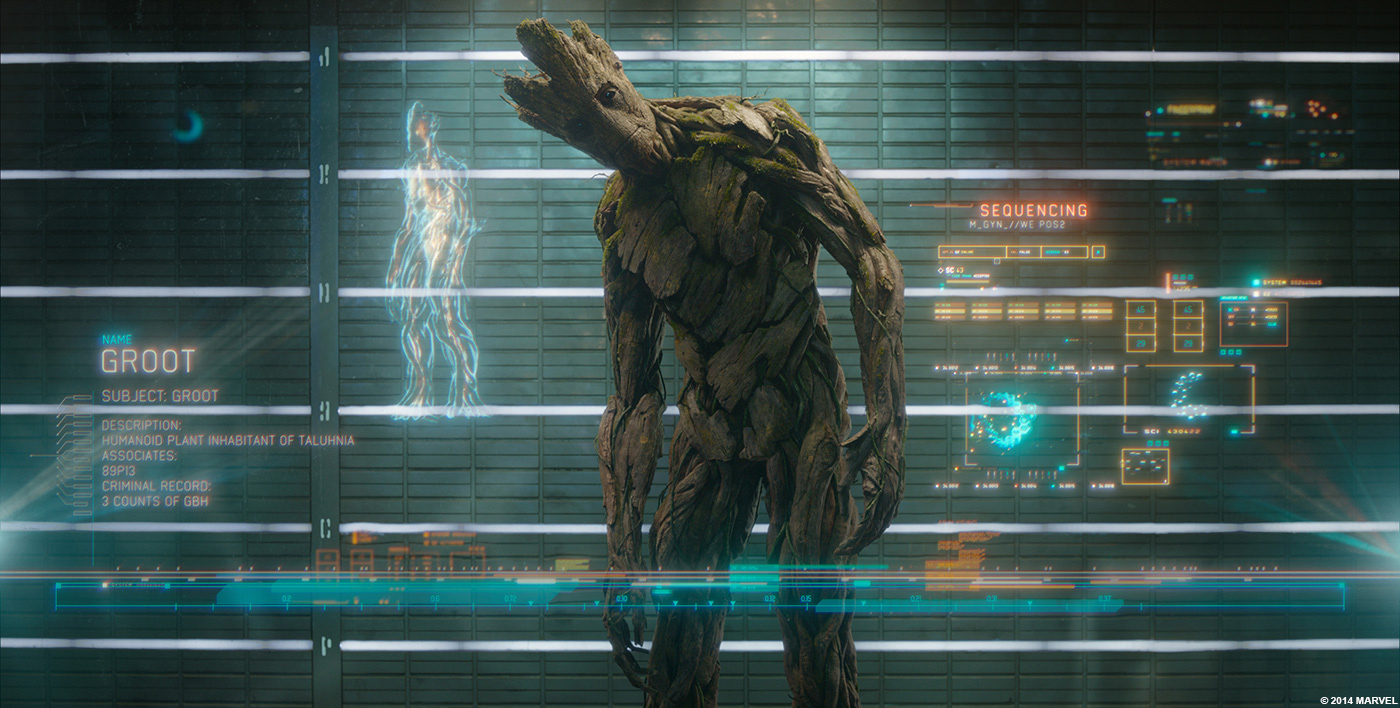
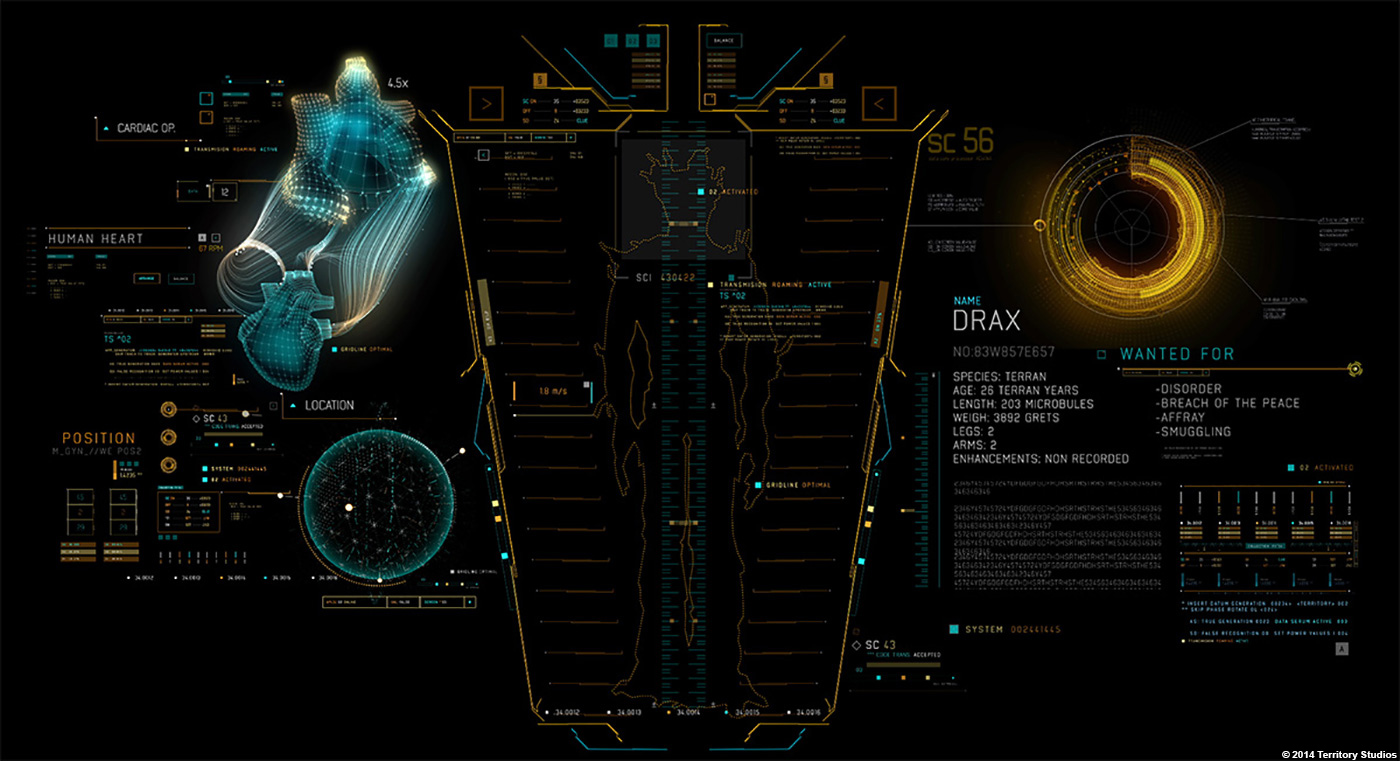
The Milano, Dark Aster and various other scenes in the film, needed us to create UI concepts and at times deliver VFX shots. One of the main ones was for the Prison Scanning System we see in the trailer and the team was very happy and proud to see it made the final cut.
The VFX supervisor Stephane Ceretti and VFX Producer Susan Pickett played a key role here – because they oversee all the vfx vendors, they are able to ensure the consistency of our concepts, from screen to post.
We shared some of the Illustrator libraries, such as Marti, our art director’s, widget designs, and some of the other teams used them for some VFX shots to help maintain consistency and ensure a seamless feel between the different animations.
Can you tell us more about Ronan spaceship navigation system?
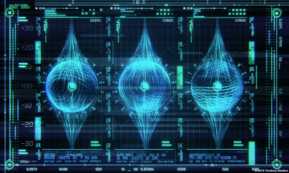
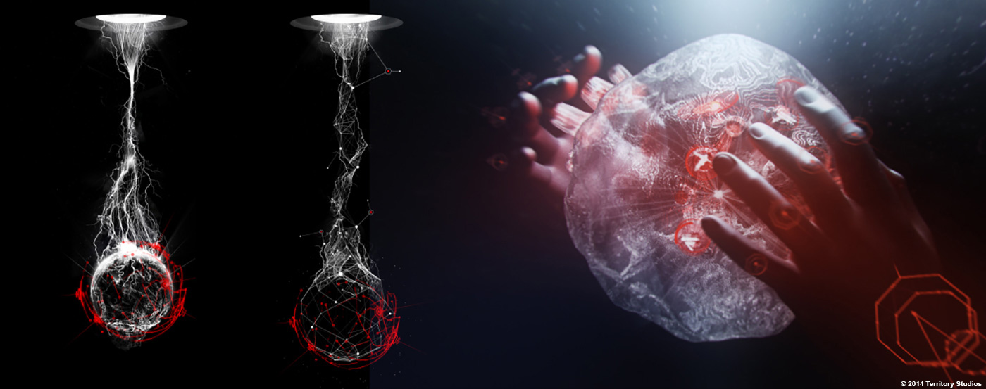
Yes, this gave me some sleepless nights! Dark Aster, Ronan’s ship was monolithic in look and dark in tone. Our direction for the UI was something that felt uncomfortable and organic. We envisaged a holographic control interface, almost a life form as a user interface, being controlled and manipulated against its will. This was a concept I’d wanted to explore for some time, and we looked at jellyfish forms and translucency, and explored buttons and controls almost protruding through the skin. Controls changed and adapted as the user interacted, but the interface almost looked as though it was under stress as it was being manipulated. It was an incredible design challenge we had set ourselves and credit goes to MPC for final execution of our vision.
What was the most difficult shot or sequence and why?
The biggest challenge was the sheer number of different sets that each required a unique visual language. With so many alien languages, fonts and looks, it was quite challenging to stay fresh and new. Plus, we had to incorporate a 1980’s feel to our designs, which was fun but again a challenge to do well.
In terms of a challenging sequence, the 80’s tape deck is an interesting. Peter Quill, the hero, is passionate about the 1980’s as is seen in the film and to reinforce that we created an interface that was based on an authentic tape deck, that visually converts the media into a cassette tape as it is inserted and ejected, with tape that can be seen to roll as the music is playing.
To maintain this illusion, we created a series of animations – inserting the tape, playing the tape and ejecting it. On set, this meant that we set up each animation to run, controlling it by manually pressing a button when Peter Quill did – it sounds simple but a lot of planning went into it to make it seamless.

Alan Payne, Art Director // I think the biggest challenge was the creation of Tubular Screens for the Milano. These screens had a tubular lens fitted to them which gave the 3D graphics we produced a great depth, something we could not have achieved with a normal screen. We also set up a lot of projections which were a challenge in themselves.
How did you organize the work amongst your team?
As diplomatically as possible! Everyone wants to work on the hero shots, but the beauty of on-set delivery is you’re never quite sure where the directors lens will land. It’s somewhat of a gamble, so we can’t really afford to let our guard down. We never think of anything as ‘background’– it all has to hold up to close shots, as best as we can within timeframes.
As much as possible we include everyone in the moodboard stage, to get a full exploration of ideas. As we moved onto styleframes and designs it became obvious to me where people were better suited. Marti and Yugen had a natural leaning to the Milano, Ryan JH more the Dark Aster (I worry about Ryan!), Ryan R-P had a great take on the Collector designs. Designers like Nik Hill and David Penn would jump across everything, bringing their own uniqueness to each screen they took on. With all these styles mixing together I was hoping for a visual richness, and I’m really proud of what everyone achieved. We’re very open and flat hierarchy at Territory, all ideas and opinions are listened too and hopefully explored. It’s also important to me that if someone is pushing a design then they should see it through to animation as it gives each artist a sense of ownership. Having said that, Jay Dingle, Peter Eszenyi and Alasdair Wilson purely focused on animation and just brought another level of dynamism to the project, throwing in further options. The whole work divide was pretty organic thinking about it.
What did you keep from this experience?
I feel that this project has really proved Territory’s capability to consistently deliver large complex projects that keep true to our creative standards and craft-led approach. It’s not sexy but it comes down to effective process and controls of visual languages for each set and internal workflow and pipeline to directors and partner vendors. Oh, and Marvel are really cool.
How long have you worked on this film?
About a year.
How many shots have you done?
At least 4-500 on set screen graphics, and around 30 vfx.
The majority involved 3D design and animation, and 2D animation.
What was the size of your team?
We always scale up as needed and began with myself and 3 art directors, then grew to 4-5 animators and back down to the core team for vfx.
What is your next project?
We finished JUPITER ASCENDING, which is scheduled for release in 2015, and are working on another Marvel project.
A big thanks for your time.
GUARDIANS OF THE GALAXY: UI Reel by Territory Studio

// CREDITS
Marvel Credits
Director: James Gunn
Production Designer: Charles Wood
Set Decoration: Richard Roberts
Art Director: Alan Payne
VFX Supervisor: Stephane Ceretti
VFX Producer: Susan Pickett
Territory Credits
Creative Director: David Sheldon-Hicks
Motion Designers: Peter Eszenyi, Nick Hill, Ryan Rafferty-Phelan, Marti Romances, Martin Aggerholm, Yugen Blake, Jay Dingle, Gabor Ekes, Ryan Jefferson Hays, David Penn, Alasdair Willson
Font Designer: Lee Fasciani
Playback Credits
Compuhire
// WANT TO KNOW MORE?
– Territory Studio: Official website of Territory Studio.
© Vincent Frei – The Art of VFX – 2014