
After explaining his work on the main titles for SNOW WHITE AND THE HUNTSMAN, Henry Hobson worked on the titles for the video game THE LAST OF US and started his studio Bootmaker Films. He is also preparing his first feature film.
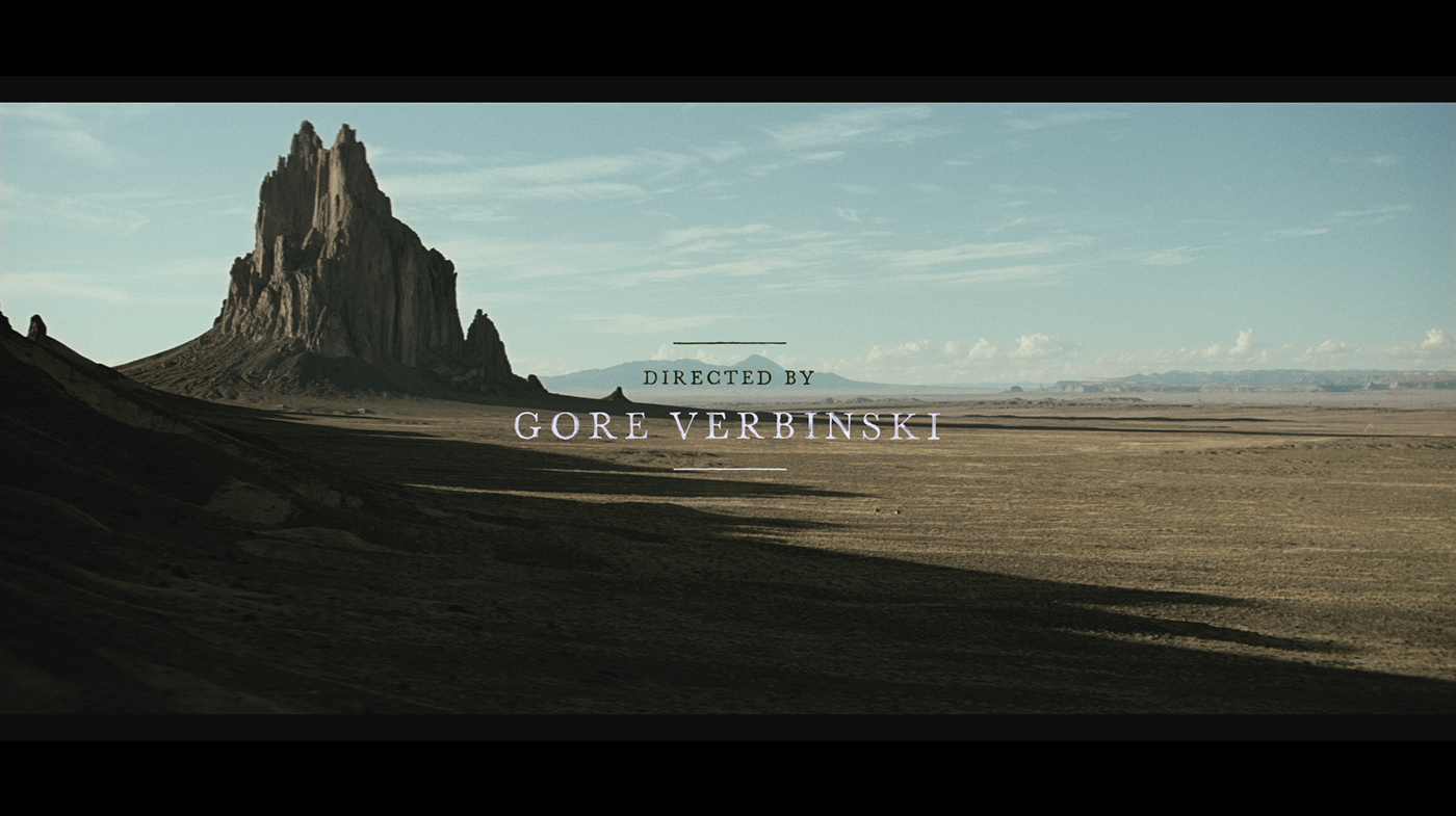
It’s your second collaboration with director Gore Verbinski after RANGO. How did you work with him?
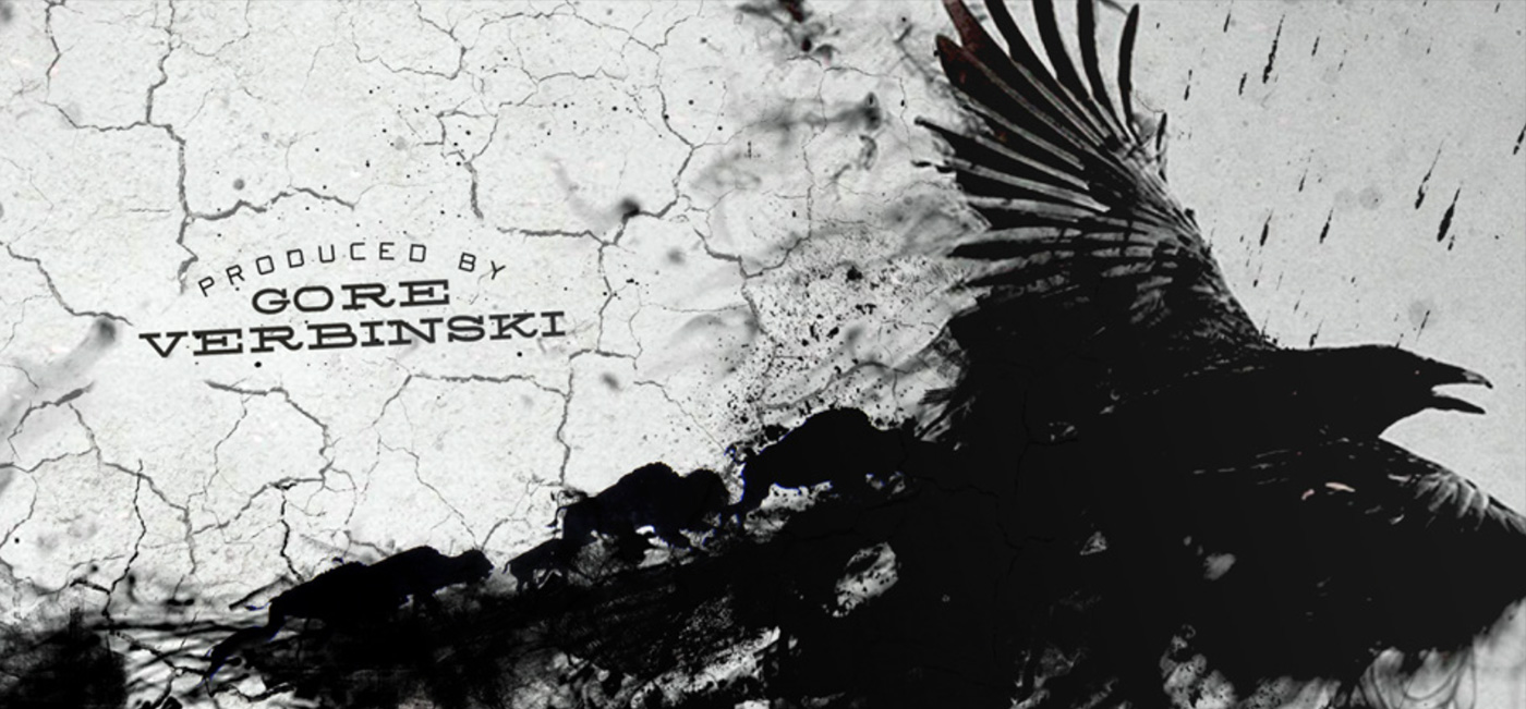
Yes it came out of the blue, I was very proud of the work I did on RANGO and how that turned out, so I was very happy when I got a call. He is a visionary director with a strong love of the western, so it was clear he was going to have a distinct vision.
What was his expectations about the titles?
He wanted something serious and more intense than RANGO, which is a very light hearted film. So when I saw the rushes and there is a scene (which didn’t make it into the final piece) where the lead villain eats the heart of the lone ranger’s brother it is an intensely powerful statement.
Did he gave you specific indications and references?
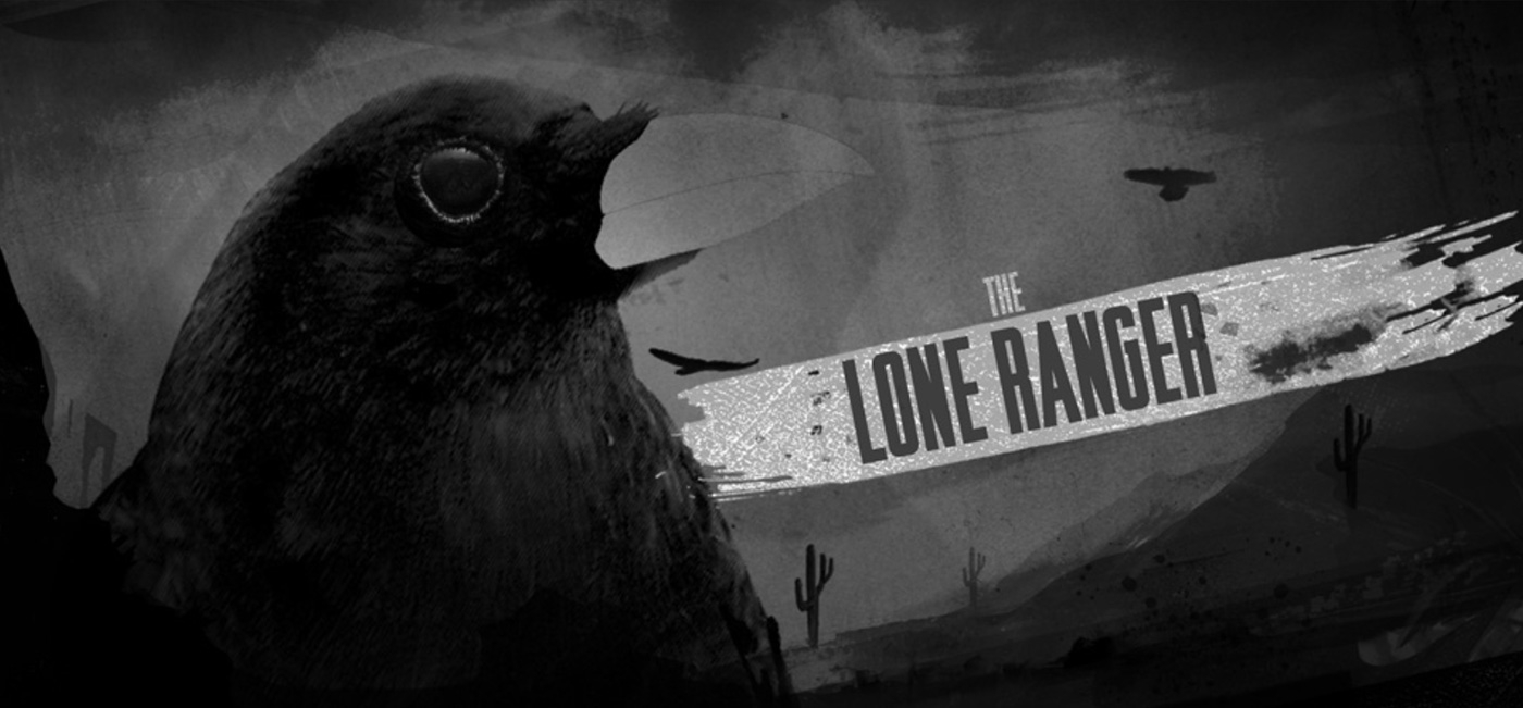
He showed the film to me and my team, and we could see what moods and themes would work, there is a sequence in the film with details, clocks, birds, scorpions etc that formed as a strong source of inspiration it felt like this was the mindset of the film. A dark hallucination. So I used that as the brief.
How did you approach the titles for this project?
Initially I approached with a full spectrum in mind, illustrations, typographic routes and 3d. I knew that Gore wanted a more ‘grown up’ approach in contrast to RANGO. But I wanted to have a cross section, designs from more playful (in keeping with the theme tune) and more intense (in keeping with the violence and hard edge of the film).
Can you tell us more about your first concepts?
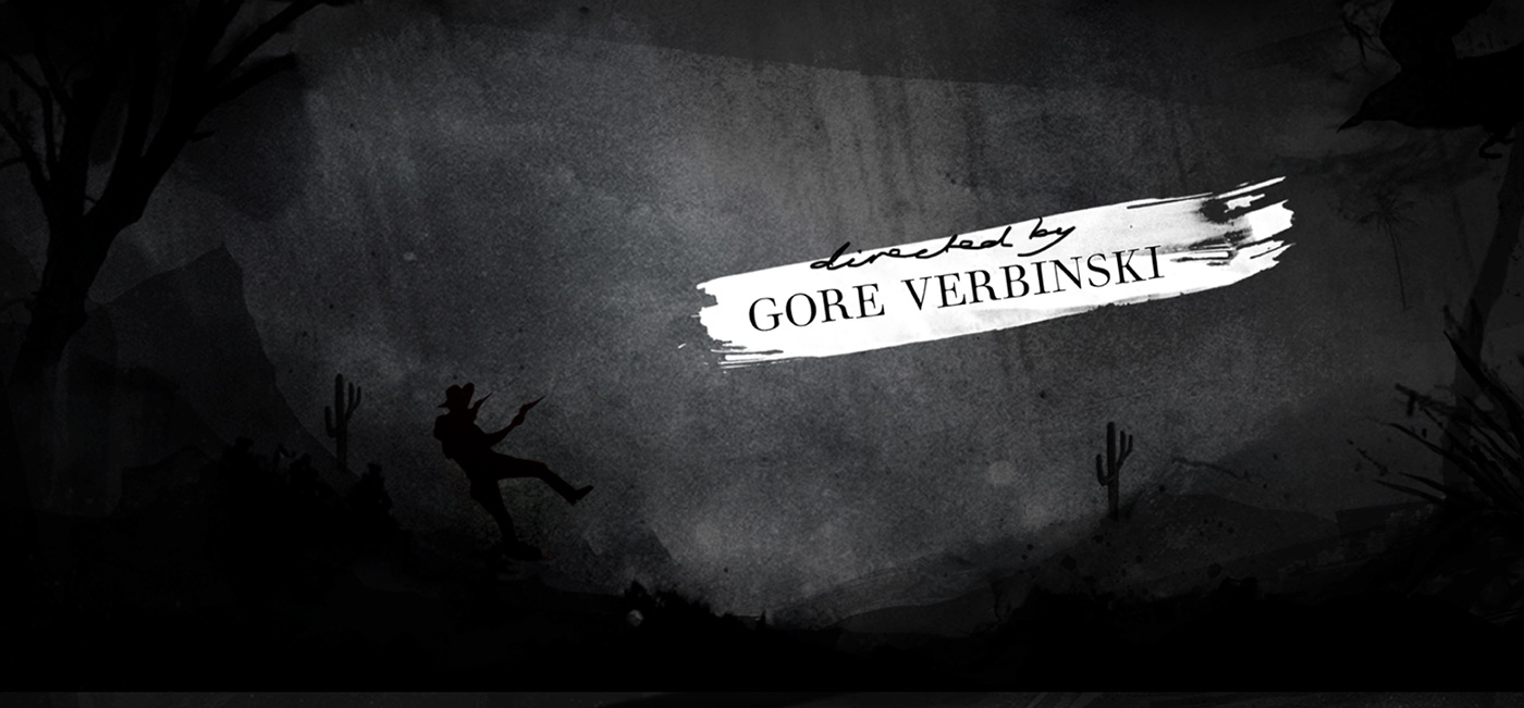
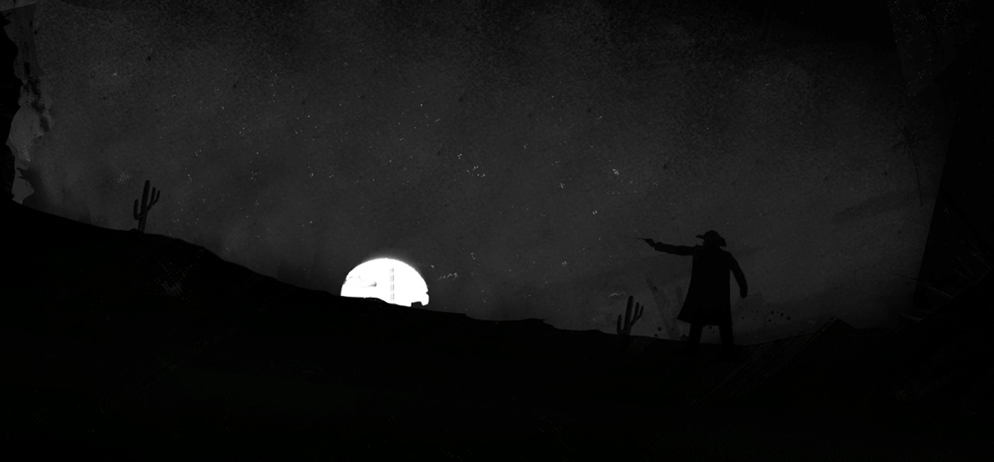
The first concepts were varied a lot of illustration and gritty textures, but each time I showed them he said they needed to be more adult, darker and mysterious. I sketched out some frames and he loved the molten silver look. I also looked at the spirit stories and history of the comanche people and looked to tell the stories of the film in a darker deeper way through the painted illustrated style. There are some really great ones about how the animals created the earth and wind, and light which play perfectly into the film.
How did you arrived to the final result?
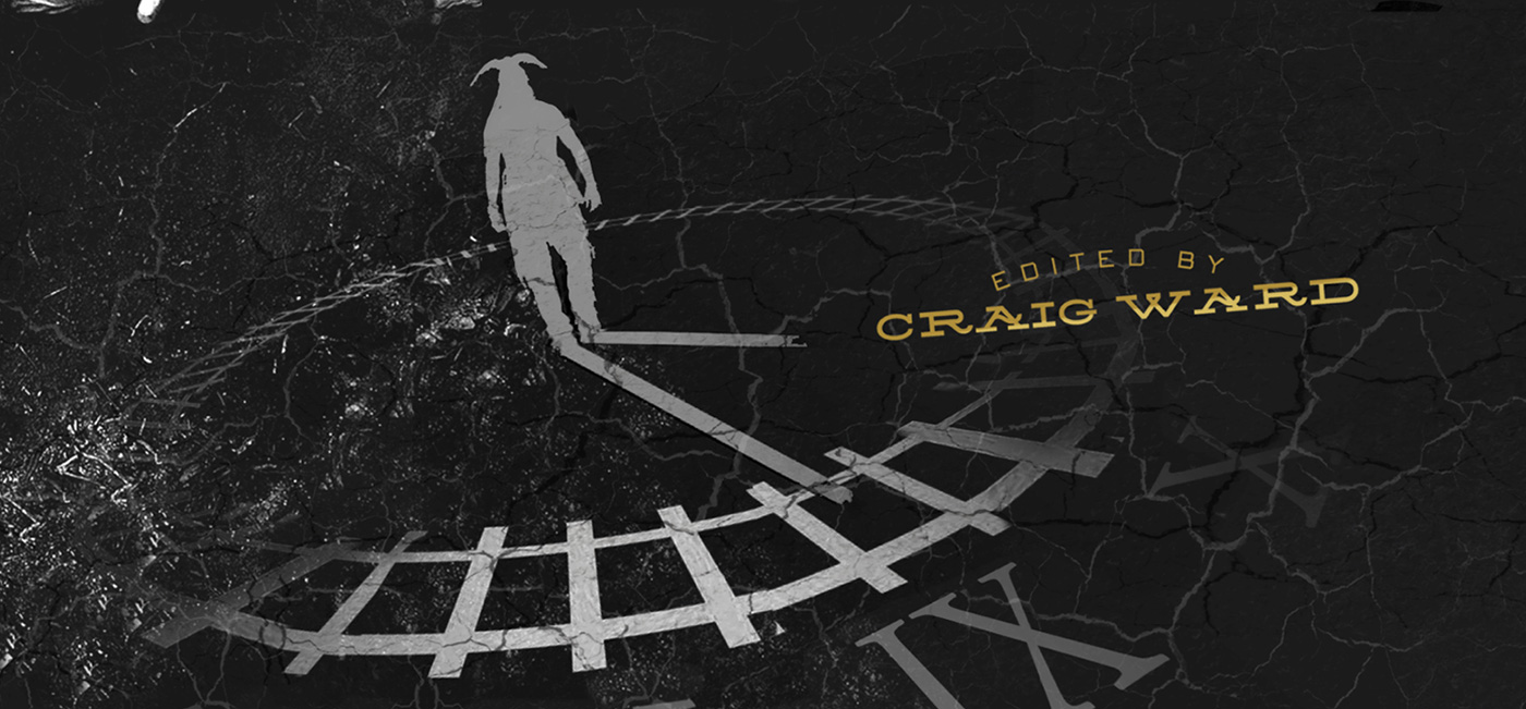
The molten silver bird was a favourite for a long while and we did tons of little motion tests and trials. But when you watch the whole sequence back you see there is a powerful end scene followed by a live action end crawl so it seemed very out of place to have a fully animated end sequence. So after a lot of discussion we eventually settled on a purely typographic route, but with a distinct animation style to it.
Can you explain step by step your work methodology?
The first stage is to layout the type and time out the sequence, we then hand painted each bit of typography, every single card is hand painted 4 times, then scanned and recomped, from 4 to 1 card, making a single piece of type, but also allowing the animation to have a bit more depth, the animator Alasdair Wilson and I have worked together for a long time, we did the SHERLOCK HOLMES titles together and a bunch of NFL commercials. It is very simple but a lot of love went into it. Each card is then animated into each other and then comped onto the scene. The tricky bit is when the type sits over picture and we have such strong contrasting end sequence, light skye and dark mountains, so I went with a black and white inverted type look which echos the lone rangers colours in a subtle way.
What is one of your typical day?
I wish I had a typical day, I am working in pre production on my first directing feature MAGGIE, starring Arnold, so that any I have just finished a few big commercials for video games which I’m wrapping up. Also a few new title sequences that I’m not allowed to talk about.
Can you tell us more about the choice for the fonts?
That all stems from one scene in the film where The Lone Ranger is reading a book on the train, “The treaties of man” by John Locke, I researched the book and the typography and then started to build that out with the typographer Manija Emran.


Can you explain to us about the fonts animation and apparition?
The font animation is key, I wanted to build a transition that would allow us to have a quick sequence without the movement feeling rushed. Alasdair Willson created a series of different techniques and this one.
What is your software pipeline on this show?
The pipeline on this was insane, I had London and LA, (as I was travelling between the two places) and had animators in both places, they would run in shifts.
Did you received the score before doing the animation and the edit?
The score I got just before the end, before that I just had the William Tell overture, but I knew (also from experience on SHERLOCK HOLMES) that Hans Zimmer sends his music over after he sees the animation. Its good to know that you play a part in influencing his mind.
What was the biggest challenge on this project and how did you achieve it?
The biggest challenge was the permanent challenge of working on film projects in After Effects, it’s a nightmare, the colour space of After Effects not being true to film is terrible. I’m sure they have fixed it in the recent one, but it was too risky to attempt halfway through making this.
What is your best memory on this show?
It was great being at Company 3 in London, while Gore and me were reviewing via satellite very exciting.
You have launched your own studio with Bootmaker Films. Can you explain more about it?
Yes I wanted to have a small studio that could be picky with projects, allowing a solid body of work, we are just about to launch our website and portfolio online. The name stems from the role of a character in an old David Lean film called HOBSON’S CHOICE. So far we have done some cool titles, stuff for the Oscars, video game trailers and short films. Its been a busy few months.
How long have you worked on this film?
In total 3 months.
What was the size of your team?
It’s very flexible at the moment there are 4 of us, myself, producer, and on and off animator and designer.
What is your next project?
I have just finished a series of commercials for a video game, and really the big one is MAGGIE.
The last time you talked about your first feature film, MAGGIE. What’s new about it?
Abigail Breslin is on board it starts shooting september 16th, its due to come out 2014 so watch this space. Not sure whose going to do the title sequence for that…
What was your feeling when Arnold Schawrzenegger arrived on MAGGIE?
Very excited, he is a true icon, and practically american royalty, I’m looking to show him in a completely new light, he will be very emotional in this role.
A big thanks for your time.
// WANT TO KNOW MORE?
– Henry Hobson: Official website of Henry Hobson.
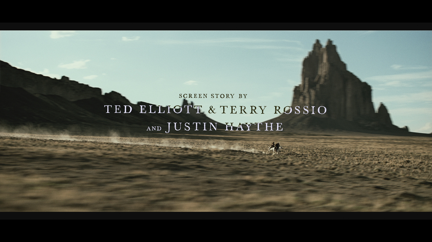
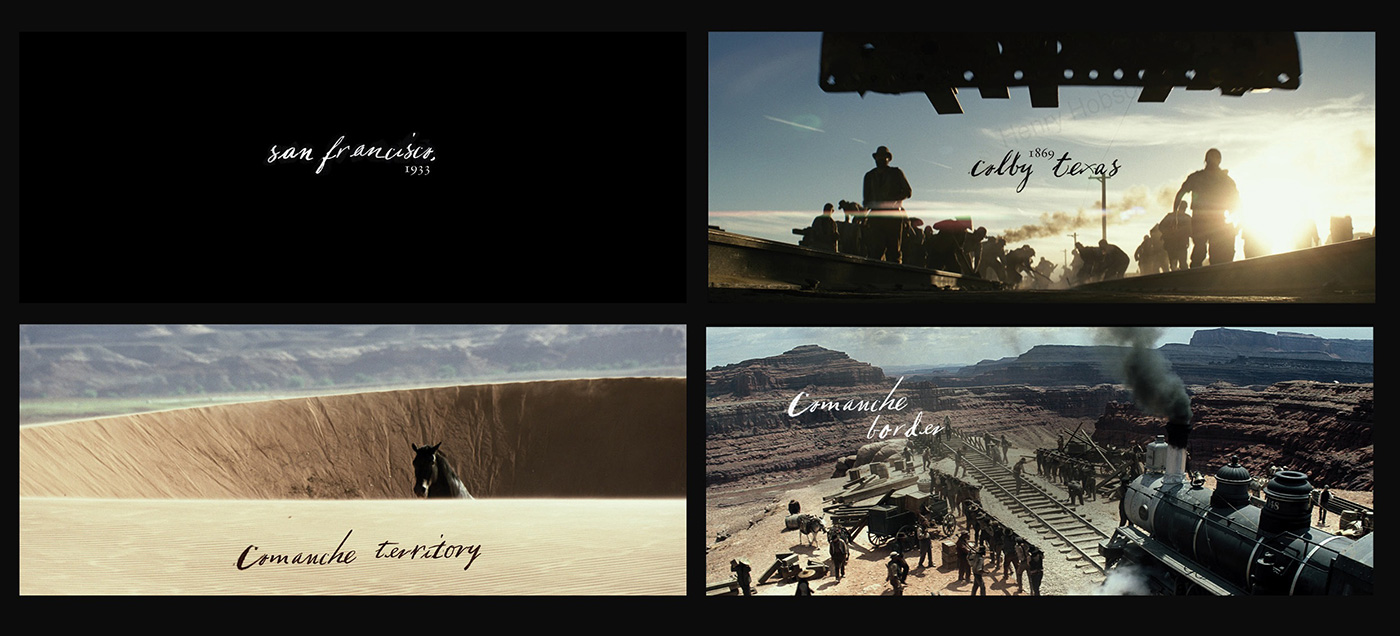
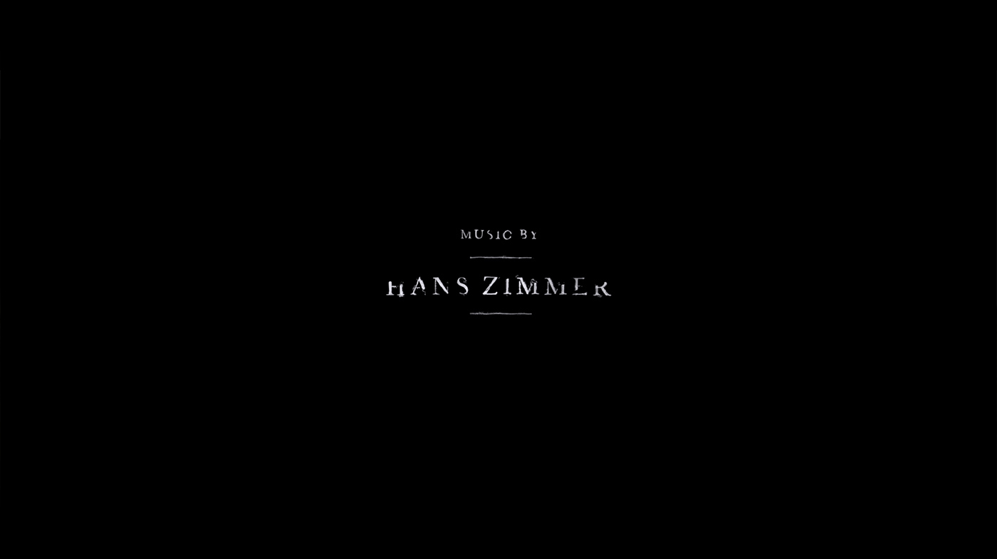
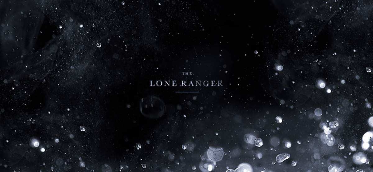
// THE LONE RANGER – END TITLES – HENRY HOBSON
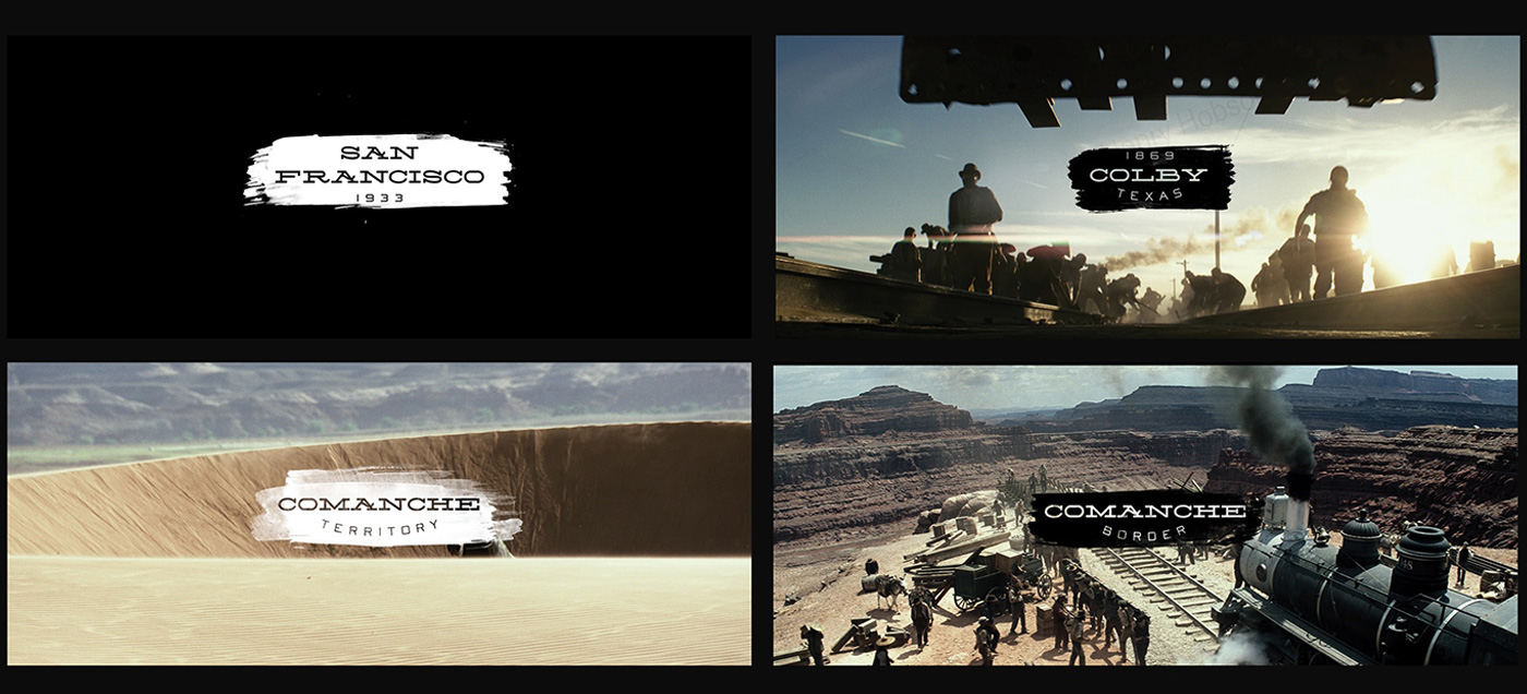
// THE LONE RANGER – CONCEPT TITLES – HENRY HOBSON

© Vincent Frei – The Art of VFX – 2013

 & Dave Cook (Head of 3D) – Jellyfish Pictures")

 & John Likens (Creative Director) – Method Studios")
