
Kaori Otagaki has more than 10 years of experience in visual effects. She has worked many times with director Takashi Miike such as ZEBRAMAN 2: ATTACK ON ZEBRA CITY, THE MOLE SONG: UNDERCOVER AGENT REIJI and THE LION STANDING IN THE WIND.
What is your background?
I graduated from the college in 1998 and began working for the CG production company. Then I worked freelance and in 2003 I started working for OLM Digital Inc. I’ve been working on Takashi Miike’s works since 2000. The first work with him was TV drama TAJU-JINKAKU TANTEI SAIKO (MULTIPLE PERSONALITY DETECTIVE PSYCHO).
How did you and OLM Digital get involved on this show?
We’ve been working on Takashi Miike’s films and dramas thus we worked on VFX of his film this time, too.
Can you tell us more about OLM Digital?
The number of staff is approximately 200. We work on 3D CG of 2D animation, 3D animation and VFX with using mainly MAYA, Nuke and Flame. You can see our works from here.
How was the new collaboration with director Takashi Miike?
Most his works include VFX and he has deep understanding on it. He has clear vision and his explanation is always straightforward. That enables us to work efficiently. For example, we don’t have to create extra animation and we don’t need to do matte for the extra frame for the purpose of deciding the points required for editing. This is because he makes decisions while shooting. Moreover, he listens to us and, he is flexible coping with our new ideas.
What was his approach and expectations about the visual effects?
The comic on which this film was based is widely known in Japan, so we didn’t get detailed, specific indications from him, but I think we shared the same understanding that the world-portrayal of the film should be inspired by the original comic. He normally creates the storyboard with the storyboard creator before starting shooting and it includes the important points and necessary elements of each scene. With this in hand and with a little more discussion with him, we were able to communicate with each other. I’ve also been working with him for a long time so I think I can understand his expectations on VFX.

How did you work with the art department for the design of the Stands?
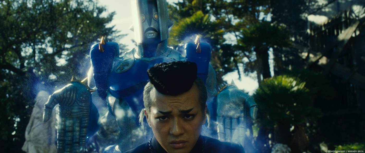
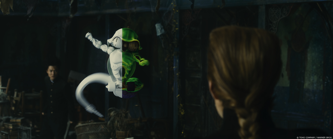
In terms of the Stands, we didn’t work much with the art department but developed the Stands based on the designs from the original comic. After modeling and making the Stands more real, we had to arrange some parts which couldn’t be exactly the same as the design of the comic in the live-action movie. For instance, the Stand named Crazy Diamond can be seen as naked in the comic. But we thoughted some angles and poses of Crazy Diamond wouldn’t look as good if he looks naked. While we discussed this issue, one of modelers came up with an idea of creating Crazy Diamond in a bodysuit and it was adopted. Moreover, in the comic, the detail of diamond is not drawn. After studying numerous images of diamond in the original manga, we discussed how smoky and broken it could be.
The original author and manga artist of JOJO, Mr. Araki also gave us his advice for each character.
Can you explain in detail about the Stands’ creation?
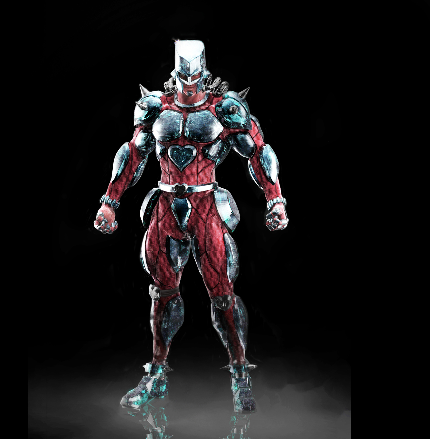
First of all, we determined the height of the Stands by comparing with the main characters such as Josuke and Jotaro. We tried to find the best balance between those characters and their Stands. Secondly, we did modelling focusing on unique points of each Stand through referencing the comics and books of painting by Mr. Araki and character figures. However, it wasn’t enough to complete the details and we still had problems (for example, naked Crazy Diamond) thus we created retouched full CG images of the Stands and we presented it to Mr. Miike and Mr. Araki. After it was approved by them, we further improved the details of the Stands and the quality of shader. (To make this clearer, I am sending you the image used in the first presentation to Mr. Miike and Mr. Araki.)
Can you tell us more about their rigging and animation?
Below is comment by Miki Kondo who did rigging: I can say that there are few shot of lower bodies of all the Stands apart from the Bad Company stand, so I made those lower bodies simple and I tried to focus on the upper part of their bodies. Crazy Diamond and Star Platinum were created in their bodysuits thus I was also careful about that point. Especially, to avoid a negative impact on shader, it was necessary to make Crazy Diamond’s parts of diamond deform as little as possible. However, that sometimes resulted in making him look less powerful/masculine so I controlled some parts when he moved dynamically.I wanted animators to focus on animation of the body and face of him so the diamond on his body was rendered optimum outputs automatically. In terms of animation, the body shapes of Crazy Diamond, Star Platinum and The Hand were similar to human beings, but we created animation of them with much faster speed which couldn’t be possible for human beings.

Which references and indications did you received for their animations?
The instructions mainly were on the storyboards. While shooting, we had the stuntmen acted out the action of each Stands which were similar to human beings. Using this as a reference, we put animation. Mr. Miike is passionate about action scenes, therefore he asked us to retake the animation frame by frame. When the animation staffs were struggling understanding what the director requested them to improve, I sent them the video of the action scene acted by himself. He is really good at acting out action scenes, and we always find it helpful to tell other staffs the key point accurately. Sometimes adding effects to completed animation was not the best way because it didn’t fit within the duration of the animation. So for those sequences, animation were edited after compositing all. I also asked animators not to include too much Stand with the unique pose called JOJOdachi (famous style of standing in the comic).
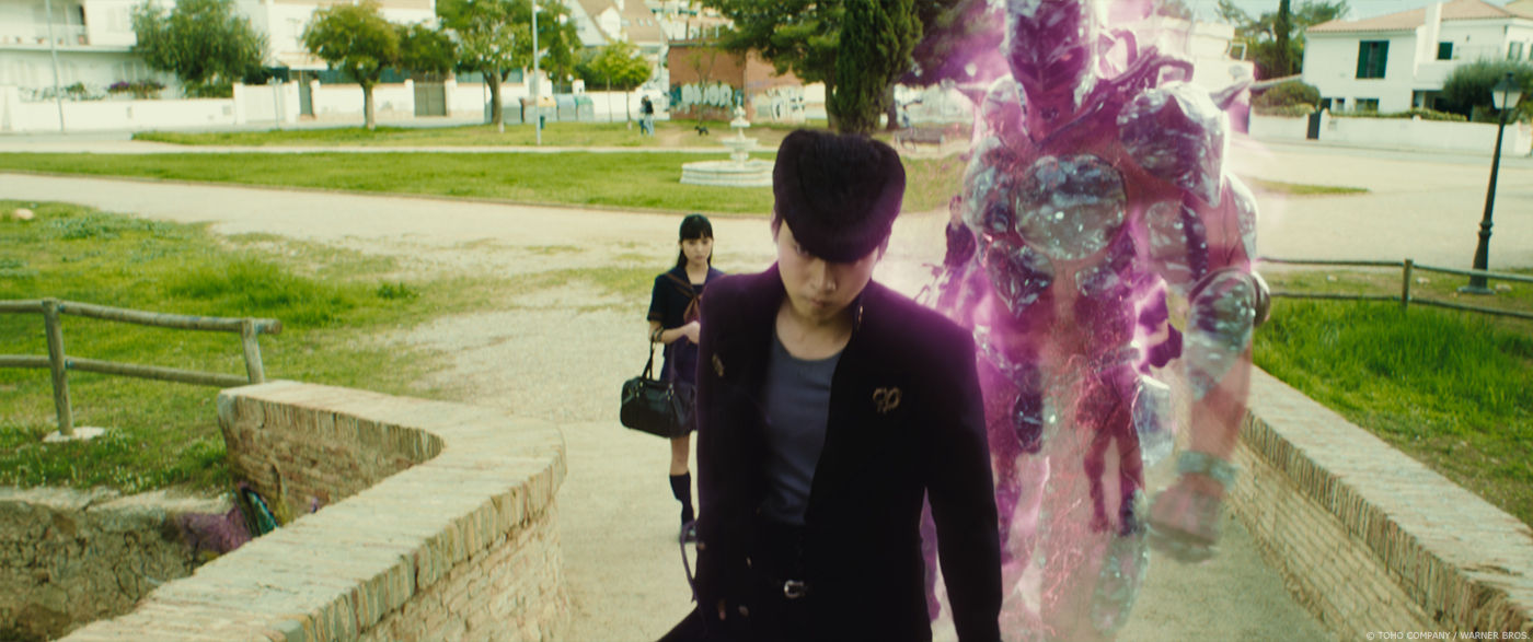
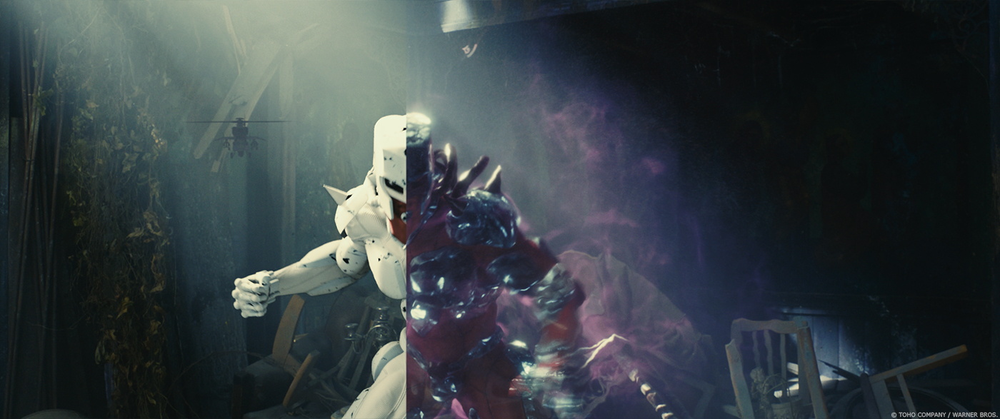
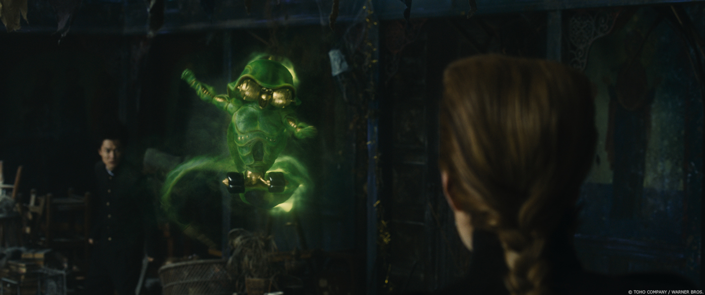
Some of the Stand are translucency. How did you manage this aspect with the lighting?
Firstly, we tried to accurately light the Stands, which were not translucent under each specific environment. Of course, references such as HDR and color chart were shot while shooting. Next, we made them translucent and we controlled the level of translucency depending on the light and color of each environment and the scene (audiences’ and characters’ emotion). I tried not to make flat translucency using shadows. If we didn’t do our best with lighting, I think we couldn’t have completed this level of quality of the Stands.
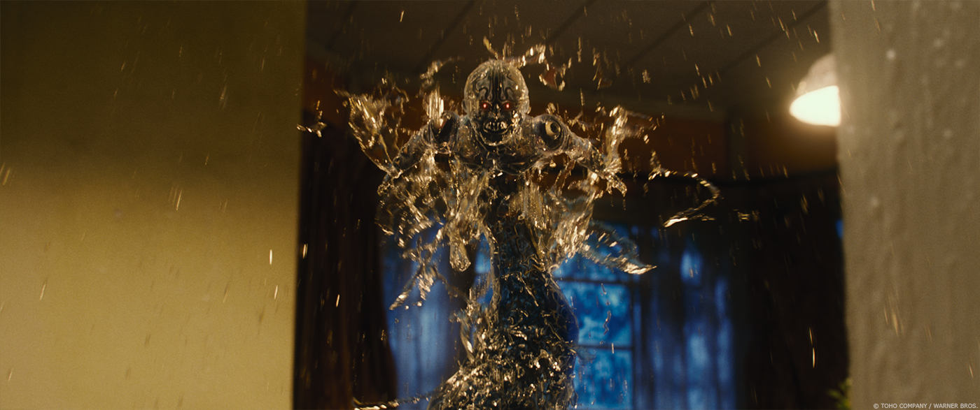
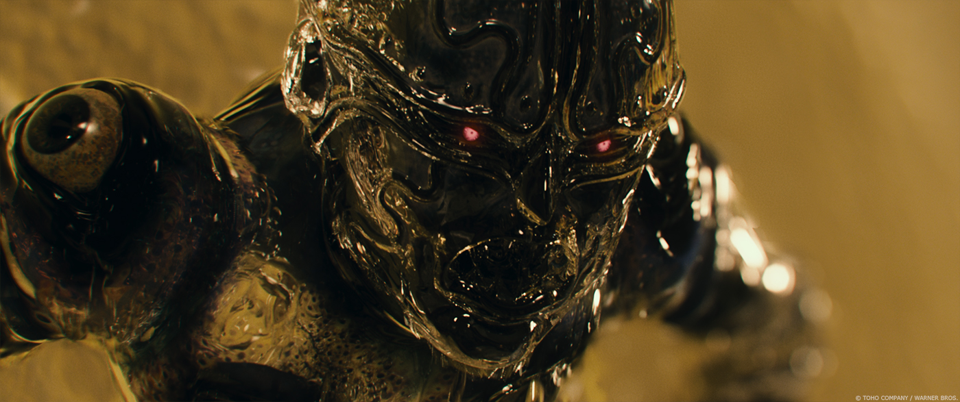
Aqua Necklace is composed of water. Can you explain in detail about the effects simulations?
Below is the comment by Yasuyuki Furukawa from Griot Groove Inc. (FX Lead) who worked on the sequence of Aqua Necklace: All the effects for water of Aqua Necklace were made using Houdini. First, we put animation by Maya, created the effect using Houdini and then sent the effect back to Maya. Receiving and sending between Maya and Houdini were done by alembic cache. The effects for Aqua Necklace such as dripping water on the surface of body and splashing and dropping water were necessary in most of his scenes and they were created using POP and VOP of Houdini. POP, VOP or Flip simulation were used to create his lower body (when it was connected to the water on the floor and looked like a tail), the aura from his body, air bubble inside body, and splashing water when he bumped the floor and the wall (SOP was used in the process of making his lower body).
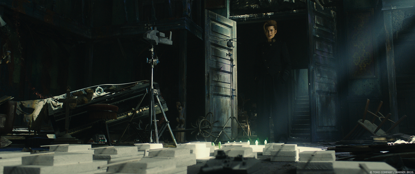
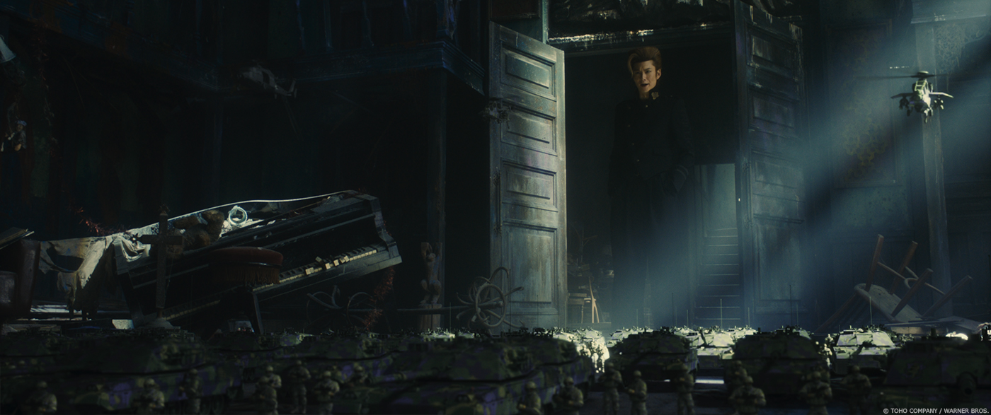
Let’s talk about the Bad Company stand. How did you create these small soldiers and their vehicles?
Director Miike asked us to create soldiers with the most advantaged equipment for Bad Company so we equipped them with state of the art weapons adapting some elements of the design of the Bad Company in the original comic. There are two types of Bad Company in the film – infantry and special forces. We studied many soldier gears from various armies. With the heavy gear, it would be difficult to make them move, so the Bad Company in the movie are soldiers with the simple gears. When we designed the pattern of camouflage of their outfit, we thought that normal color might not be unique enough for the world of JOJO, so we asked Mr. Araki to design the pattern just for this film. Other models, including tanks, and military helicopters were created not as miniatures but as real-size. We attempted to make them really natural even if they became real-size.

How does their really small sizes affect the animation work?
Its body height is about 8cm. If they run with the same speed as actual human beings, they would seem slow. The scene would also be perceived as lengthy by the audience. Therefore, we made soldiers run really fast. Just making their motion fast is not interesting thus we controlled the details of their action. We were careful to be extra careful, because if undervalue this process just because they are small and there are a lot of them, because we didn’t care about the details of animation it could result as disappointment by the audience. To avoid that, we endeavored to put animation on each soldier carefully. The animation staffs learned the detailed motion of soldiers from the film BLACK HAWK DOWN.
Can you tell us more about the effects work for the Bad Company?
We didn’t add any FX such as aura to the Bad Company but we added particles of dust in order to make the motion of them dynamic and real. To the helicopters, we added dust when they took off. Moreover, while shooting, we shot the movement of the actual wind (for instance, materials waving via the wind and the dust thrown up by a wind) assuming that the helicopters were hovering. As a result, that enabled the Bad Company to look much real, I think. Thanks to those processes, we were able to give the Bad Company strong presence in this film.
Which Stand was the most complicated to created and why?
All the staff may not agree with me but in my opinion, Star Platinum. It looks like a human being more than any other Stands so I considered that audience would be sensitive with even a small difference between them and those character. Moreover, Star Platinum appears in the beginning of this movie and he is standing next to Jotaro confidently therefore we challenged many times to create final look of him until deadline not to give the audience disappointment.
How did you enhanced Morio-cho to have this mix of an European and Japanese city?
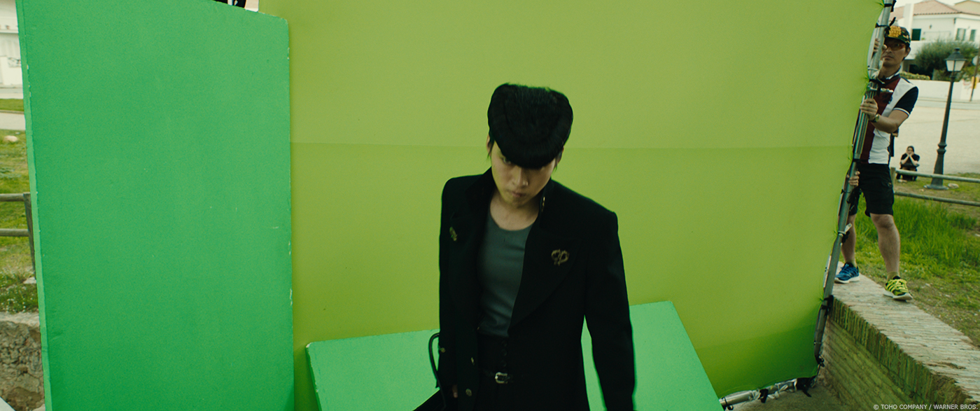
The world portrayal of the comic is really unique and different from the actual cities in Japan. That’s why we did the shooting in Sitges, Spain. This was the idea from the director, Miike. He chose Sitges out of port cities all over the world. I think Sitges was the most similar to the world of the comic, JOJO.
What was the main challenge on this show and how did you achieve it??
We had two challenges. One of them is the decision of using Arnold as renderer before starting shooting. The most important point of VFX of this film was to create Crazy Diamond as a cool and dynamic character so to make it easy to control the expression of the parts of diamond, we started with developing shader first. The staff of Arnold from Autodesk, Mr. Ogaki cooperated with us and helped us a lot. We spent a really long time to complete the texture of the diamond.
The other challenge was creating the Stands that would satisfy Mr. Araki and that was the biggest pressure for me. Many members of our team were fans of his comic. Therefore, I think every staff worked on this movie with the same passion. I had some chances to talk with Mr. Araki and he gave me advice. That resulted in the high quality of VFX. I was really honored that he praised us and our work after watching the film, screened for staffs.
What is your favorite shot or sequence and why?
Animation of one of the Stands called “Echoes”. We attempted to create it as a funny character and I think we succeeded in making quite a cute animation.
What is your best memory on this show?
My best memory on this movie is the discussion we had on VFX in the film with the manga artist of JOJO, Mr. Araki. It is usually a rare chance to get direct advice and opinion about VFX from manga artists so this time was new experience for me.
How long have you worked on this show?
From modelling the Stands to the end, it took 12 months approximately. We started working on VFX 6 months after shooting.
What is your VFX shots count?
For this film, 382 shots in total.
What was the size of your team?
The number of staffs of the team of OLM Digital. Inc is 43 and we had other 16 subcontracting companies. In total, 142 people worked on VFX of this film.
What is your next project?
I’m working on LAPLACE’S WITCH directed by Takashi Miike. This film has many FX thus using Houdini is essential. Thanks to the film JOJO’S BIZARRE ADVENTURE: DIAMOND IS UNBREAKABLE, the skill of Houdini of my company improved a lot but VFX of this film LAPLACE’S WITCH mainly features natural phenomenon so it would be a new challenge to me.
What are the four movies that gave you the passion of cinema?
It is difficult to choose only 4 movies… ICHI THE KILLER, RESERVOIR DOGS, PULP FICTION and YOUNG GUNS. They are not related to VFX though.
A big thanks for your time.
// WANT TO KNOW MORE?
OLM Digital: Official website of OLM Digital.
© Vincent Frei – The Art of VFX – 2017


movie behind the scene is awsome man you nailed it
The effect of this movie is fantastic.
Man i wish i can see more stand designs than just Crezy D