Mert Kizilay is a designer and director based in Los Angeles. He graduated from Fine Arts Animation School in Eski?ehir/Turkey. He has recently joined the teams of yU+co as designer.
What is your background?
Born in a very small town called Malkara in Turkey. I used to live in Istanbul before I came to Los Angeles, joined to yU+co. I always tried to experiment different things; I like sketching, figure drawing, I studied traditional cell animation, made a stop-motion short animated film, I’m really into sound design and music making, and of course graphic design. Keeping these medium as a tool and focusing on essence, concept and idea is important for me. I never feel restricted. It’s been around 2 years since I came here and it’s great to be here and work with Garson Yu and all these talented inspiring people in the studio.
How did yU+co get involved on this show?
There was actually another studio which was taking care of POV graphics. But then we’ve been invited, started to sketch ideas. Apparently director wanted to go with a whole different direction, especially story telling wise. Then we took over the project. So we already had a huge time/deadline handicap.
How was your collaboration with director José Padilha?
We worked very closely with José, we set up a small annex office to work in right down the hall from editorial here in Los Angeles, making it easy for José to give instant feedback. We were sketching ideas, then sharing those with José and brainstorming solutions together often. He was very open and fun to work with throughout the whole process.
What was his expectations about the HUD/GUI?
His biggest expectations about the HUD/GUI was having something that was logical, believable, and most importantly communicating the story to the viewers. He didn’t want the graphics to seem busy or crazy futuristic. He wanted everything on screen to have purpose, something that was possible to see in the near future, which we really liked.


How did you work with Production VFX Supervisor James E. Price?
James E. Price was really nice to work with, he always provided us with clear direction. He was very supportive of our work technically, visually, and from a storytelling standpoint as well.
What was your role on this project?
I was the Lead Designer and was responsible for the look, style, behaviour, motion, story and consistency of the graphics, working under the supervision of our Creative Director Garson Yu and with the great support of an awesome team of designers, animators, and compositors.
What did yU+co have made on this show?
We designed over 70 POV shots for Robocop, the ED-209s and EM-208s and monitor assets for an additional 40 shots.

How did you approach the HUD/GUI design for Robocop, ED-209 and the EM-208s?
Because the ED-209s and EM-208s are literally robots, we wanted to keep them tech-y, military-esque and conservative in their HUD design.Their programming is not as interactive as Robocop’s, since they are all automated.
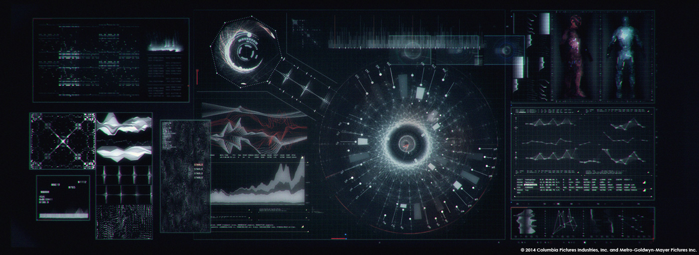
But Robocop’s was entirely different. First of all, Robocop has both robot and human sides. The HUD/GUI is already part of his character, he is constantly interacting through graphics. So we wanted to make his HUD/GUI design much more human, to have it feel appealing, sophisticated and dynamic. We designed and animated all the gadgets that he can access and use through his HUD, having them combine fluently. It’s supposed to feel like a fully-developed Operating System but at the same time look like he is in control and managing things in his view.
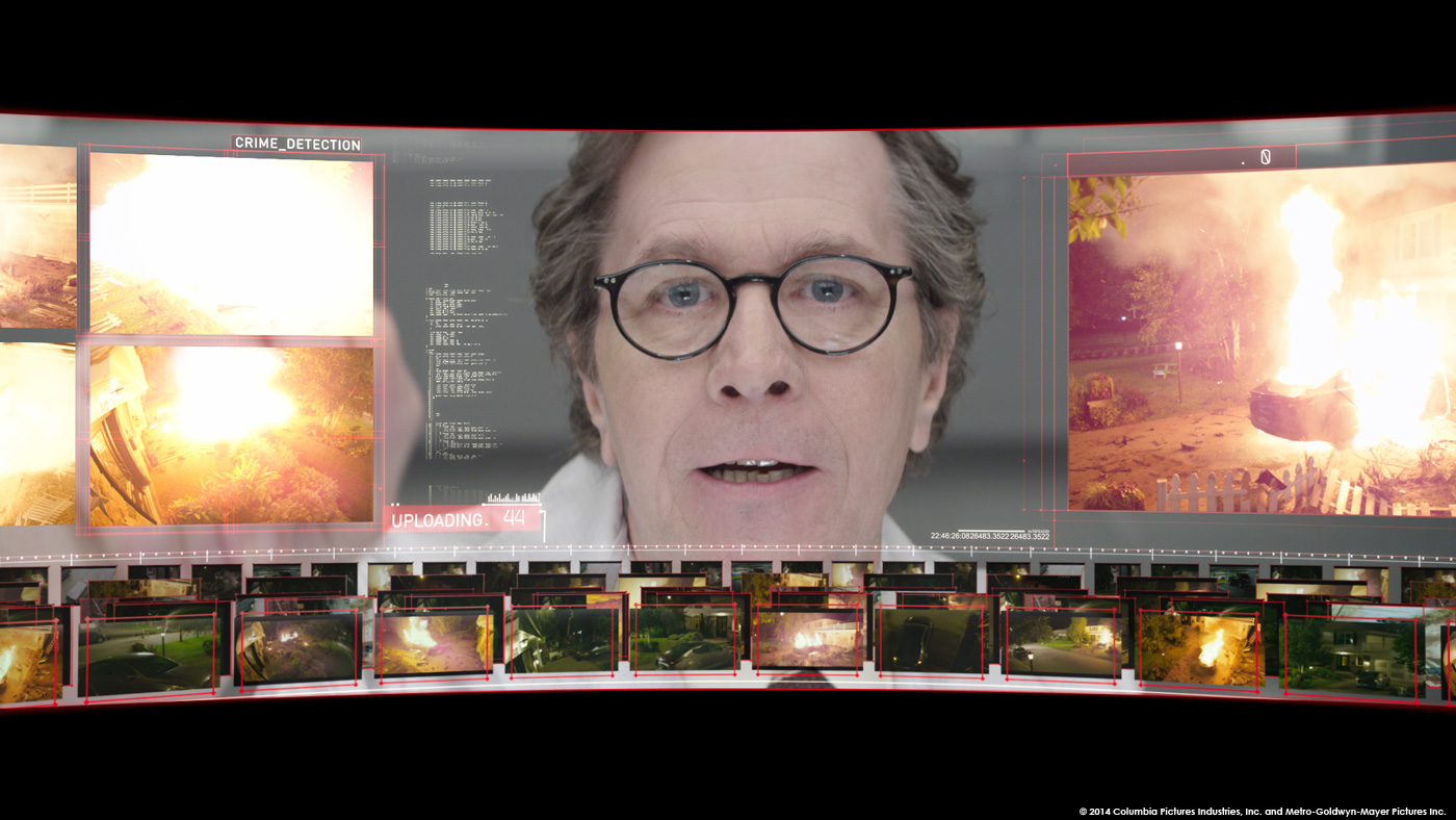
Other than that, there were some sequences which were long and had specific intensity. For example, there is a sequence where Robocop has the Detroit Police Department’s CCTV database uploaded to his brain, and it’s a pretty long sequence. There is an emotional momentum in that sequence, which increases in time. So we focused on the whole sequence rather than individual shots. And working with audio was essential of course.


What indications and references did you received from the director for the HUD/GUI?
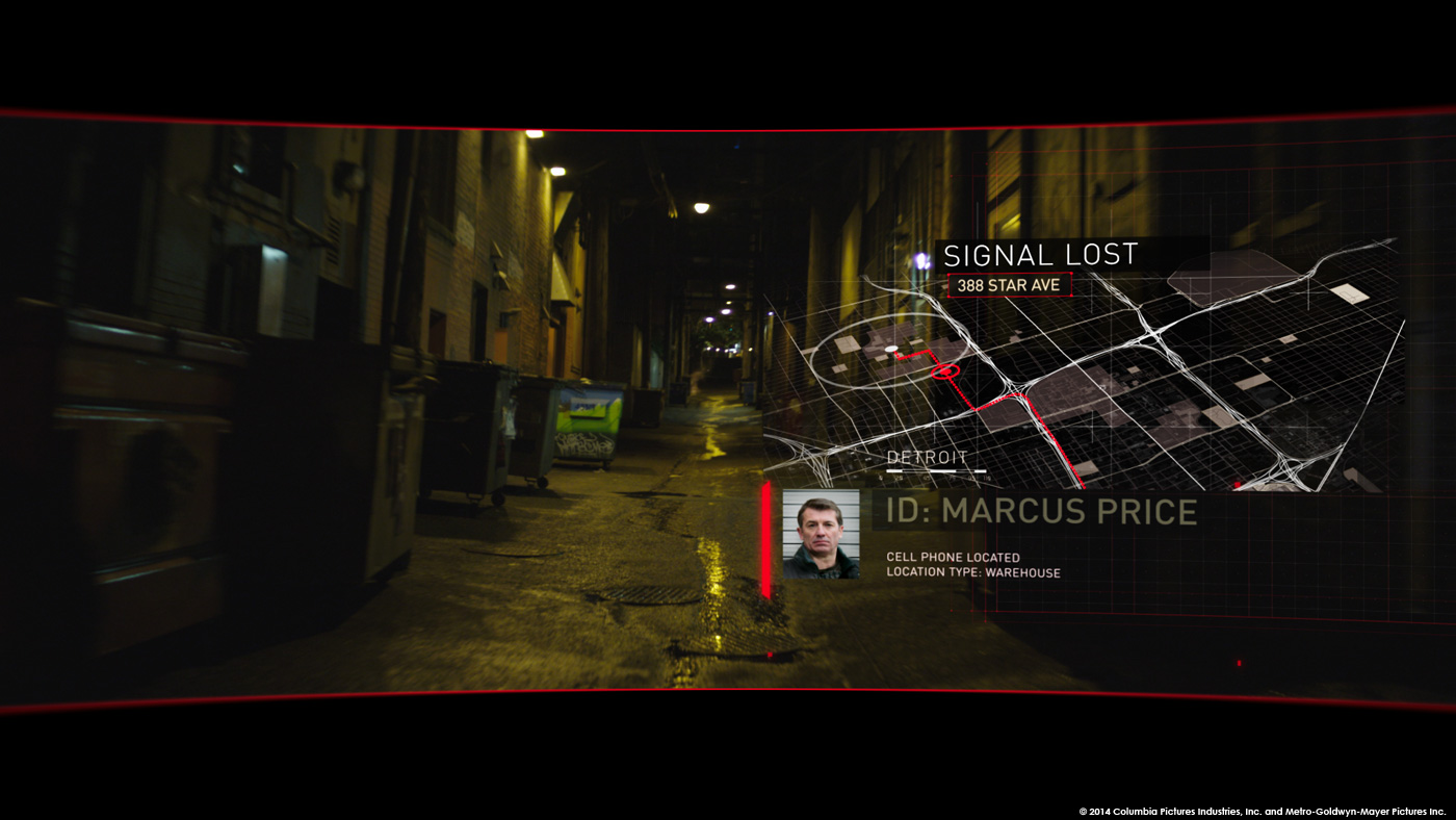
For José the most crucial thing was the story. Visually we were free as long as the story was clear. So he was asking us to come up with graphical solutions to questions like « What would a cop do if he sees a suspicious person? » or « What would he do to see if the person is lying or not? ». It was a very practical approach.
Can you describe your work process?
We were designing visuals and sketching animation to be on the same page with story simultaneously. We needed to move really fast because of the deadline.
While we were setting up the story, we went basic with the visuals just to make sure story is clean and timing is good for the cut. Once we had the flow, then we applied the visual language that we developed on top of it. Once we got the overall approval, the shot was passed over to our compositing team to prepare the shot for final.


Can you explain in details about the creation of these various HUD/GUI?
First thing we wanted to make everything united and consistent. There are couple of situations where Robocop is using similar methods to achieve something. So instead of introducing something new every time, we wanted to create specific gadgets that Robocop can use whenever he needed. That way we were able to keep things simplistic and easier to communicate. Make it easier for viewer to focus on story instead of trying figure out what’s going on the screen. Some shots are really short duration wise.
Visually we wanted make it feel like it’s a whole branding. For some elements we have imitated the octagon shape of Omnicorp logo.
José didn’t want to keep everything boxy, so we combined transparency, blurry and sometimes detached graphical elements.
For the 3D simulation sequences, we kept the visuals easy to read but convincing like other graphics. We wanted to have outlines of the objects for readability, and applied point cloud layer on top of that to imply the actual environmental scanning technologies. Navarro Parker created a perfect visual language for these sections.
In terms of behaviour; the starting point was imagining that all the tools that Robocop can access are surrounding him. So for the most part, elements/gadgets are sliding in and out from top, bottom and sides.We believe that also kept the graphics united and added more characteristic feel to it.


These various HUD/GUI have huge numbers of elements. How did you handle the animation?
There were lots of shots, and keeping the consistency was a major challenge. To solve this, we created an animated graphical elements pool. So once we had an approved gadget or element, we were dropping that as a project file into that pool. If the artists needed to recycle or use that element, they were importing that specific element, and adjusting it for the actual shot. It could be target, map, ID layout etc.. With this way it got easier to divide the work efficiently.
Can you tell us more about the compositing part?
We had a lot of interaction with actual footage. Blur, transparency, and color blending were all part of the visual language. We wanted to keep design minimal but detailed. After design process we needed to deliver all the elements individually with matte channels for the final color correction. Since our graphics were interacting a lot with the actual footage it was a challenge. Transparency and color blending especially caused difficulties. So pretty much every single shot needed specific treatment to have nice and clean matte. Our lead compositor Stevan Del George made some tests, and we held multiple screenings for DI color sessions couple of times to see how those worked. Stevan deeply investigated the requirements and after the success of having a working matte, he created specific procedures for compositing team to deliver the shots after design approval.


How did you choose the various fonts?
We tried various fonts, some techy, some militaristic, some futuristic… None of them felt natural because Robocop deals with a wide variety of different situations; Sometimes it’s combat-related, sometimes emotional and sometimes informative. We needed something more essential. Garson directed us towards using the DIN family of fonts for the most part. It worked really well, because even in real life, user interface design is getting more and more simplistic, elegant and easy to read. And it blended really well.
What is your softwares pipeline?
We mostly used After Effects, for 3D part we used Cinema4D, to generate point clouds; Nuke, and for match moving PF Track.
What was your feeling to redesign the HUD of the original Robocop?
It was so exciting, because original ROBOCOP has some really nice and smart POV shots. I think those are still good references for telling the story through HUD. It’s always great to have a tribute to a great piece, that you specifically like. And to me, this movie is taking it a step further, because its trying to tell much more throughout the graphics.
What was the biggest challenge on this project and how did you achieve it?
Designing all those graphics to be easy to read on the screen in a very short amount of time, while keeping them cool and appealing at the same time. This was the next level in terms of story telling, because some shots literally don’t have dialogue. It’s all the graphics telling the story. That was the biggest challenge for me.


Was there a shot or a sequence that prevented you from sleep?
Absolutely; two sections; figuring out the CCTV Database System and 3D simulation parts. They were pretty complicated, with multiple stages, by using different applications.
What do you keep from this experience?
A lot of things; With this big project, it was wonderful to see yU+co in action, with it’s design perspective, pipeline, production quality and everything. It was so great to work with big team and I feel even more confident with working on big projects and big teams now.
This was my first complete feature film experience, designing from start to finish. Also I was already a fan of José’s work, I’ve seen ELITE SQUAD movies long ago and the editor Daniel Rezende because of CITY OF GOD. Working with them closely was really great experience and memorable. We learned a lot about User Interface dynamics, interaction design, development, processing, past, current and future technologies.


How long have you worked on this film?
We began the end of July and wrapped early January. So around 5 months total.
How many shots have you done?
We did 117 shots total.
What was the size of your team?
The size of the team varied throughout the project depending on our needs but we had twelve designers and ten compositors working throughout the project.
What are the four movies that gave you the passion for cinema?
TAXIDERMIA by György Pálfi, AKIRA by Katsuhiro Ohtomo, STALKER by Andrei Tarkovsky, CROSSING THE BRIDGE: THE SOUND OF ISTANBUL by Fatih Akin.
A big thanks for your time.
// WANT TO KNOW MORE?
– yU+co: Official website of yU+co.
© Vincent Frei – The Art of VFX – 2014


