Last year, Ash Thorp had explained to us his work on TOTAL RECALL. He has since worked on projects such as IRON MAN 3, HAWKEN or AFTER EARTH. He also created the new logo for The Art of VFX.
How did you get involved on this show?
A couple years ago, I was freelancing on another project and would see Ben Procter and Sean Haworth (the production designers of ENDER’S GAME) working away on concepts and art in a room on the other side of the building. Curiosity got the best of me, and I decided to boldly introduce myself to them one day; we bonded in conversations over our common love for creating. In our talk, I mentioned to Ben that I would love to work on ENDER’S GAME, if there was any help needed on designing the user interface for the film. I put together a quick concept and pitched it to Ben and Sean. I think they appreciated my enthusiasm and excitement for the project, and before I knew it, I was hired onto the film. At the time, I was still a young up-and-coming artist in the early stages of my freelance film career, and Ben took a chance on me; I am so thankful to him for believing in me enough and giving me that opportunity to prove myself.
How was your collaboration with the director, Gavin Hood?
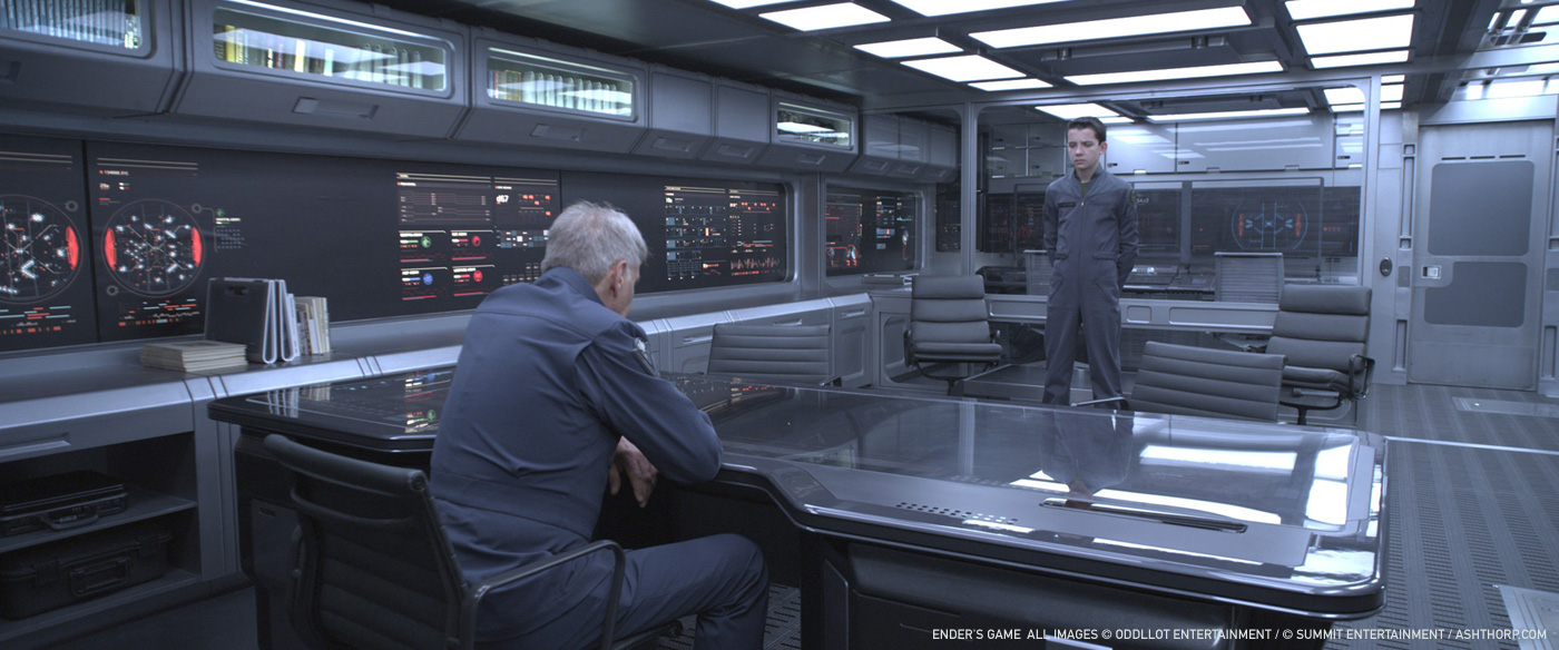
At the start of my involvement on the project, I met with Gavin Hood, Matthew Butler (the visual effects supervisor), Ben Procter, and Sean Haworth for lunch; we discussed the project in its entirety which helped get a real feel for what direction to take this film. Being that this was my first feature film working as a freelancer, I was truly honored to be among such great talent and having lunch with the Director and his closest collaborators. I got a real kick out of that! Gavin, the team, and I hit it off very well, and I did my best to make sure that I helped the team try to push the boundaries for what was needed. Once production started to move along, Gavin’s time was being requested by many people and so I spent more time working with Ben. However, I would still send periodic emails to Gavin checking in, and he was always generous with his time in responding with feedback and encouragement. It was also great to eventually meet up again with him in person on the set in New Orleans. Gavin instilled a great amount of trust in me and my design on his project.


What was his expectations about the interfaces and graphics?
Ben Procter and Sean Haworth were my main points of contact, so the three of us had the most conversations on locking down the look and feel of the technology being used in different environments.

With this project, you are back in Sci-Fi, and what was your feeling about it?
As you may know, I’m a big fan of the genre, and so this was a lot of fun for me. Also, since this project started a couple years back, it was actually my first big leap into UI for SciFi films. With the different release schedule of films, it seemed like this was my return to Sci-Fi, when it was actually my beginning. I read the series of books and really enjoyed the story and its underlying meanings. It was a challenge to try and put forth all my crazy ideas into the film, but I’m really happy with the end result.

How did you approach this project?
In many different ways. Since I was on and off the project for a collective one and a half years, my involvement happened in many roles and stages. In the beginning, I was trying to quickly sketch or build style frames to show the team my ideas and thoughts on how the UI should look and function as a narrative to the story. Once I figured that out, I started to dive further into solving the specific requests of the script that called for UI technology. So I would read through the script multiple times and specifically note my ideas for the events or moments that needed UI. I think the beginning creative process was the most fun for me because I was able to throw every idea at a blank canvas and see what really stuck out. During the production stage, I focused further on helping the story and refining the designs to Ben and Sean’s approval. We would work together on what was actually working versus what was not, such as the fonts, color palettes, etc. During the last stretch of the process, I focused on collaboration with my partners that helped bring the designs to life and gave them motion.

Can you tell us more about your role?
I worked as UI motion graphics designer for this film. I would help with art direction, ideation, and concepts from the beginning of the film up until its completion.
How did you work with the other motion graphics artists?
Since my project involvement was stretched out over one and a half years, I had the pleasure to work with many, many talented artists through the various stages. I built relationships with these artists that transcend simply involvement on the film, but rather resulted into some new friendships. Too name only a couple out of the many amazing creatives on this film, I had the pleasure of bringing on and working with my close friends, Ryan Cashman and Alasdair Willson. Since Ryan lives on the other side of the city and Alasdair was living out in the U.K. at the time, we did all of our collaborations remotely using Dropbox, Skype, iChat, cineSync, and anything we could to help share ideas and notes. In the later stages of the project, I also enjoyed working with G Creative on numerous shots and aspects of the film. We all worked together so well, that it brought a great surge of energy to this project.
What kind of references and indications did you receive from the director and production?
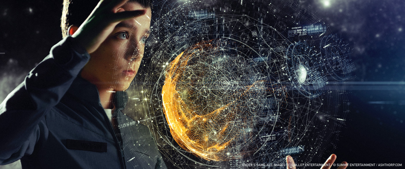
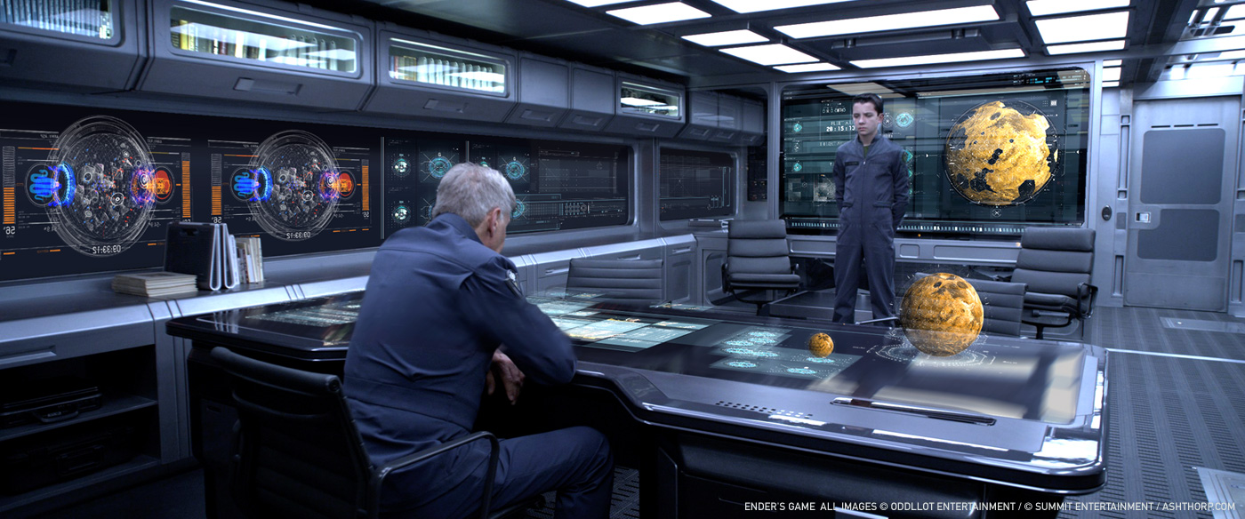
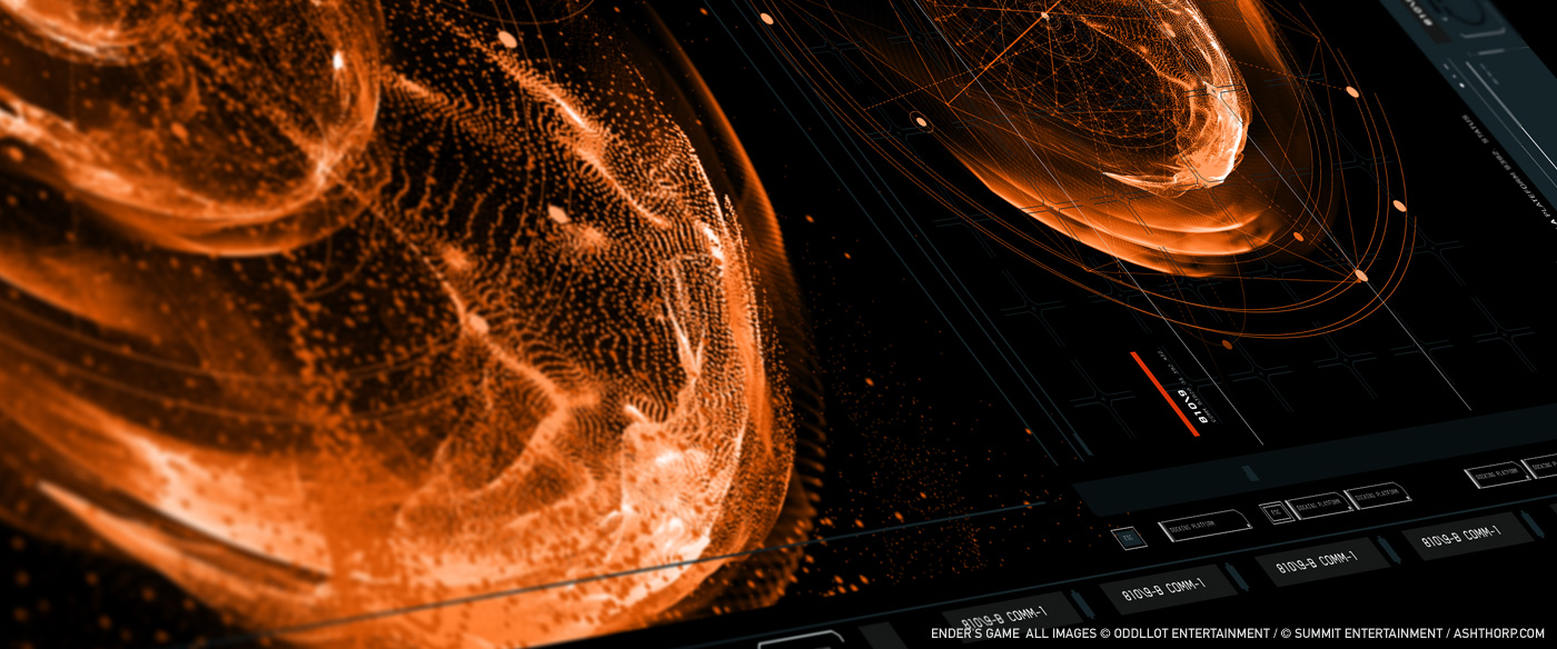
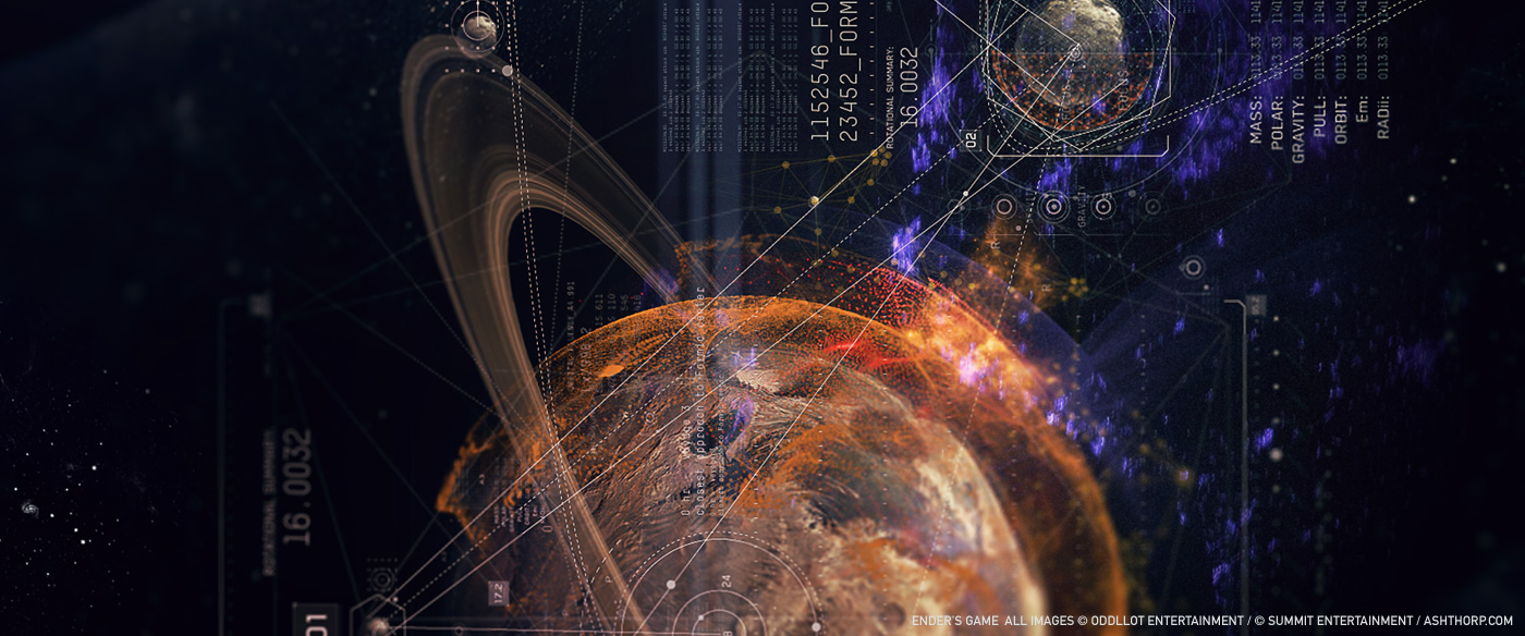
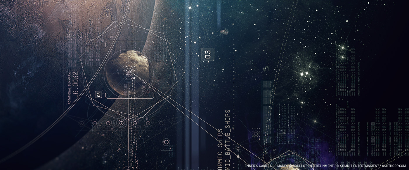
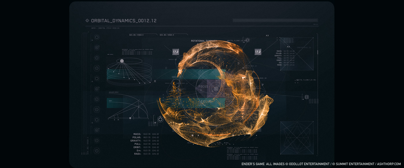
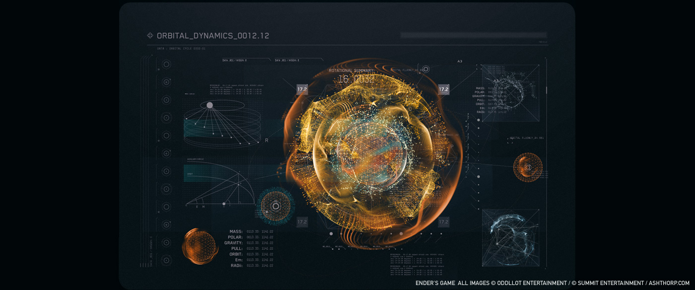
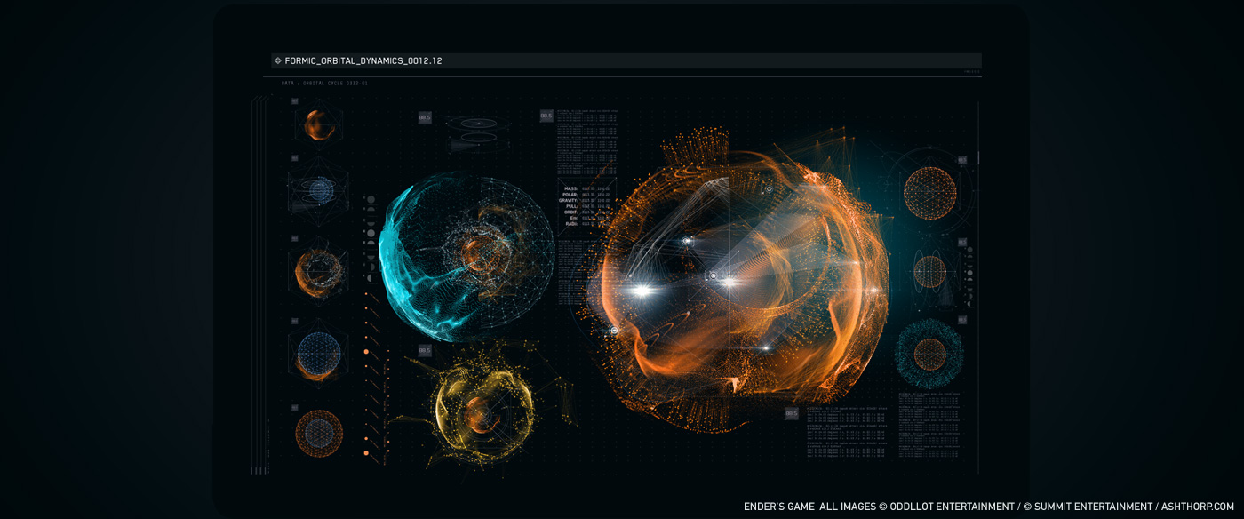
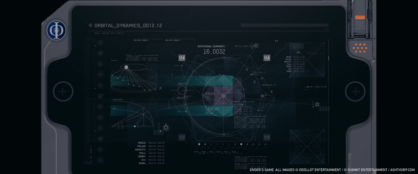
Ben and Sean wanted to pull muse from NeXT Computer OS. The old, clean, simple, beta-like quality of it appealed to us all, and I did my best to put my own spin on it. I am a massive fan of Dieter Rams’ work, so I also used his work as a muse for how to properly portray some of the more complex elements of the film in its simplest form. The final film edit doesn’t show all of what was created, but those references were some of the original focal points of inspiration.


Can you describe your work process?
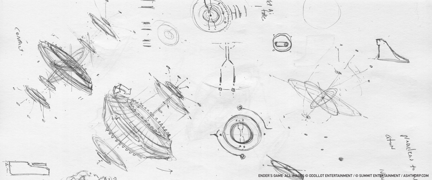
Each project is different, because I like to change my habits whenever possible. I think it’s important to evolve with each project and strive to find new ways of approaching things. Since this was my first UI freelancer job on a feature film at that time, I completely emerged myself in this project and the world of UI. I hadn’t had much experience on UI work or design prior to ENDER’S GAME, so it was extremely fun and challenging at the same time. With ENDER’S GAME, I would read the script, pull notes, draw rough concepts, and then jump onto the computer and start making things in Adobe Illustrator and Adobe Photoshop. I like to work very fast and build concepts out while I have the thought and energy. For me, the ideation phase is the most fun part of the process.
How did you approach the various different interfaces?
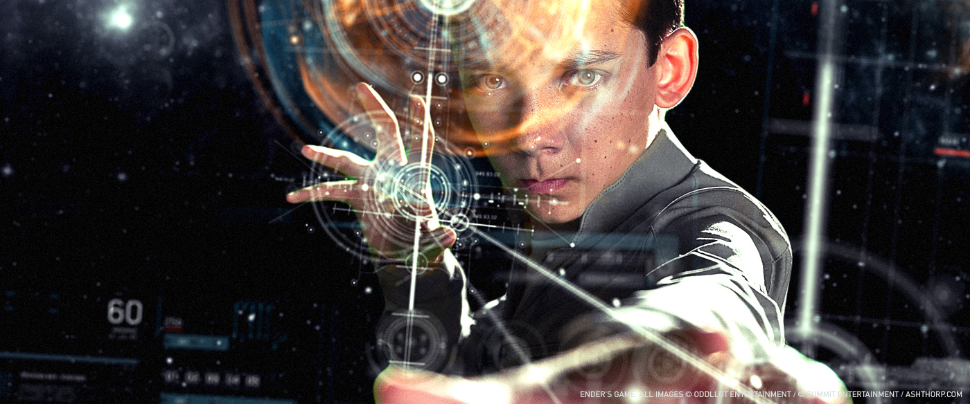
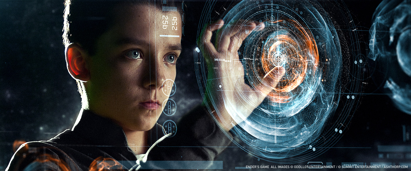
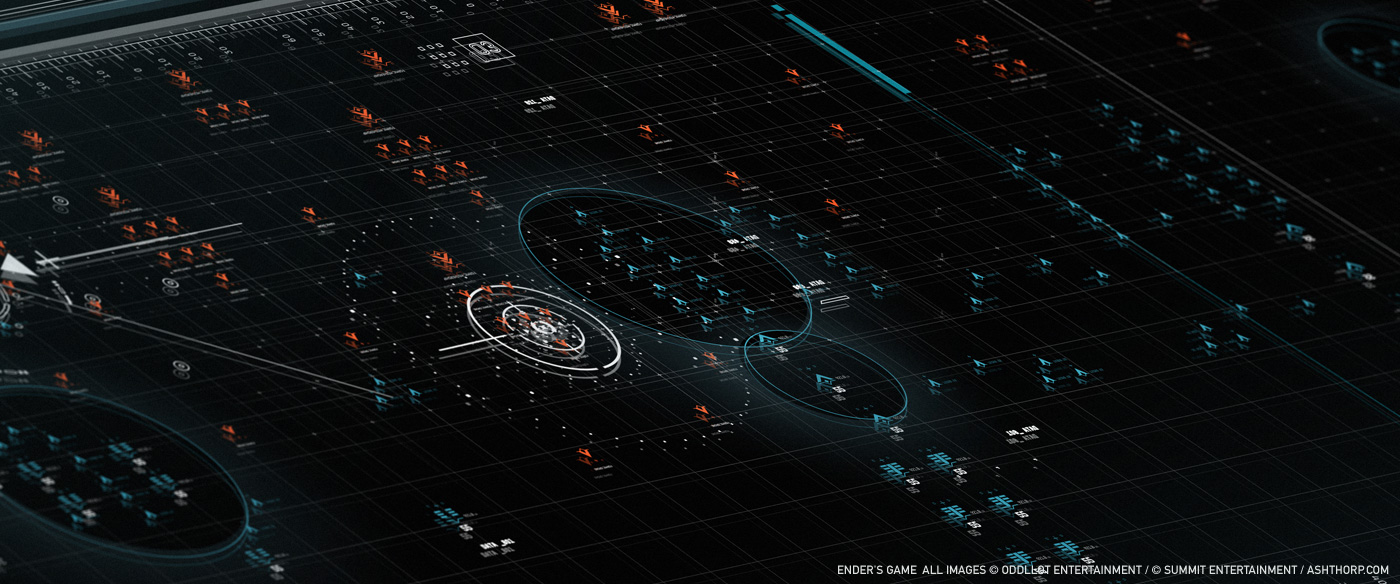
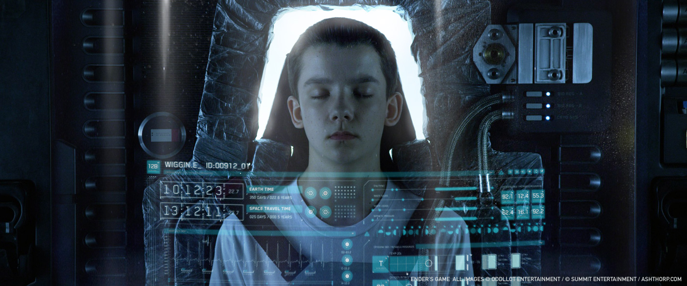
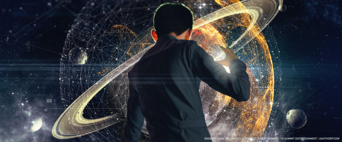
Since there were so many scenes involving UI in the film, I tried to focus on how to best help tell the story and give the shot something special. I would pull ideas from my library of references to help guide me on the overall aesthetics, while also seeking to challenge those concepts into a more relevant and updated form. Once I found the right balance, I would then build the files to the shot’s particular specs.

Can you explain more about their creations?
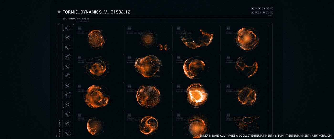
As I mentioned earlier, I like to get the raw, honest ideas out as fast as possible, so I don’t forget them. Once I get the ideas out of my imagination and onto the computer, I start to make things more structured and detailed with grids and font details. Since this project was so massive and ongoing, I created a very large sum of work; I had about 650+ Photoshop files alone.

Can you tell us more about the font choices and design?
I proposed over 40 different font families at the beginning of the project. Eventually, I decided on a clean, modern, structured base font that I thought would be used for the military UI, and then some more utilitarian fonts for the civilian world. Fonts are a massive deal breaker for me, because they either work and help set the feel for scenes, or they do the opposite and completely detract from the meaning. I will spend a significant amount of time in selecting which font families I feel work best, and then test them multiple times in the setting until I feel they are a good fit. If the font doesn’t work, then nothing does. The font selection is always the first big obstacle for me to tackle after I sketch out my ideas.

Which softwares did you use?
For ENDER’S GAME, I mainly used Adobe Photoshop, Adobe Illustrator, Adobe Indesign, and Cinema 4D.
How did you work with the VFX studios about the interfaces animation?
This was a HUGE task. I learned so much on the process of ideation in early production to the final composite for the film. At the start of the project, I was focused on things like font families, grids, and object layouts. Then it shifted towards the stage of putting the designs into motion, and then into the film. There was a great deal of back and forth with Matthew Butler, G Creative, and the other teams, once we got things moving in the scenes. Matthew really has an expert eye for picking up subtleties. We would have lots of meetings and remote calls to discuss the tasks and solutions of each shot. It was truly a great collaborative experience with everyone. At times, the challenges could get incredibly taxing and exhausting, but I believe we accomplished what we wanted and got it done to the best of our abilities. Although the journey on this project extended over such a vast amount of time, ultimately, I couldn’t leave what I had started and I had to help see it through to the end.

What was the biggest challenge on this project and how did you achieve it?
Honestly, this was the biggest project for me at that time in my life. It was incredibly challenging on multiple levels, and I learned my fair share of life lessons on this project. I had never been on a project for this lengthy span of time, and so my biggest challenge was staying in love with it. I had to keep digging deeper within to continually be 110% on each and every stage of the project. Keeping that momentum and love going for over a year and half became emotionally and mentally exhausting, since I use my emotions to fuel my creativity. Also, since I work remotely out of my home office, it was challenging to stay connected with everyone and be on the same page at all times. However, with all these obstacles, it just makes the result that much more rewarding at the end of it all.
What is your best memory on this project?
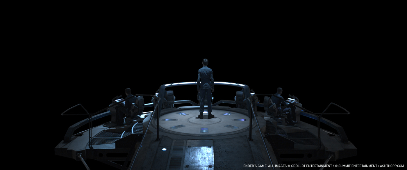
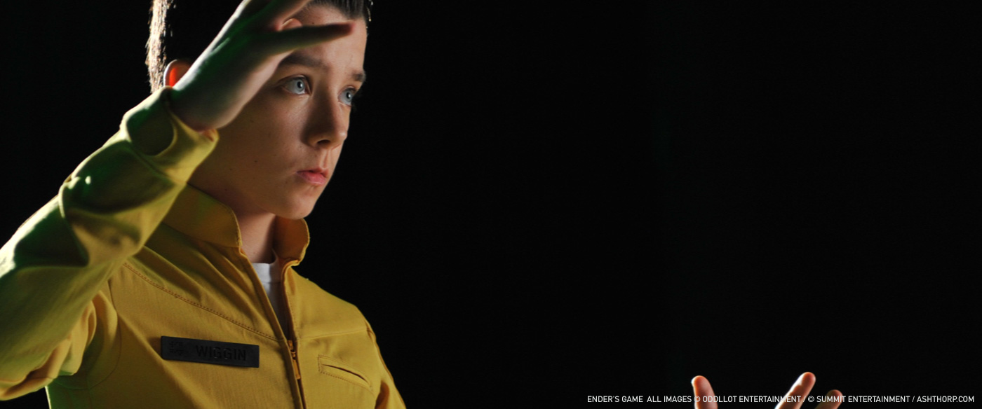
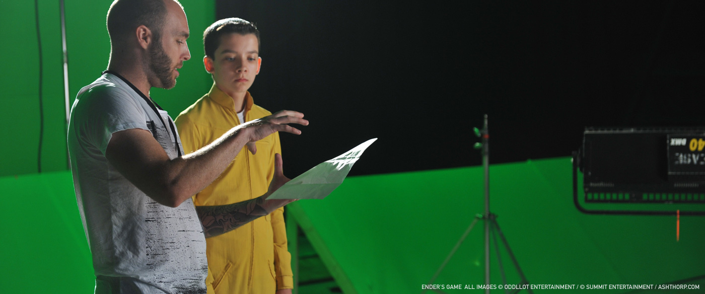
I really, truly loved having the chance to work with so many amazing people. It was also such a great experience being able to fly out to New Orleans and stepping foot onto the massive sets out at the NASA stations. Watching the crew build the sets, Gavin directing everyone, the chance to work directly with Asa Butterfield, and just seeing it all come together on location was beyond anything else I’d experienced. I was in complete awe of the amount of love and craft that went into this project. With it being my first time on a production set of that scale, it has forever created a permanent impression on me.

How long have you worked on this film?
Overall, I’d say it was about a total of one and a half years, off and on through various stages.
What is your next project?
Ah! Now you know I can’t tell you guys that one just yet, but I have 3 or 4 exciting projects in the works, and it will be great to share them with everyone when the time comes around. I’m truly enjoying my blessed life and being able to do what I love… The future is bright and full of endless possibilities.
Any last thoughts?
I would like to thank EVERYONE who helped me on this project and for giving me the chance to create alongside each and everyone of you, my wonderful wife and loving daughter who put up with me through the craziness of it all, and my supportive friends and family. You are all amazing, and I love you all. Cheers everyone!
A big thanks for your time.
// WANT TO KNOW MORE?
– Ash Thorp: Dedicated page about ENDER’s GAME on Ash Thorp website.
© Vincent Frei – The Art of VFX – 2013


I love the fact that the GUI’s and NUI’s are making a big splash in feature films it is becoming an interesting challenge to make it look new and fresh plus functional great for digital artists and designers.
I particularly like the nebulous particles outside the sphere shape as a holographic 3D representation fantastic work 🙂